Redesigning workflows to improve enterprise connectivity and search quality
Dec 2025 - August 2026
Connection is the bottleneck to a quality Glean experience
Connecting company apps to Glean is the first step in every customer's journey. Without connected content, there is no enterprise search, Assistant, or agents. But the setup experience was fragmented, confusing, and took weeks to configure.
One pilot customer described onboarding as “30 days of setup and implementation, and actually 30 days of piloting.” Another lost track of their setup entirely partway through. We called this period the valley of despair: the weeks admins spent waiting for their connectors to index (ie. finish storing their data) while their employees couldn't meaningfully search or use Glean's capabilities. Roughly 60% of pilots weren't converting to paid customers, and about 40% of support escalations could be traced to indexing and setup confusion.

A fragmented configuration led to user friction
The second issue was that connectors and tools were split across two parts of the product. Admins could connect an app for search without realizing they also needed to visit a separate tab to enable the actions tied to that connector. For example, an admin could setup the Google Drive connector, but they also needed to enable its tools like Upload file to Drive or Create Google Doc. Without them, end users would hit dead ends: Glean could find their files but couldn't act on them.
Only about 40% of customers had tools enabled for connectors. For Google—one of Glean's most important connectors—roughly 55% of admins never set up its tool pack. Because Glean's agentic capabilities depend on these actions, this fragmented setup limited how much value customers could get from the product. It was evident that we needed to unify these flows to increase tool attachment rate and improve the quality of a company's Glean experience.

Separate tabs fragmenting one workflow
Designing a framework, not a one-off flow
Glean supports more than 250 connectors, each with different authentication models, required inputs, and technical constraints. Trying to solve every edge case at once would have forced us to design too narrowly. Instead, we scoped the first phase to roughly ten of the most commonly used connectors, which included Notion, Slack, Atlassian (Jira and Confluence), Google Drive, and Microsoft O365.
Whatever we built needed to work as a framework: flexible enough to add or skip connector-specific steps, but consistent enough that setting up one connector would make the next feel familiar.

Balancing simplicity and control across setup
I began by mapping the admin’s end-to-end journey—from onboarding and connector setup to deploying Glean across their organization. What initially seemed like a linear process quickly branched based on connector capabilities, authorization requirements, and the features an admin chose to enable. Defining these paths helped me identify where the experience needed clearer guidance and where complexity could be reduced.

With that foundation in place, I explored different setup experiences, varying the interactions, level of control, and amount of information presented upfront.
I first explored a modal-based setup flow to keep admins anchored in the connectors page. This treated setup as a focused, guided task: admins could open a connector, understand its capabilities, and move through the required configuration steps without losing the context of the page. This approach also made the flow feel more contained and sequential, which was useful for testing how we could reveal technical requirements (ie. authentication details and optional advanced settings) only when relevant.
An early prototype of a modal setup experience
While the modal worked for simple connectors, it was too constrained for connectors that required detailed instructions, multiple configuration decisions, and visual guidance. Fitting lengthy documentation and images into a compact overlay made the experience harder to scan and limited how clearly we could explain each requirement. Moving the flow to a full page gave us the space to guide admins through each step, surface the right context at the right time, and make technical decisions easier to understand.


Evolution of the setup UI over time
One guided flow, tailored to each connector
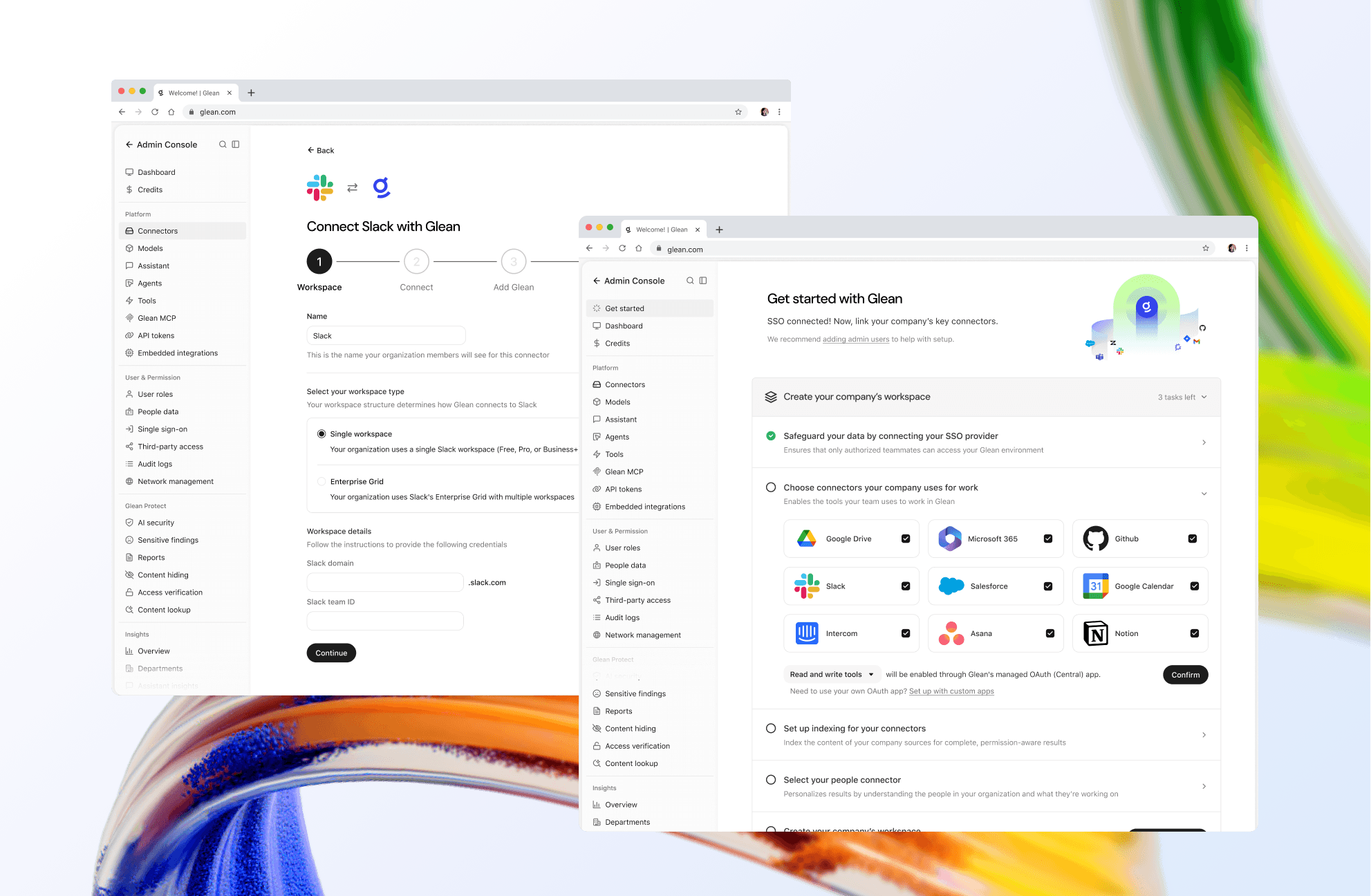
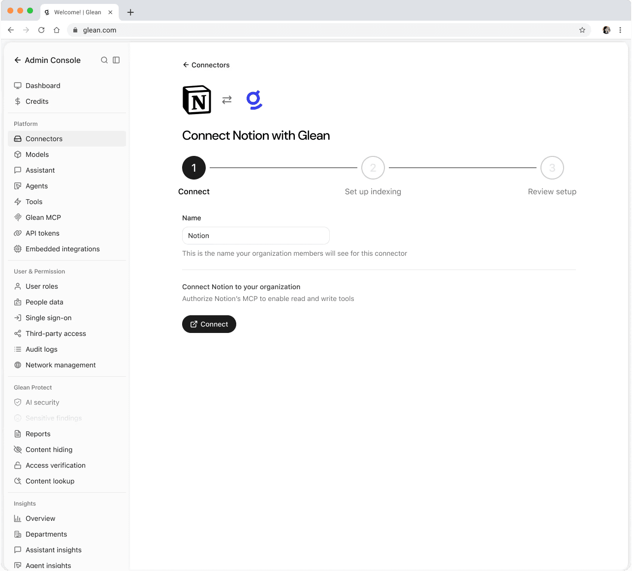
The final unified flow (with Notion as an example) shows how that pattern came together. Every connector follows the same overall pattern, while individual steps adapt to its technical requirements. This framework was applied to the first ten connectors selected for unification, which included important enterprise apps such as Slack, Microsoft O365, Google Drive, Github, Atlassian (Jira and Confluence), and more.
The result gives admins a clearer path to completing a deployment while establishing a familiar pattern they can reuse. Whether they are setting up their first connector or their tenth, they know where to connect tools, configure indexing, and understand what comes next.
The final Notion setup flow
As I mentioned before, the framework needed to flex around each connector’s technical requirements. The image below shows how individual setup screens could look quite different while still following the same guided flow. Microsoft 365 and Atlassian Cloud are suites with nested connectors, and Salesforce needed a custom page to add a technical requirement called "objects." These variations all needed to be redesigned in new unified flows without departing from the overall guided experience.

Unique screens from connector setups (Slack, Microsoft O365, Atlassian, Salesforce)
Redesigning the connector catalog for easier navigation
Unifying setup also meant improving the moment before configuration begins: finding the right connector. The original connector modal displayed the full catalog as a single, undifferentiated list. As the number of available connectors grew, admins had to scan through every option to find the tools they needed, with little help understanding what was already connected or where to start.

I redesigned the modal around the admin’s primary tasks: finding a connector, understanding setup status, and browsing relevant categories. Quick filters distinguish connected from unconnected connectors, while category controls and grouped sections make the catalog easier to scan. The result is a clearer starting point for building an organization’s connected workspace.

Completing the end-to-end journey
With the setup flow established, I turned to the post-configuration experience. I designed the connector overview and tools pages to show admins what was happening next and whether action was needed. Clear states—indexing not started, in progress, or complete—turned technical status into actionable context.
The pages also adapt by connector type: tools and live connections appear where supported, while other connectors focus on indexing and configuration.
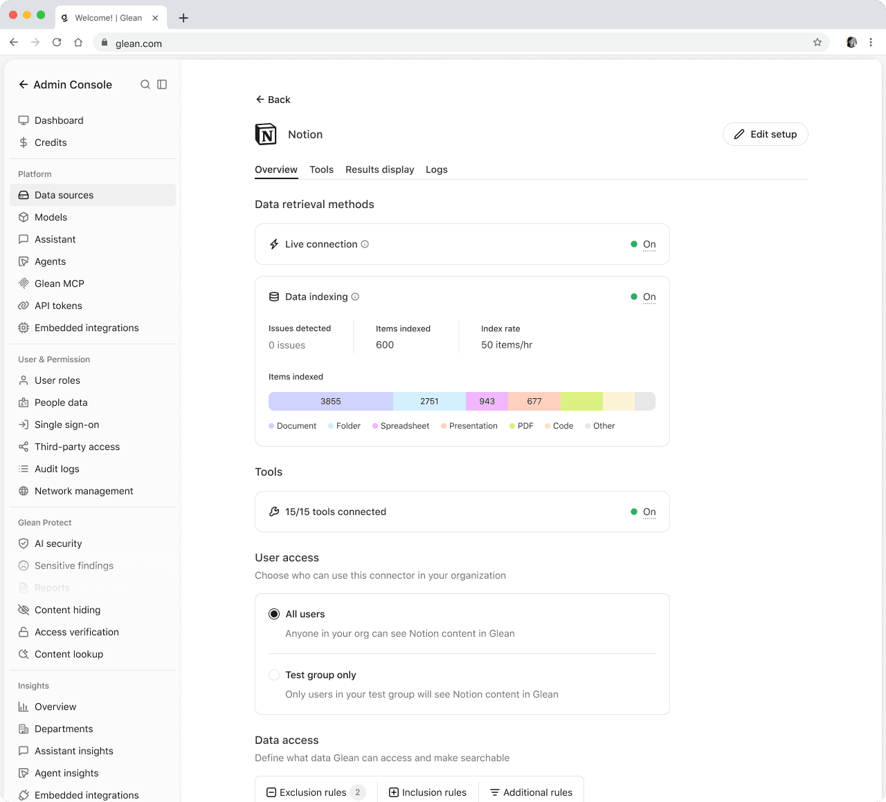


Index not configured

Tools page
A unified setup and deployment experience
Together, these changes transformed setup from a collection of disconnected configuration tasks into one guided experience. Admins can find the right apps, connect and configure them through a familiar flow, enable live capabilities and tools when applicable, and return to a consistent overview to monitor progress. By balancing immediate value with a clear path to full indexing, the framework shortens time-to-value while building the permission-aware foundation for Glean search, Assistant, and agents.
The impact
The early impact is already visible in time to value. Customers who created a connector through Unified Setup reached their first chat query in a median of 10 days, down from ~28 days—effectively reducing time to value by 64%.
Tool attachment also increased: 32 of 70 completed connectors had a tool attached, a 46% attachment rate compared with a 33% baseline. As the unified setup expands to more connectors, the same integrated flow should make it easier for admins to discover and enable tools, creating further opportunity to increase tool connectivity.
