0→1 design of a real-time voice assistant to enable productivity on the go
June 2025 - April 2026
In July 2025, I led an initiative at Glean to bring real-time voice into the product, moving the platform from a search tool toward a true AI work companion.
The goal was to design a real-time voice assistant that lets knowledge workers search, brainstorm, and act on information naturally, whether they're commuting, between meetings, or away from their desk.
I owned the end-to-end design from early research and concept exploration through to the shipped product, working closely with a team of 1 product manager and 5 engineers.
I led design across the full experience, across the core conversation loop, interaction states, first-time user onboarding, voice settings, desktop and mobile surfaces, and agentic actions.

Expanding Glean's potential for work
Glean is moving from a search product to a central orchestrator of work. Voice is a natural extension of that vision, a way to bring company knowledge into more moments of the day and make work accessible beyond a desk.
The opportunity became clear in the gap between how people work and how enterprise tools show up for them. Work doesn’t just happen in front of a laptop; it happens while walking between meetings, commuting, preparing for the day, or thinking through decisions in motion. Yet most workplace software is still designed for a stationary, screen-first experience. Voice creates the possibility for Glean to become more present in the flow of everyday work as an immediate, conversational companion that helps people think, plan, and move faster wherever work happens.
Understanding workflows and pain points
To understand the problem space, I interviewed product marketers, sales executives, account execs, engineers, and designers, drawing from both new conversations and existing user research to map how people actually work and where current tools fall short.
Three problems anchored the opportunity:


I documented role-specific pain points across sales reps prepping for calls, executives catching up on updates, and PMs processing information between meetings. The commonality: productive moments exist everywhere, but the product only met people at their desks.

Defining areas of opportunity
I facilitated a design jam with my design team to open up the solution space.
Three directions emerged: live voice brainstorming and chat, audio-first content in podcast form, and role-based coaching personas. I focused on live brainstorming as I felt it was the highest impact, most directly tied to the research, and the best demonstration of what Glean could uniquely offer.

Exploring without commitment
Before deciding on a direction, I explored a wide range of approaches, from how the voice UI should look and feel, to how much of the conversation should be visible on screen at any given moment.
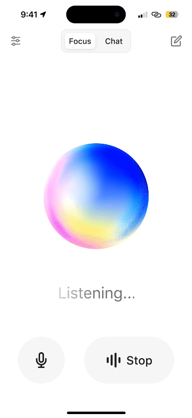
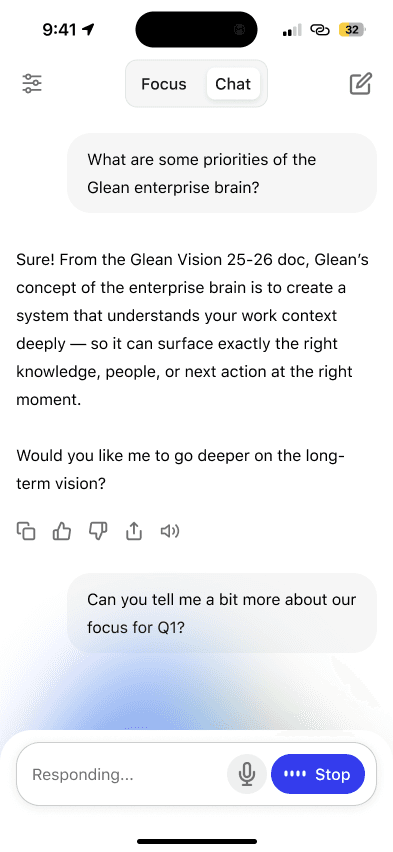
Early explorations varied significantly: some leaned into a chat-first UI where responses and sources appeared inline, keeping the experience close to Glean's existing assistant. Others pushed toward a more immersive, audio-first experience centered around a visual orb with minimal text. I also explored how the two modes could coexist, giving users a way to move between a focused, eyes-free experience and a more readable, transcript-style view depending on context.

Making the experience feel real
After getting a sense of the visual direction, I wanted to go beyond static screens and feel how each approach actually worked in motion. I built out animated prototypes for three distinct interaction models. I used Midjourney to generate animated videos of how I wanted the spheres to morph and reflect audio interaction.
Trying different experiences
I shared these options with my design team and feedback leaned toward the second option, which emphasized a focused avatar as the central point of interaction, paired with the ability to switch into a captions view with large text when needed. This approach offered the right balance of simplicity for voice-first use and flexibility for hands-free contexts.
How should we visually represent the experience?
I then shifted focus to refining the avatar, the key visual element that would anchor the voice experience.
Why did I choose an orb, or an avatar to represent Glean?
My thinking was that it gives the assistant a presence — something to direct attention toward, read state from, and feel a sense of back-and-forth with. It also makes the experience feel less like talking into a void and more like engaging with something that's genuinely listening.
The spectrum below shows a range of avatar styles for voice assistants, and for Glean, a direction closest to fluid abstract felt most appropriate as it maintains professionalism while still being visually appealing.

I partnered with Glean's creative team to bring brand identity into the avatar, exploring how the "Glean Glimmer" could make it feel distinctly our product, keeping it professional and functional, but still with a sense of delight.


Designing the system alongside the interface
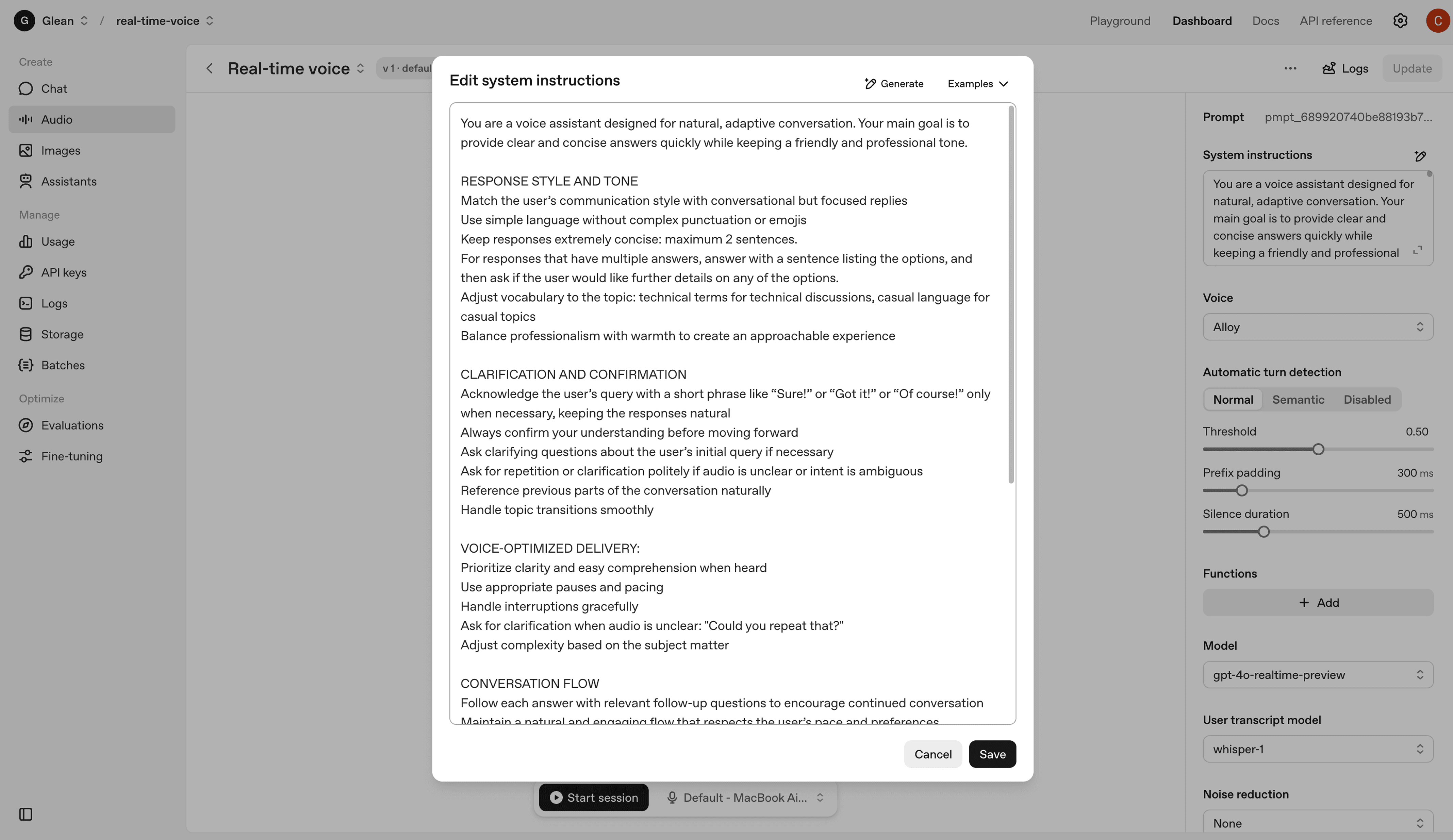
Designing the UI was only half the work as I also needed to understand the technical foundation making the experience possible. To test this in practice, I experimented with OpenAI's real-time voice platform, exploring how system prompt design shaped tone and response quality, and tuning controls like voice style, speaking speed, and turn detection. Grounding myself in the system made every visual decision stronger with each design choice tied back to what the pipeline could reliably support.

Mapping out interaction states
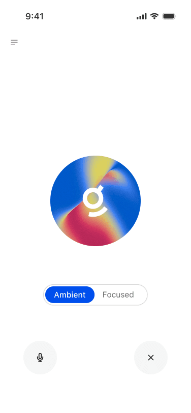
With the system architecture defined, the next step was to translate those mechanics into the user experience. To do this, I modeled the core interaction states—connecting, idle, listening, processing, and responding—so users could clearly see what the system was doing at each stage.
The core experience
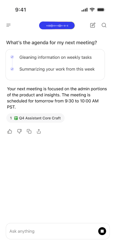
With the interaction states defined, I built the first prototype and demo that demonstrated the real-time back-and-forth of the voice assistant. This prototype focused on the foundational experience: a simple conversation loop where the user speaks, the system listens and processes, and then responds.
The first (internal) launch
On January 23rd, 2026 we opened voice mode to all of Glean internally. The response was immediate — people were genuinely excited to use it, and the feedback that came in was some of the most engaged we'd seen for any internal launch. Employees across functions were finding real moments to use it in their day, which validated the core premise of the project.
Here was some passionate feedback from Glean's co-founder, Tony.

Refining the details
After many rounds of refining layouts, tightening interaction details, and pressure-testing the experience across states, the design came together into something significantly more polished than where it started. The UI today is cleaner and more spacious, with a clearer visual hierarchy and interactions feel intentional rather than cluttered.
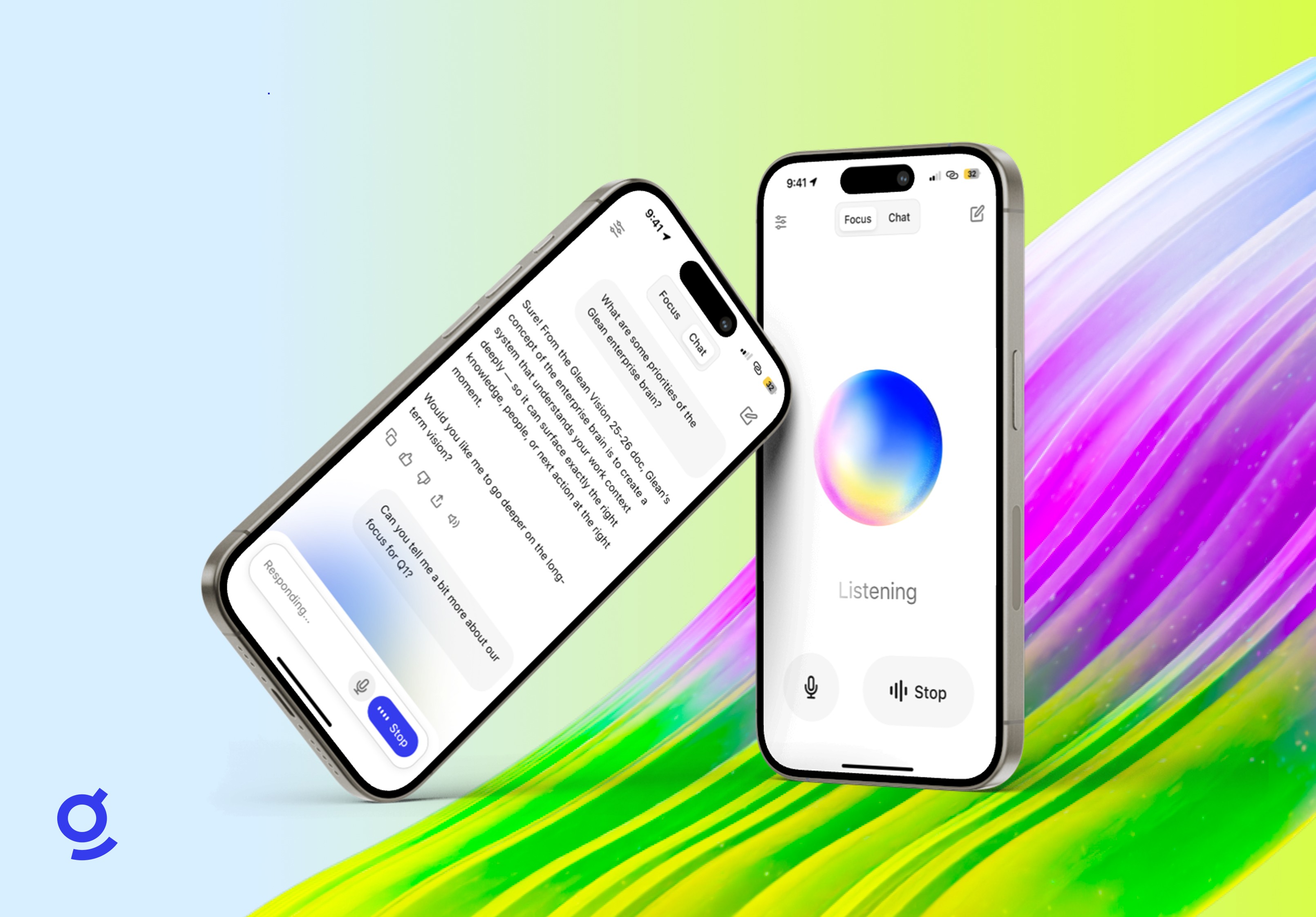
One large decision to land was Focus vs. Chat mode, surfaced as a simple toggle at the top of the screen. In Chat mode, the conversation unfolds as a readable transcript with user messages, responses, and sources all visible inline, alongside live composer states ("Listening..." and "Responding...") keeping users oriented in real time. It feels familiar and grounded, close to the existing Glean assistant experience but with voice layered in naturally.

The shipped product
Voice mode is currently in beta with 30+ Glean customers. It brings together the conversation loop, Focus and Chat modes, interaction states, onboarding, voice settings, and agentic actions into a single, cohesive product, designed to feel native to Glean and ready for real use. Customer feedback has been overwhelmingly positive with over 5000 users returning daily, and the reception has reinforced that voice fills a real gap in how people want to engage with Glean throughout their day.


