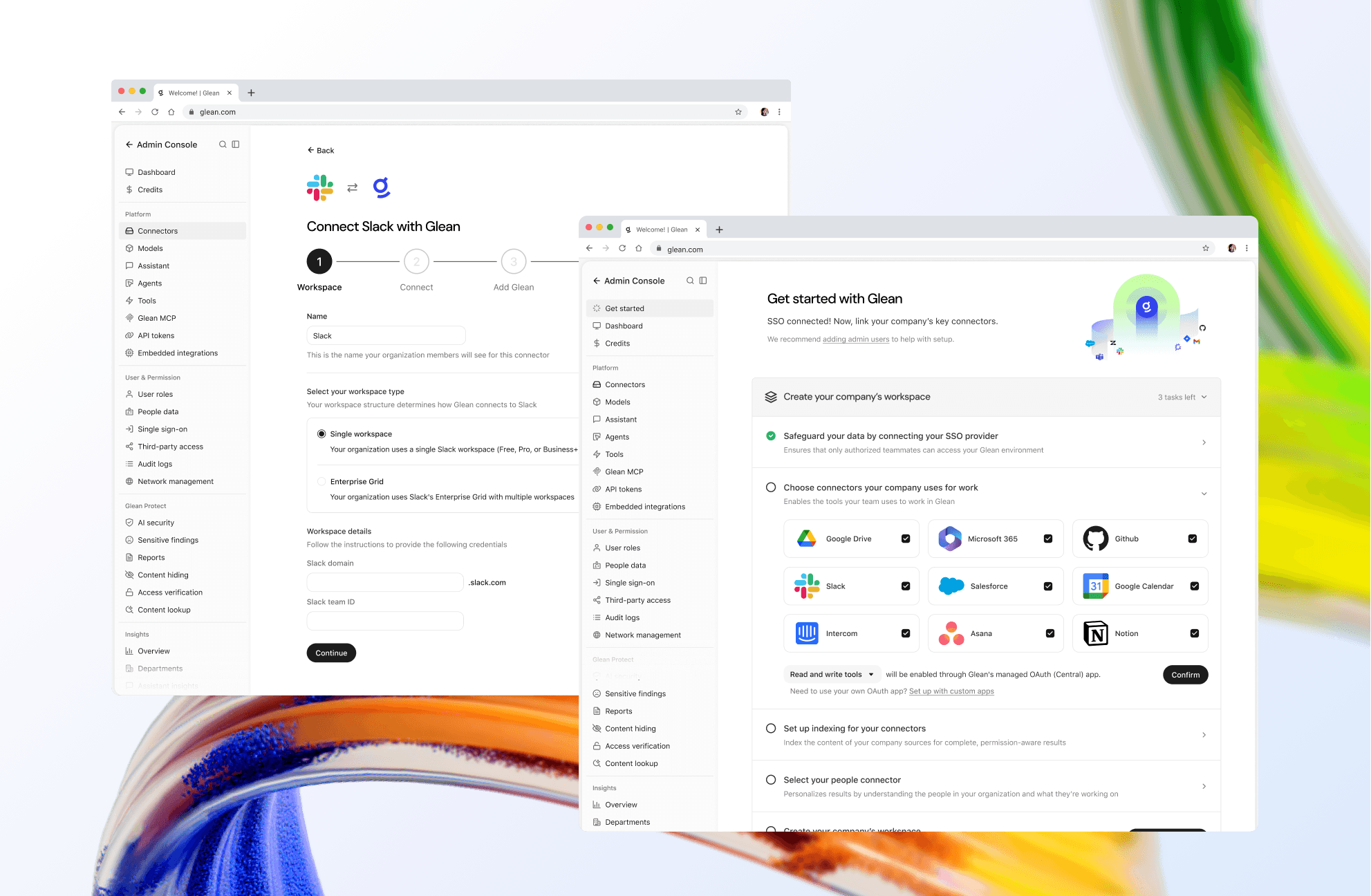
Designing how employees connect their apps and take action in a conversation
August 2026 - November 2026
Doing work in Glean depends on each user's connections
Glean lets people search across the apps their company uses, so they can find information and documents in one place. Beyond search, Glean is evolving into a platform where people do work: drafting documents, creating slide decks, analyzing data, and taking actions like sending an email or creating a Jira ticket, without switching between tools.
When an admin sets up a connector, Glean can search that app's content across the organization. However, write actions (ie. sending a Slack message or creating a calendar event) run through each employee's own account, so users still need to authenticate the apps they want Glean to act in. Most hadn't connected their apps before asking Glean for help, which meant authentication often interrupted or blocked their requests.

Actions required too much user input
Even after authenticating, actions were difficult to use. Some flows were broken, while others were unclear or required significant manual input. Drafting an email or creating a Jira ticket in Glean often took more effort than doing so in the native app, leading users to drop off and return to other tools.
Together, these problems framed the question for the project: how can we help people get work done in Glean while making authentication feel seamless?

An overwhelming user experience to invoke actions
Encouraging connections earlier in the journey
The first opportunity was to help users connect their apps before a task depended on it. Onboarding was a natural starting point, as it consisted of only two screens: a welcome and an extension install. I explored adding a third screen that recommends apps to connect based on the user's role and team adoption, along with the value each connection provides. The goal was to make authentication feel relevant without adding friction before users had experienced Glean.
I also explored the homepage, Glean's primary surface, as a place to encourage connection without interrupting users. The design was constrained to an existing promotional area below the search bar, which required precise copy and layout. I designed two directions:
Multiple connectors, each surfaced as a chip that starts authentication in one click
One connector per session, paired with a specific benefit like creating and tracking Jira tickets
I preferred the single-connector design for its clarity and low cognitive load. However, engineering identified a constraint: the ranking system for selecting the most relevant connector was not yet reliable, which risked recommending an irrelevant app. We chose the multi-connector design as the more dependable option.

Multiple connectors

Single connector
Asking for access only when it matters
Not every request requires a new connection. I designed two ways for Glean to ask someone to connect an app, depending on whether access is necessary for the task at hand.
Blocking authentication comes up when Glean needs the connection to complete a specific part of the request. The prompt appears at the moment the work pauses, explains why access is needed (ie. Glean needs opportunity stages and close dates from Salesforce to rank at-risk accounts), and gives people a clear choice to connect or skip.
Non-blocking authentication applies when Glean can still give a useful answer with the information it already has. It answers first, then recommends a connection at the end of the response that would make future answers more complete, so it never interrupts the conversation.

Blocking authentication

Non-blocking authentication
Recommending connections while Glean is thinking
Blocking authentication pauses the response, and non-blocking authentication waits until it is complete. We also designed for the time in between, while Glean is still thinking and the answer is streaming. As Glean works through a request, it can recognize when a connected app would improve the result and surface a recommendation directly within its thinking steps, alongside the searches and sources it is already showing.
The card explains what connecting would add (ie. live deal stages and forecasts from Salesforce) and gives users a choice to connect or skip. Glean continues working either way, so the recommendation doesn't interrupt the response, and a new connection can inform Glean's next answer.

Authentication while the answer is streaming
Auditing actions as one system
Before designing, I audited every action creation flow in Glean to understand existing pain points. I mapped how each flow worked from start to finish and grouped similar flows to see where the experience felt consistent, where it felt fragmented, and what it wasn't helping people do. This gave us a way to think about actions as a whole, rather than solving for each one in isolation.

Auditing all action creation flows in Glean
Keeping the email in the conversation
I focused first on creating and sending an email. Previously, asking Glean to draft an email opened a separate side editor that shifted the layout. Beyond the unnecessary layout shift, users couldn't edit the draft in place or send it from Glean, so moving from generating an email to refining and sending it felt disconnected.

Email creation pulled users into a separate editor
We wanted to keep the conversation and draft in view, preserve the layout, and let people edit the email right where it appears. In early explorations, the draft rendered in-line as a Gmail card with the recipient, subject and message visible, so people could review it and send or discard it without switching to Gmail.

Early explorations of in-line email editing
From there, I refined the details. I moved the CTAs to the right, where people expect them from Gmail, and added a gray header to separate the action from the email itself. I also added a copy button next to the message, since many people prefer to copy an email and send it themselves.

The shipped design
Designing for edge cases
I also designed for requests that aren't a single, ready-to-send email. If someone hasn't connected Gmail, Glean still drafts the message in-line; they can review or copy it, and the main action asks them to connect Gmail, which then reveals Send and Discard. People can still get work done without being blocked by authentication.
When someone asks for emails to six different recipients, I grouped the drafts into one action card with unread indicators rather than filling the conversation with six open drafts. People can open and review each message, send them individually, or choose Send all.


Reorganizing the connectors settings page to be more actionable
I also redesigned the end-user connectors page, where people manage the apps they've authenticated. The first version separated connected apps from those available to connect, but there was a technical detail to work around: some connectors need more than one authorization. A connector could appear as connected while still needing another step, so we needed to make that status clear while also helping people decide what to connect next.

In another iteration, I borrowed the category layout from the admin connector catalog. However, that layout was designed for admins searching a long catalog. The design imagined 50 available connectors, while most enterprises have around 10–15 set up, so some categories would contain a single connector and separate sections would add little value.
By the third iteration, a broader product decision moved all of Settings into a modal, so I had to rethink the hierarchy for a smaller space. I made Connected a compact row and added a Recommended for you section, using signals like how many people in a user's department use an app and flagging connectors that still need a step to finish setup. My assumption was that surfacing what people haven't connected matters more than listing what they already have.
Overall, the page shifted from a static list of connectors to an organized view that prioritizes incomplete setups and recommended connections.
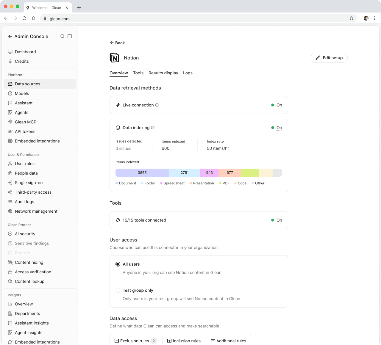


Index not configured

Tools page
A unified setup and deployment experience
Together, these changes transformed setup from a collection of disconnected configuration tasks into one guided experience. Admins can find the right apps, connect and configure them through a familiar flow, enable live capabilities and tools when applicable, and return to a consistent overview to monitor progress. By balancing immediate value with a clear path to full indexing, the framework shortens time-to-value while building the permission-aware foundation for Glean search, Assistant, and agents.
The impact
The early impact is already visible in time to value. Customers who created a connector through Unified Setup reached their first chat query in a median of 10 days, down from ~28 days—effectively reducing time to value by 64%.
Tool attachment also increased: 32 of 70 completed connectors had a tool attached, a 46% attachment rate compared with a 33% baseline. As the unified setup expands to more connectors, the same integrated flow should make it easier for admins to discover and enable tools, creating further opportunity to increase tool connectivity.
