Designing a scalable workflow for admins to feature and organize agents
May 2025 - July 2025
I led the design of the Agent Featuring workflow at Glean, enabling admins and moderators to better curate and manage an expanding library of AI agents within large enterprises.
Customers like Dell and Zillow flagged that cluttered admin views and limited discoverability were blockers to rolling out agents, a core part of Glean's product. Our goal was to introduce a “Featured” category and moderator tools that improved efficiency, control, and discoverability for both admins and end users.
I led the design strategy alongside another designer, a PM, a user researcher, and four engineers to define the end-to-end experience. My work ranged from framing the problem and exploring potential solutions to prototyping flows and aligning with engineering constraints.
The result was a scalable solution that unblocked customers and made agent curation simple and intuitive.

The Problem(s)
In Glean, admins and moderators are responsible for configuring the platform for their organizations. When Glean introduced agents, admins also decided which agents were visible, how they were organized, and managed how employees would use them.
By default, admins and moderators could see every agent in the system, including private and unshared ones. While this gave them visibility and control, it also led to two major issues:

Customers expressed that they wouldn’t roll out agents at all until these problems were solved. It became clear we needed to quickly close this gap by providing admins with reliable curation and control tools.
Understanding the project scope
With customers already waiting on the feature, the timeline was tight, leaving roughly two weeks to finalize designs. I ramped up quickly by reviewing existing scope, work already in progress, and notes from ongoing customer conversations to understand prior decisions and ensure alignment before moving additional designs forward.

The team’s initial framing centered around a “Moderator Mode”, a toggle that would let admins preview the agent library as a regular user. This approach aimed to solve the visibility issue by allowing admins to switch views and understand what employees would see. My first step was to validate this direction, identify gaps in the experience, and explore whether this model could scale across organizations with thousands of agents.

Prototyping agent organization patterns
I began exploring how to refine and simplify the existing approach. I experimented with everything from small placement details to larger workflow patterns. moving the placement of the moderator mode toggle, testing different banner states to clearly indicate which mode users were in, and exploring how admins could add, remove, or reorder agents within a featured category.


I created several prototypes exploring different ways admins could interact with the system and shared them with my team for feedback. I wanted the team to have a clear visual sense of the options and understand how each flow felt, how it scaled, and what tradeoffs came with it. These early critiques were really helpful in surfacing what worked and what didn’t, and guided where I took the next round of designs.
Rethinking the mental model
As I dug deeper into the problem, I started to question whether the existing framing truly made sense. Did these moderator-specific actions really warrant a distinct state change?
I brought these questions to engineering, and we rethought the model entirely, shifting away from a rigid state change toward a simpler, embedded set of admin-only actions directly within the agent library.

This shift not only simplified the workflow but also allowed moderators more specific filtering controls, such as viewing agents created by the entire company or specifying by department.
With that being said, the initial designs didn't all go to waste. It laid a good foundation for the workflow and gave us a strong starting point to refine into something both feasible and scalable.
Collaborating on the solution
I organized a focused brainstorming session with a few designers on my team to explore how we might replace the old toggle model. By sketching and discussing ideas as a group, we aligned quickly on new ways admins could take moderator actions inline and use filters to simplify their view.

Brainstorming together
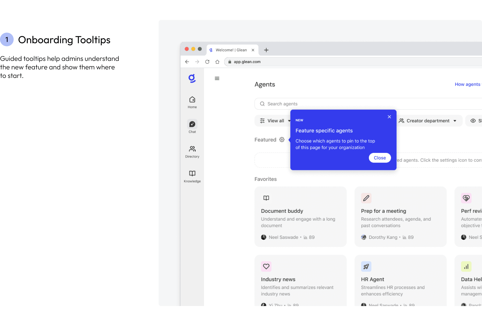
With the new framing in place, we shifted our focus to defining how admins would curate agents without relying on a mode switch. The solution centered around a designated “Featured” category, a persistent, high-visibility section that sits at the top of the agent library. This gave admins a clear and intuitive way to highlight important agents for their organization.
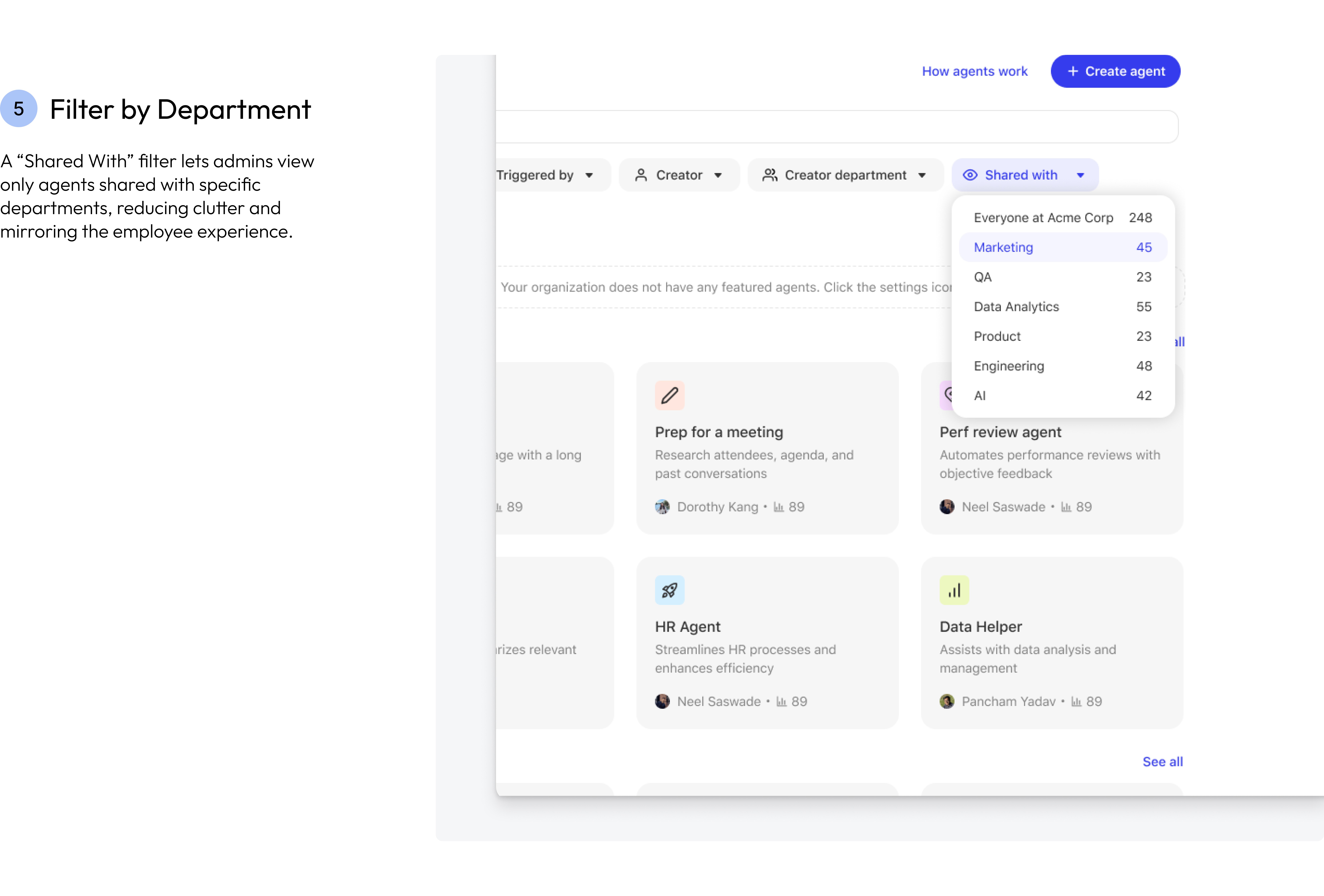
We also introduced a “Shared With” filter, giving admins more granular control over what they see. It allows them to filter by department or group, mirroring what general employees in those segments would see in their own libraries. This solved a key pain point around cluttered admin views and made it easier to preview the experience from a typical user’s perspective.
Finally, we created a dedicated management page where admins could easily search, filter, and add agents to the featured list. This separation simplified the experience: employees saw a streamlined, curated library, while admins retained full control and flexibility behind the scenes.


Refining the direction
Once we aligned on introducing a Featured category, the next step was to design how admins would manage it. Using feedback from my team, I explored four lightweight directions that prioritized clarity and visibility:
Dropdown Selection
Dropdown with Chips
Modal Selection (Agent Card View)
Modal Selection (List View)
Each approach came with tradeoffs. The dropdown and chip selections were faster but displayed less metadata, making it harder to evaluate agents at a glance. The card and compact list views showed more detail, but limited how many agents could be seen at once, raising questions around scalability for large organizations.
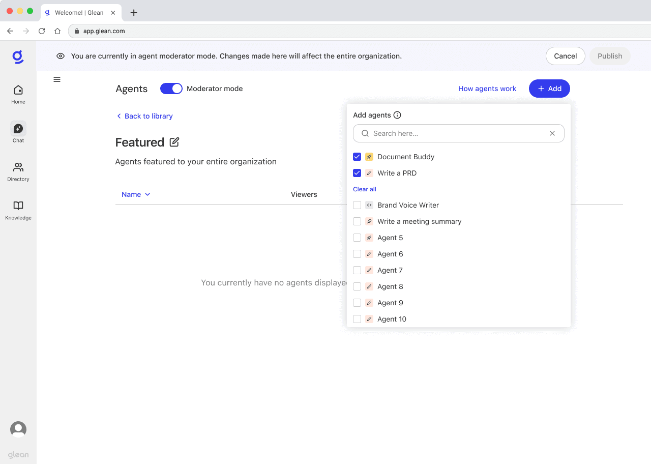


We ultimately chose the modal selection (list view) for a few key reasons. First, it maintained parity with the existing Collections UI, making the technical implementation smoother and reducing design debt. Second, our user researcher noted that a list view was more practical for admins managing dozens of agents—allowing for easier drag-and-drop reordering and better visibility compared to a grid layout. This approach struck the right balance between usability, scalability, and implementation efficiency.
The shipped design
After multiple rounds of iteration and feedback, we converged on a streamlined workflow built around a compact list view. The design offered admins simple, intuitive controls to add, remove, and reorder agents, all within a clear and scalable interface. It balanced usability and flexibility, creating a consistent experience that felt cohesive across Glean's product.
Some highlights of the final design:


The end-to-end flow
Here is the full workflow in action—from admins curating agents in the modal, to reordering them in the list view, to how employees see featured agents surfaced on their home page. Together, these create a streamlined end-to-end experience for managing and discovering agents. The feature has now been built, tested, and is shipping to customers, and early previews have already received overwhelmingly positive feedback.
The impact
The impact of this feature was visible immediately. Within just over a month of launch, weekly active users of agents grew from about 1.2K to nearly 15K. Employees started using more agents directly from the assistant home page once the new Featured row appeared, showing that a simple curated surface made it much easier to discover and use agents.
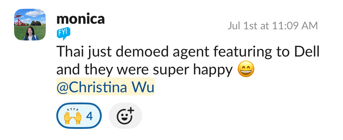
On the customer side, the feature immediately unblocked deployments: Dell green-lit their agent rollout as soon as the feature went live, and have already started using the feature across their organization. Beta customers including Zillow, Ahead, Lockstep, and Reddit also responded positively, with feedback highlighting how the curated surface met a clear need for trusted, scalable agent discovery.