Onboarding Carousel
CW
Menu
WagerWire
Mobile App Design | UI/UX

Project Overview
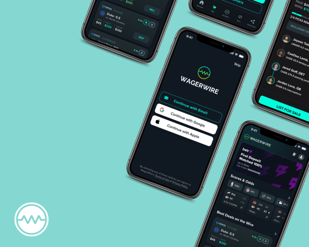
WagerWire is a mobile app that allows users to seamlessly sync their fantasy sportbooks and track real-time value changes with data visualizations and live updates. The app empowers users to view their bets as a portfolio of assets that can be bought and sold at any time.
I worked with a team of 2 other designers, 3 developers, and 2 project managers to deliver design solutions.
My shipped features involved a redevelopment of the design system, an implementation of a new navigation bar, wireframes of skeleton screens and empty states, and the launch of a redesign of the user helpdesk.
Details
Role: UI/UX Designer
Duration: April 2024 – August 2024
Tools: Figma, Testflight, Adobe Illustrator
Basics: Design System
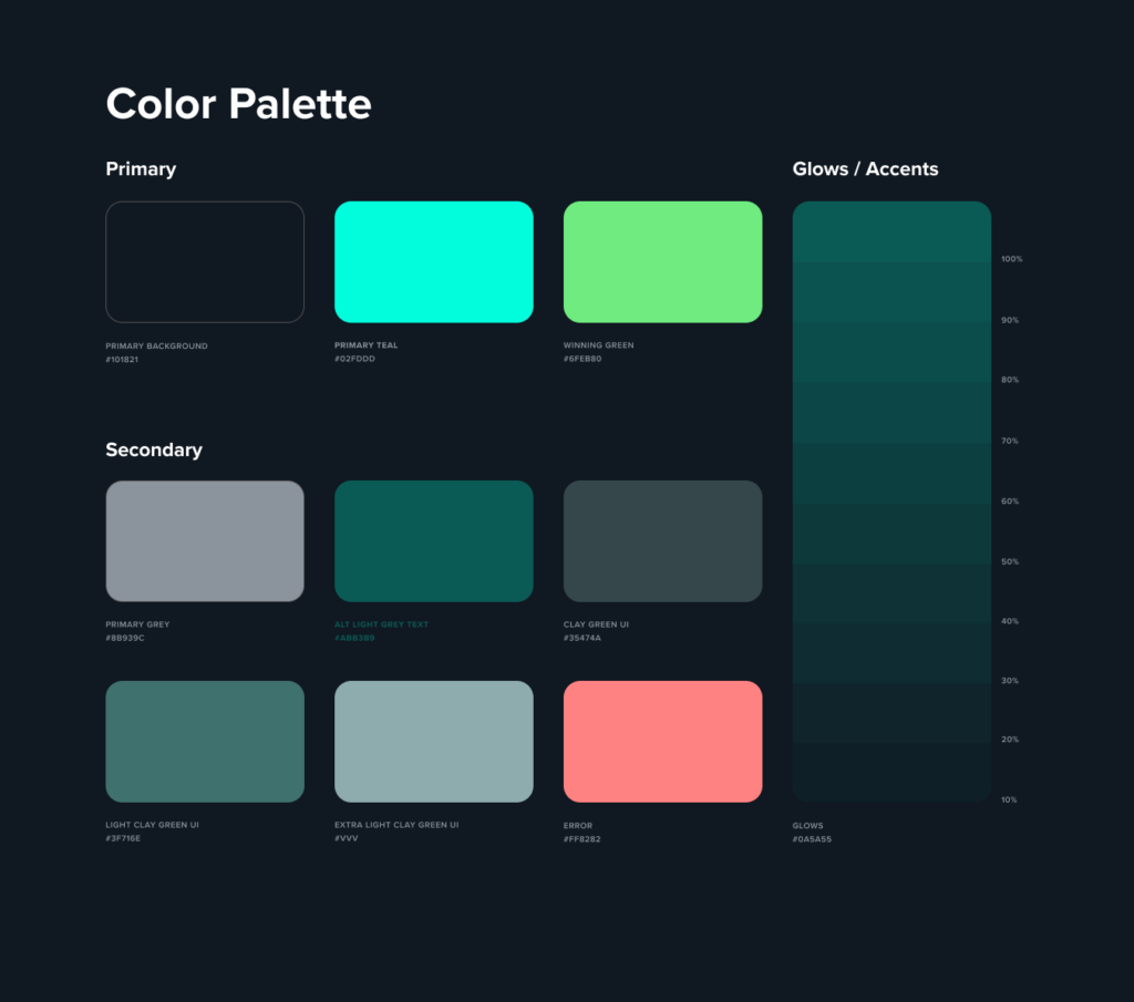
Design systems are a single source of truth to ensure that every design initiative is just one piece of a brand’s bigger picture.
WagerWire’s previous design system, though functional, had a few shortcomings that created some friction in the workflow. One of the primary issues was its overall structure; components were distributed across various sections without a coherent organizational framework and specific section headers.
Additionally, the old system included numerous unnecessary components that cluttered the library. This not only slowed down the design process but also increased the risk of inconsistencies in the user interface. At times, because there were multiple versions of different components, it was unclear which ones would be used for implementation, leading to inefficient backtracking.
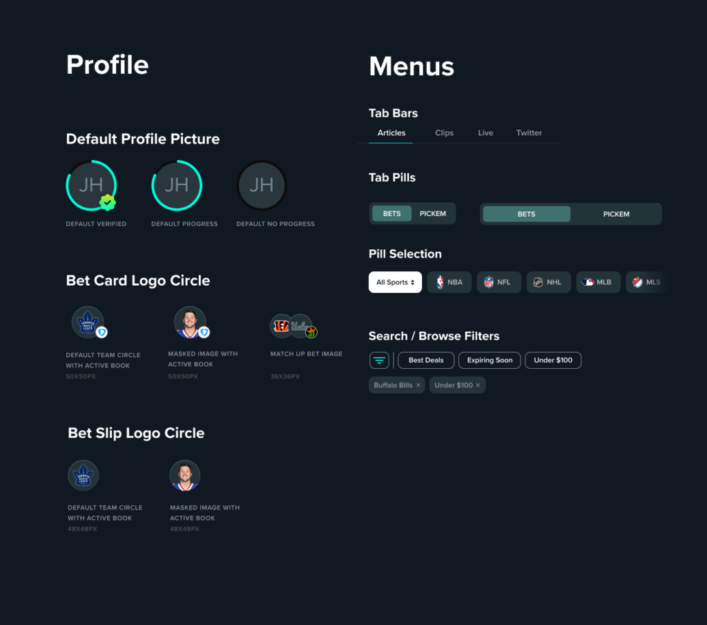
I began by reorganizing and refining the existing design system, focusing on optimizing its structure and ensuring it met current needs. This involved reviewing and archiving outdated components, streamlining the system to eliminate redundancy. I also sifted through our Figma files, updating them with the current components to ensure consistency across the system. By the end of this process, the design system was not only more cohesive and efficient but also better equipped to support future design work, enabling a smoother and more intuitive workflow for the entire team.

Navigation Bar
With that foundation in place, I was then tasked with creating a new navigation bar for the mobile app.
The initial request was to create multiple variations and to be bold with the exploration. Even if the design wasn’t chosen, it would still be valuable for us to understand why it didn’t work.
Below is my 1st Pass at the icons. The only icon that was consistent throughout was the “Portfolio” tab, as this was predetermined to be set to our company’s logo. The fun part about this stage is that there are so many ways to visually represent an icon. For example, “Buy” could be anything from a shopping cart to a price tag. I used this creative liberty to brainstorm multiple iterations for each icon and built complementary combinations for each row.
Furthermore, when it comes to iconography, even the smallest shift in width or height is important to an overall aesthetic. For example, in the “Discover” column, I compared minutely different versions and sizes of the home icon to see what looked best.
In the second iteration, we were more specific with our choices and we refined the overall style for the icons that best fit our needs. For instance, we selected a shopping cart as the base for the ‘Buy’ tab and circling arrows for the ‘Sync’ tab. With these design choices established, I moved on to more detailed ideation for the next set of icons.
Typically, an icon size between 24-30px is an ideal balance—large enough to be easily recognizable without overwhelming the screen. This is the size guideline I decided to adhere to for these icons. For labels, I found that a size of 10-12px works well, as text that’s too small can compromise accessibility, while larger text may create clutter and divert focus. To test how these looked visually, we utilized TestFlight to evaluate beta features before final release. Through trying various combinations of icon and text sizes, we ultimately settled on a 30px icon size paired with a 10px font, ensuring both clarity and a clean design.
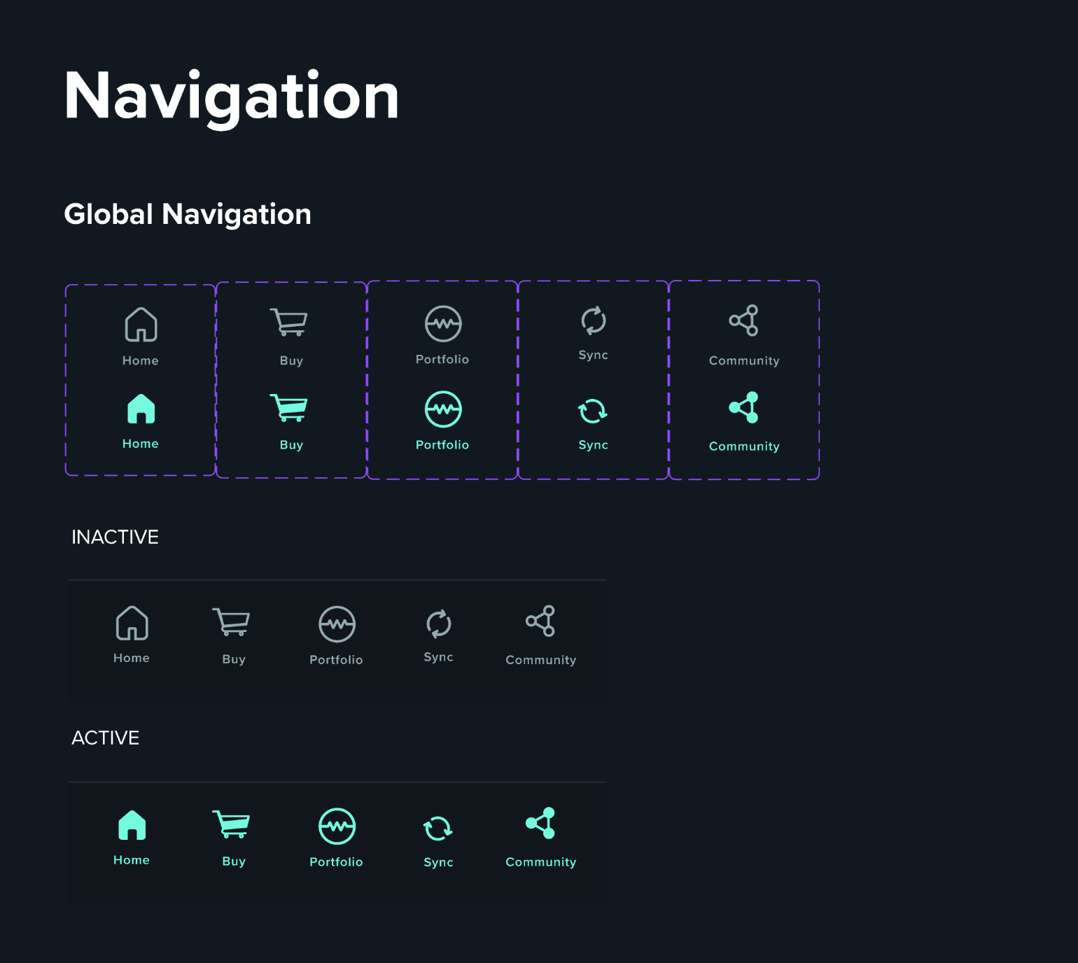
Another key consideration was distinguishing between active and inactive states, particularly in the bottom navigation. Differentiation of the active state is crucial for a smooth user experience, as it immediately signals to users where they are within the app. One approach that we considered was to modify the style and color of the active icon—in this case, transitioning from an outlined to a filled icon with a distinct color change. We also recognized the impact of micro-interactions as subtle pulses or slight enlargements upon selection can significantly enhance the user experience. For instance, when designing our shopping cart icon, we tested an active state where the cart dynamically fills up, adding a nice visual detail in the flow.
Below is the finalized navigation system with active and inactive states.
And here is our finalized navigation bar implemented in the app with working components and micro-interactions. You can see that we added in the small pulse movements, a rotational state change for the ‘Sync’ tab, and fill changes with several of the icons.
As a bonus anecdote, what I’ve discovered through my own experiences in both using and designing products is that micro-interactions DO matter. They add a sense of delight and make the product more memorable, adding a touch of uniqueness that can really differentiate between a good or a great product.
Onboarding Carousel
Another responsibility I was given was leading the design of the onboarding carousel for first-time users, ensuring that new users understand how to navigate the application effectively while guiding them to further action. The main goals were to increase conversion rates and reduce user abandonment.
In today’s competitive app market, acquiring users is just the first step, and the real challenge lies in keeping them engaged and returning to use your app or service. Onboarding tutorials and screens are an important step to help the user understand key features and showcase the app’s value proposition. But it is also critical for setting users up for success, since a good onboarding will increase the likelihood that first-time users become full-time users.
I had several considerations in mind while beginning the design process.
Firstly, I needed to keep the process simple but concise. Users have limited attention spans, so it was important that the onboarding screens could quickly deliver information without overwhelming them. Additionally, providing visual elements and images can make the onboarding process more engaging, but I needed to ensure that there was a balance between text and visuals. Additionally, I was able to dabble in a bit of content writing, as I needed to ensure that the language within the carousel, especially in regards to the call-to-action (CTA) buttons, encouraged users to take specific actions and progress through the app.
The project requirements included a few general constraints on each page of onboarding carousel, for a total of 5 screens.
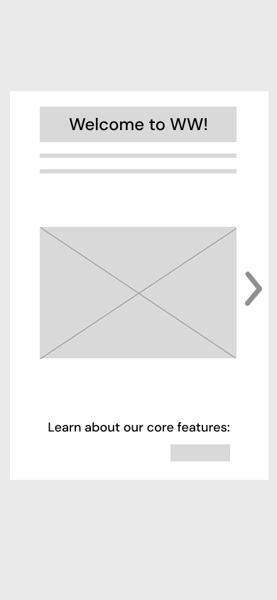
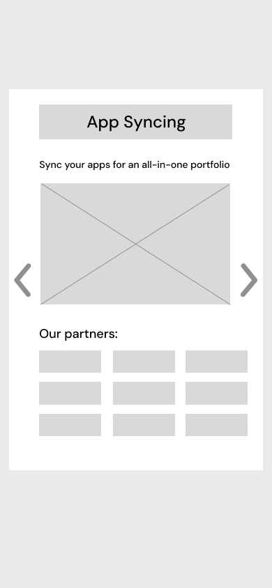
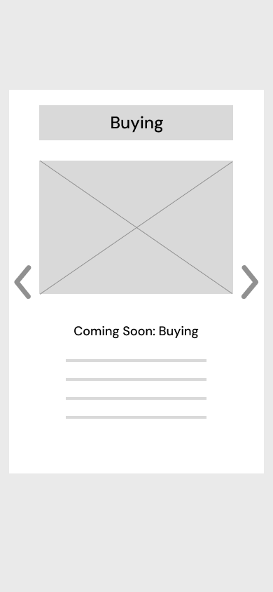
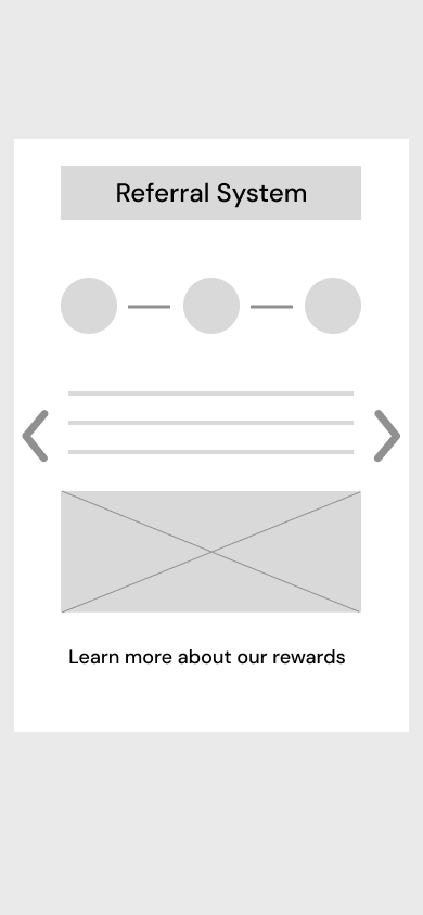
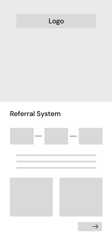
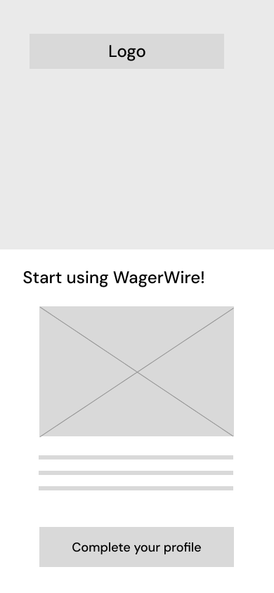
I started with some low-fidelity screens to brainstorm some ideas and create several variations to get the design process started. In this step, I wanted to get an overarching user flow and start blocking out areas of information.
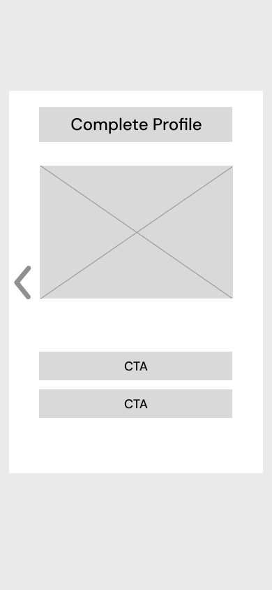
Variant 1
In the first option, I created a carousel that was centered in the screen with arrows to navigate between pages. I made sure to include CTAs as the option on the last screen, guiding users to take an actionable step.
Once viewing these screens, the team requested a version where the carousel is positioned on the bottom half of the screen. They wanted slightly different variations for some of the text and image displays, so I tweaked the layouts to reflect those requests as well.
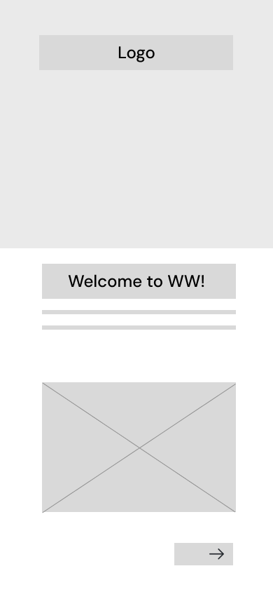
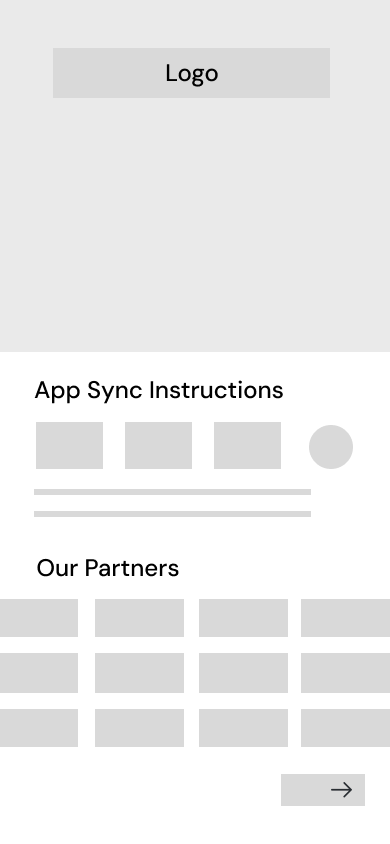
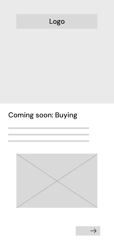
Variant 2
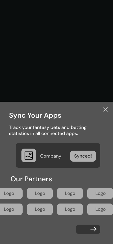
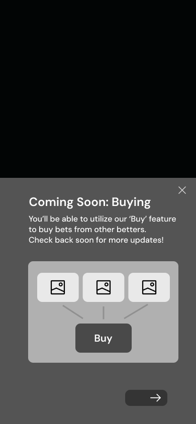
After some design feedback and discussions with the team, we decided to move forth with variant 2. I then moved to creating medium-fidelity prototypes to to refine the visual flow and interactions.

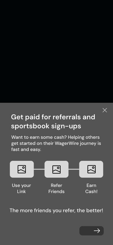
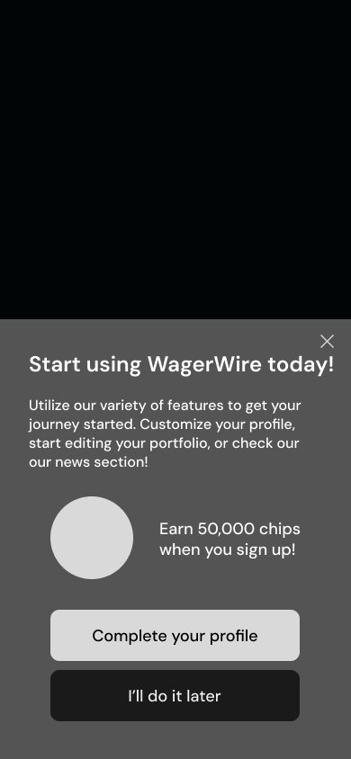
Medium-Fidelity
The medium fidelity prototypes were met with positive feedback, and I worked with the project manager and design team to refine the content and ideate ways to display the images and visual elements. After iterating over a two-week period, we finalized the high-fidelity version of the carousel, which is showcased in the demo below.
Onboarding Carousel
1. Welcome Screen
The first screen of the 5. It provides an overview of the main features in the WagerWire app.
2. Sync Your Apps
This page provides an overview of WagerWire's numerous partners, which informs users of its syncing capabilities.
3. Coming Soon
We included a sneak peek into one of our core features: Buying. This would keep users intrigued for future updates.
4. Step-by-Step Instructions
This showcases a timeline teaching users how to best utilize the referral system in the app.
5. Finish Profile
Once users complete their profile, they will be rewarded with 50,000 chips, an in-app currency.
Empty State Screens
Empty states are often overlooked in UX design, but they can be key to driving user engagement and, if executed well, contribute to a more compelling user experience. They are essentially “in-between moments” that appear throughout an app or website, and a useful empty state will let the user know what’s happening, why it’s happening, and what to do about it.
My task was to design several iterations of empty state screens for the ‘Buy’ tab, which had yet to launch its full features. We wanted to create a placeholder that not only sparked curiosity but also provided users with an engaging and informative empty state that would keep them interested and set the tone for future updates.
I was given a list of project requirements for this task as well.
Empty State screens
Project Requirements
1. Incorporate a main graphic with elements relating to sports or WagerWire's theme
2. Add a header and brief description relating to the 'Buy' tab
3. Insert a CTA prompting the user to visit another page
I was allowed the creative freedom to develop unique designs and explore new possibilities, while still adhering to these three key guidelines. However, the designs still needed to align with WagerWire’s branding and color palettes, so maintaining consistency was a key focus throughout the design process.
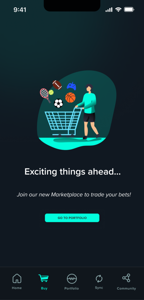
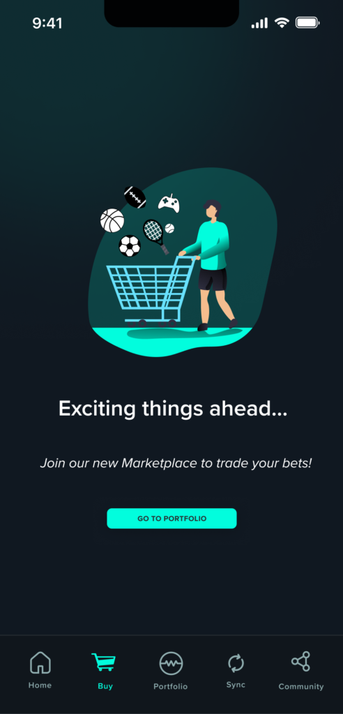
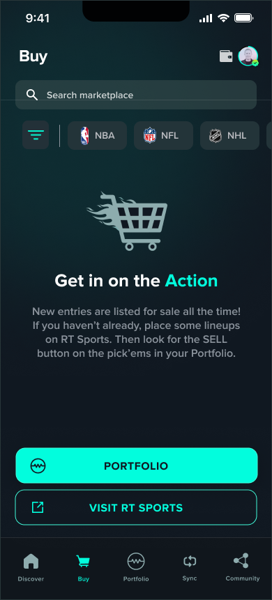
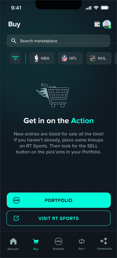
Below are some of the designs I created using a combination of Adobe Illustrator and Figma. We experimented with various descriptors and headlines to determine which best conveyed our intended message.
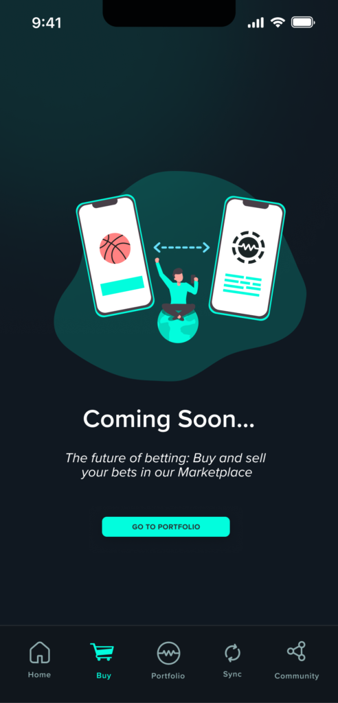
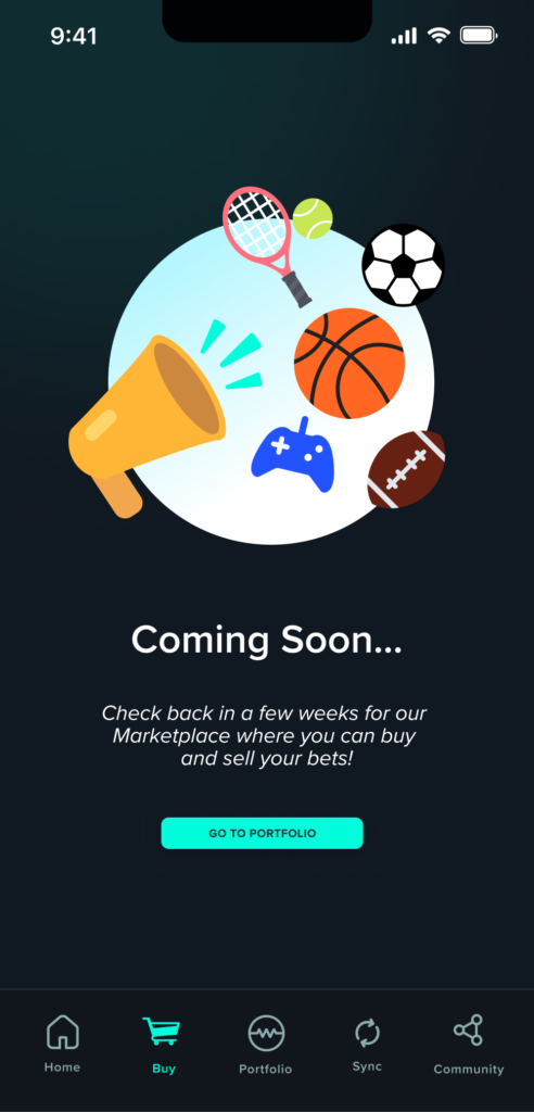
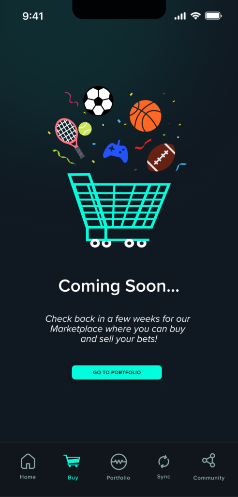
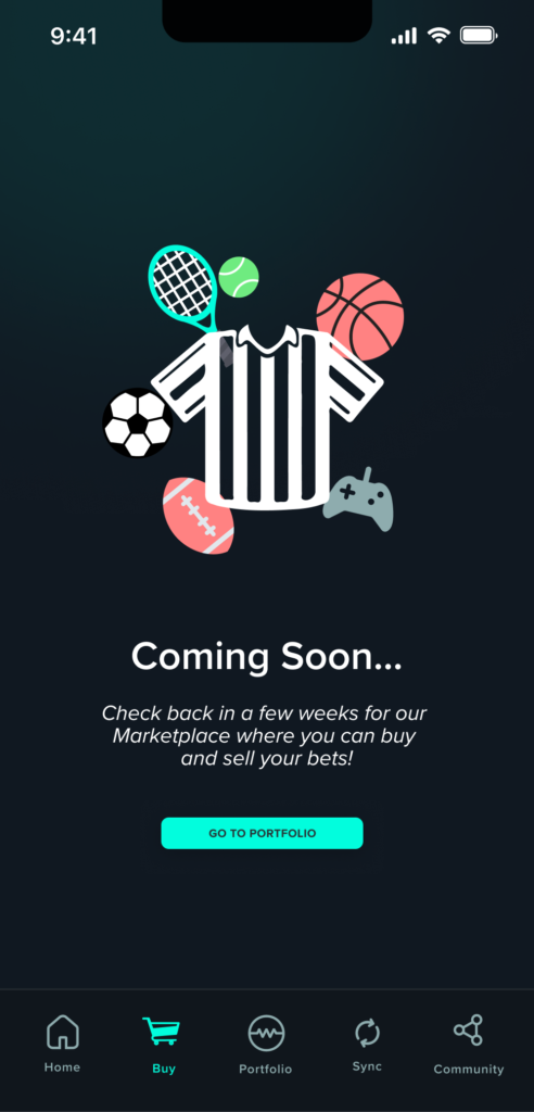
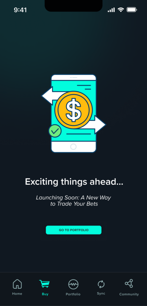
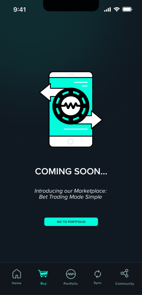
After the initial iteration, two designs emerged as favorites, and I received feedback on their strengths and areas for improvement, namely on increasing the CTA’s visual importance and creating a stronger headline. The shopping cart as the central image effectively conveyed the purpose of the ‘Buy’ tab, while incorporating various sports icons highlighted the diverse range covered by WagerWire. I then developed several additional iterations, adjusted the CTAs, and ultimately presented two final versions that were approved by my team.
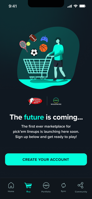
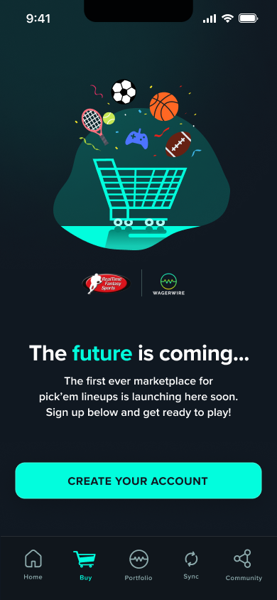
Later on, we wanted an option with a simpler design, so I created custom vector graphics in Adobe Illustrator and added two more mockups in Figma. These versions provide more room for text and descriptions, helping users understand how to interact with this empty state. We also updated the call-to-action (CTA) buttons to link to the portfolio and an external website, prompting users to take actionable steps.
Zendesk Redesign
Zendesk is primarily used to serve, support, and engage customers. It helps companies manage all their customer interactions in one place for more efficient customer service. The software turns all customer inquiries into manageable tickets to ensure every issue is tracked and resolved promptly.
I was in charge of redesigning the Zendesk home page, making it more modern and better aligned with the WagerWire brand aesthetic.
Below is the comparison after the design overhaul.
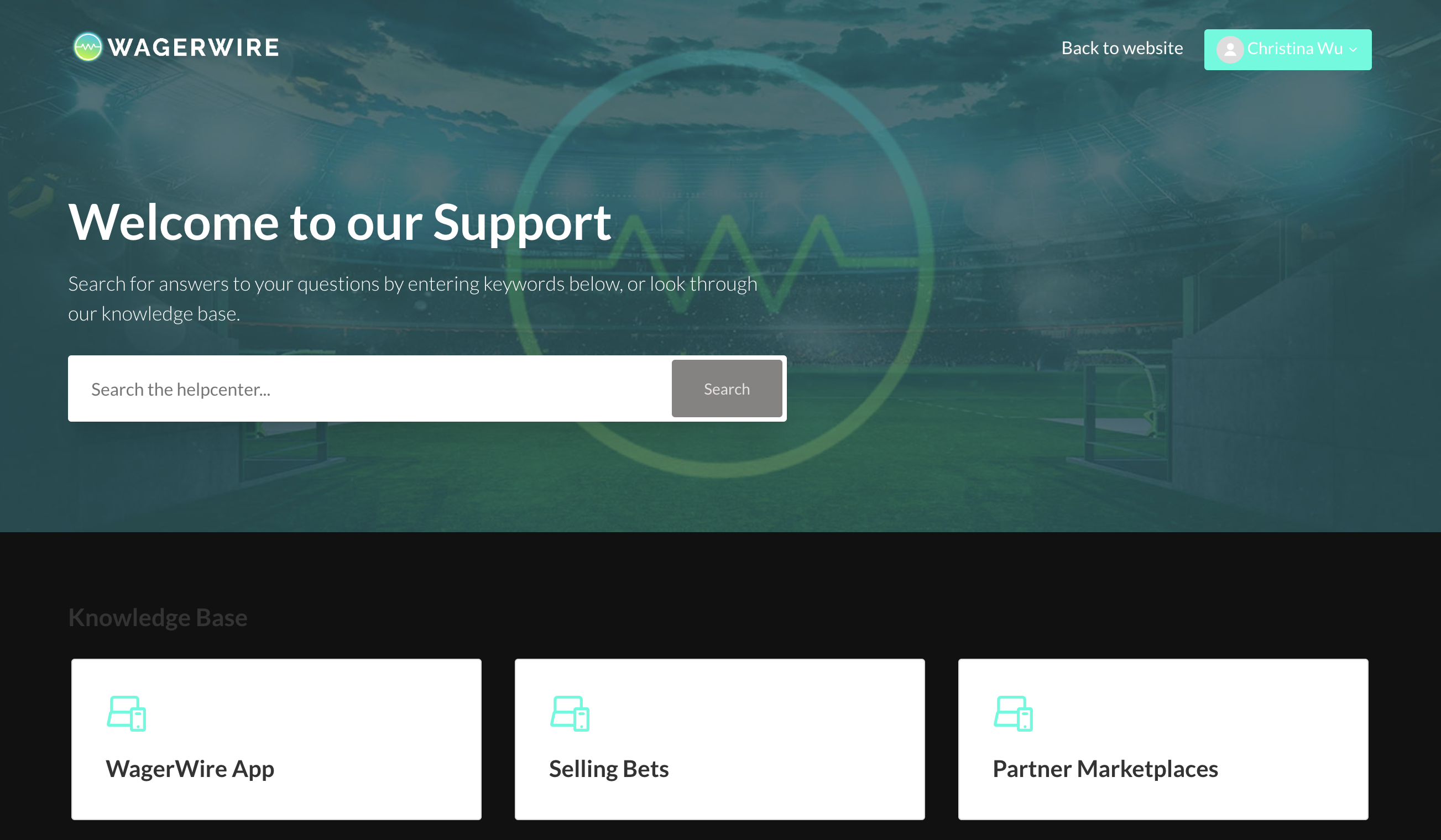
Before
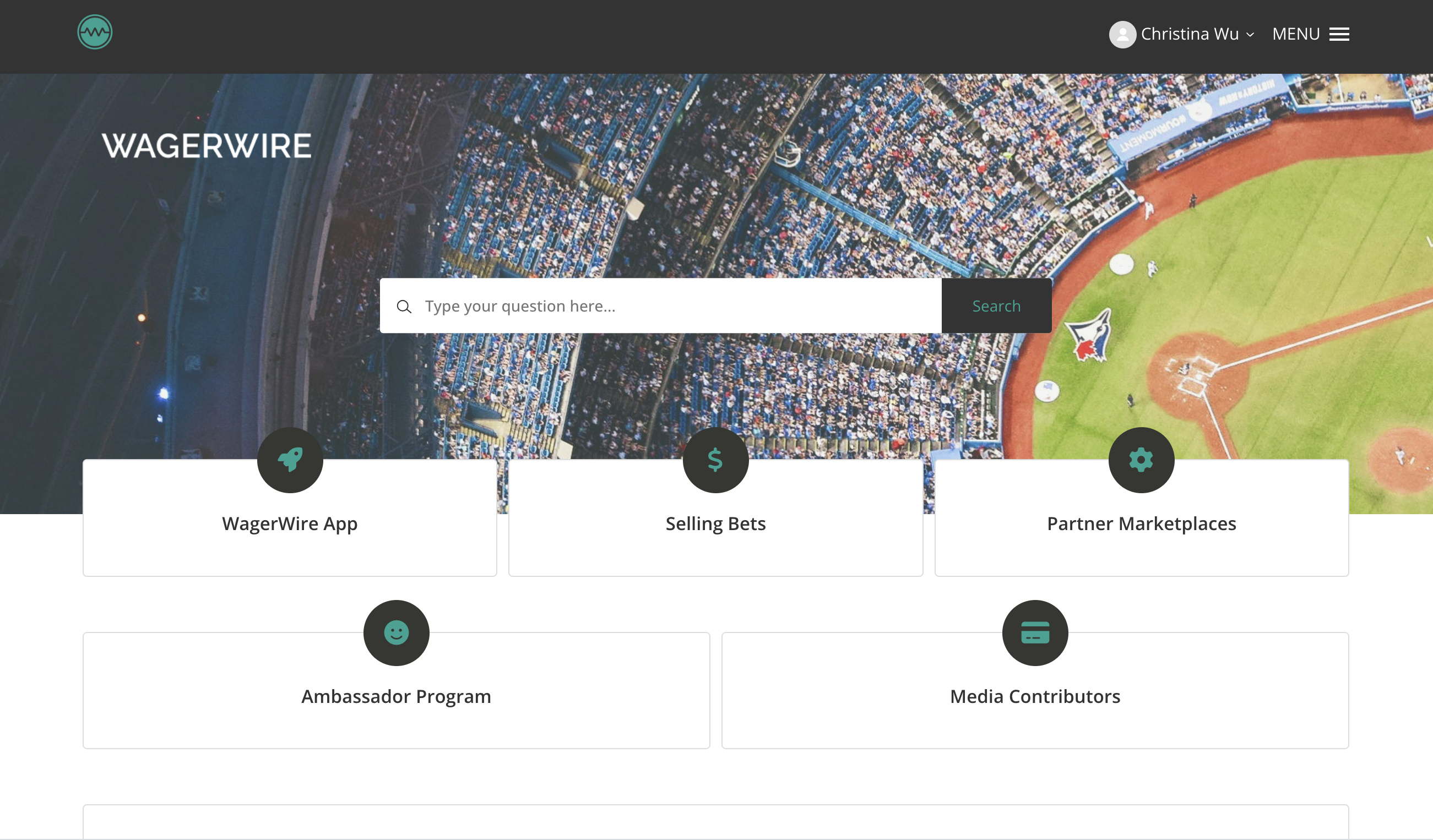
After
Key Takeaways
Working on this project has taught me a variety of skills in product creation, UX research, and competitor analysis. One important takeaway was the need to adapt to different challenges and understand that designs are always subject to change; it is up to the team and designers to effectively communicate and implement these new ideas.
Questions for future work:
- What is the emotional response we want an app to evoke?
- How can microinteractions and animations enhance the overall experience?
- How will the app evolve over time with scalability in mind?