
Volkswagen Group of America
Designing an AI-powered HMI that uses gaze detection and voice interactions to reveal points of interests.
Jan 2025 - May 2025
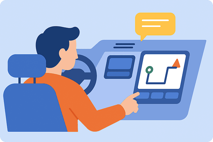
Interactive Discovery is an AI-powered in-car system designed to help drivers and passengers explore their surroundings safely and effortlessly. It combines gaze detection, voice interaction, and a dynamic HMI (human-machine interface) to surface real-time information about nearby points of interest.
By leveraging voice commands and large language models (LLMs), the system responds naturally to questions like “What’s that?” and can proactively guide users toward meaningful discoveries—without requiring them to take their hands off the wheel or eyes off the road.
I was the lead product designer alongside 2 designers, 3 engineers, and 1 product manager.
I was responsible for the end to end design of the prototype, designing user flows, wireframes, and the final screens, as well as defining system logic for multimodal interactions (voice + visual output). Throughout the process, I collaborated with developers for UI feasibility and design handoff.


Understanding the Space
Humans are becoming more comfortable with interacting with a voice agent in their day-to-day lives.
We live in an era where people are increasingly at ease interacting with voice agents. From Siri and Alexa to ChatGPT, natural language models have become woven into our everyday routines—helping us search, shop, organize, and connect with minimal friction.

Car Tech Doesn't Cut It.
Yet when we step into the car, that ease often disappears. Maps and in-car systems today are largely practical tools, built for point A to point B. They rely on manual input, pre-set navigation, or clunky interfaces, leaving little room for spontaneous discovery.
Discovery on the Road
But driving is an experience filled with curiosity. We’re always scanning our surroundings, especially in new locations and cities.
Drivers and passengers frequently spot intriguing places—a bustling café, a striking landmark, a live event just unfolding. And yet, accessing that information in real time is often difficult, distracting, or unsafe.

AI for (Safe) Discovery
Introducing: Interactive Discovery. Users can simply ask, “What’s that?” and within seconds, a voice agent responds alongside a UI interface displayed on the car's middle screen.
Beyond just answering, the agent proactively offers context, suggests related places or events nearby, and guides users toward richer, more meaningful discovery. We also see that integrating AI into the driving experience is an opportunity for exploration. It bridges the gap between where we are and what we’re curious about, without pulling our attention away from the road.
This led us to write our problem statement:


To guide my design, I looked at Apple CarPlay as a reference. Its interface uses large touch targets, clear visuals, and minimal text—making it easy to use while driving. This helped me simplify my own designs and focus on what works best in a car: quick, glanceable, and distraction-free interactions.
Creating a Framework
We created a standardized card framework to guide what types of content would be displayed and how they'd be structured. Drawing inspiration from Adobe’s design system and card anatomy, we focused on building a clear, intuitive content hierarchy—ensuring that each layer of information felt organized, readable, and easy to scan in a driving context.

This content hierarchy was designed to prioritize clarity and scannability, especially in a glance-based environment like an in-car display.
We placed the preview image and title at the top to immediately capture attention and establish context. Metadata and content areas follow, offering supporting details in digestible chunks. Finally, actions and CTAs are anchored at the bottom for easy access if the user chooses to engage further.
Next Iterations
We used the card framework as a focused lens to guide our iterations, helping us stay aligned on what content needed to be prioritized and how it should be structured. It gave us a clear foundation to evaluate what changes improved usability while keeping the overall experience familiar, intuitive, and easy to process in motion.

This content hierarchy was designed to prioritize clarity and scannability, especially in a glance-based environment like an in-car display.
We placed the preview image and title at the top to immediately capture attention and establish context. Metadata and content areas follow, offering supporting details in digestible chunks. Finally, actions and CTAs are anchored at the bottom for easy access if the user chooses to engage further.


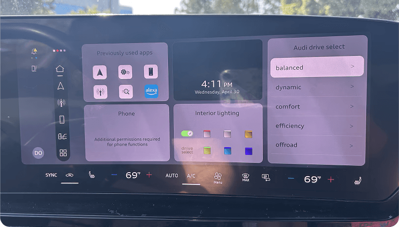
Applying the Framework to Audi's HMI
Later in the project, I was also tasked with designing an Audi-specific interface, aligning with the broader goal of making this system adaptable and appealing for automotive brands to integrate into their future vehicles.

You can see that it has a darker, more muted color palette compared to our original designs. But since we had our UI framework and core elements in place, I was able to easily scale across other visual languages without requiring a full redesign.
Seeing the UI Live
Seeing the UI in a real environment was actually very important as it helped us see how different widgets and components interact within the navigation screen and would help inform later design decisions.

For example, when testing the map screen, we realized that the map widget had to take up a minimum of two columns. So that gave us a constraint to work around and saved us time in designing something that wasn’t feasible.
Adapting for Audi

We initially explored a small version that would live as a small widget that could expand into a full view, then we moved onto explore larger versions, which we decided to prioritize. Going from the small widget to the expanded view would take another prompt or click, and we wanted to keep the experience as simple as possible.
The third card on the right is the finalized audi design, and we shifted the close button to the left so that it would be closer to the driver, and we decided on the CTAs of “More Info” and “Save.” More info would allow the card to expand into a full-screen view given that the driver doesn’t have ongoing navigation, and save would save the card to a library that they can access later in a parked state.

To align with Audi’s visual language, we created a custom set of icons for each point of interest category. These icons were designed to match Audi’s minimalist, monochrome aesthetic—ensuring they felt native to the brand’s HMI while maintaining clarity and recognizability at a glance.

We designed Audi-specific cards for categories like cafés, restaurants, and landmarks. Each card followed our core content structure but was visually adapted to match Audi’s darker style and suited with the custom icons.
Discovering Use Cases

When we first began designing Interactive Discovery, we started by figuring out the core use cases.
We asked:
When would drivers and passengers want to engage with their surroundings? What types of places would spark curiosity?
This led us to define categories like single businesses, residential properties, landmarks, nature spots, and venues.

Before I joined the project, there were already previous designs that had been made, but these weren’t ones that we had to stick with. I felt that there were a lot of areas that we could make improvements on to make this a more enhanced experience.

With those designs as a starting point, I began to make my own explorations.
I explored many variants — from minimal snapshots to richer, more detailed previews.
I played around with different sizes of cards, different colors and looks for the CTAs, and how much information would be shown to the user when the pop-up first appears.

Early on, I realized I was unintentionally designing for a mobile interface. The layouts, text density, and interaction patterns made sense on a phone screen—where users can scroll, tap, and read at their own pace.
But in a car dashboard environment, attention is limited and safety is critical. The HMI requires a radically simplified UI: larger touch targets, minimal text, and clear, glanceable visuals. This shift in mindset helped us refocus the design around what's actually usable—and safe—in motion.
Expanding to Full Screen
We initially explored a small version that would live as a small widget that could expand into a full view, then we moved onto explore larger versions, which we decided to prioritize. Going from the small widget to the expanded view would take another prompt or click, and we wanted to keep the experience as simple as possible.
The third card on the right is the finalized audi design, and we shifted the close button to the left so that it would be closer to the driver, and we decided on the CTAs of “More Info” and “Save.” More info would allow the card to expand into a full-screen view given that the driver doesn’t have ongoing navigation, and save would save the card to a library that they can access later in a parked state.