
PRxDigital Silicon Valley
Creating a professional website experience for a long-standing digital agency
Jul 2023 - Dec 2023
PRxDigital is a digital marketing agency based in the Silicon Valley. They have worked with both large and small businesses and nonprofits for over 45 years and offer a variety of services ranging from video production to content creation.
My task was to redesign PRxDigital’s website and give it a modern yet professional look. I also redefined its branding and color systems, creating a cohesive website identity.
Website Audit.
Before creating the new designs for PRx’s website, it was important to first audit their current website and take note of potential areas of change and features that should be implemented in the new design.
Here are the main findings I gathered from that initial audit, split into 3 main categories.
1. Clarity & Content Optimization
The landing page text (e.g., motto and "About" section) is too broad, lengthy, and text-heavy, making it overwhelming for users at first glance.
Key messages—such as what PRx does—should be more prominent, better summarized, and visually emphasized.
Suggested reducing large blocks of text and highlighting important info with bold/italic styles.
Visual Design & Layout
The top menu has redundancies. For example, “Media Coverage” doesn’t warrant its own section and could be merged or removed.
“Contact Us” and “Work With Us” can be combined to streamline navigation.
Service pages could be redesigned using grid layouts or icons for better clarity and user experience.
Navigation and Site Structure
The top menu has redundancies. For example, “Media Coverage” doesn’t warrant its own section and could be merged or removed.
“Contact Us” and “Work With Us” can be combined to streamline navigation.
Service pages could be redesigned using grid layouts or icons for better clarity and user experience.
Overall, PRxDigital's website was a bit dated for a marketing agency in 2022, so I knew I had to give it a refresh while adhering to current trends and considerations for digital agencies.
Creating a Foundation.
With a general idea in mind, I then needed to finalize the website’s typography, color palette, icons, and other key components.
I knew that I wanted the website to have a minimalistic but professional look while also incorporating PRx’s brand colors as accents.
I chose a font combination that was legible and clean, and chose icons that matched the overall aesthetic. These were not permanent, but would give me a tangible idea of the designs to implement.


Website Designs.
I started to create some design drafts through Elementor, a plugin in WordPress.
There were many features of the old website that would still be implemented, such as a Services and Case Studies page, but would be given a new, fresher look.
Below is a side by side comparison of the old designs versus some of the new implementations.

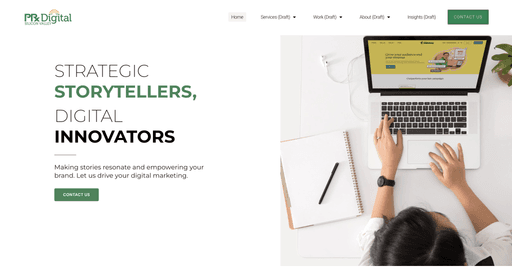


The goal was not to completely overwrite PRx’s current designs, but to make it more modern and concise.
PRx’s old website placed every section on the home page—this meant that there would be a lengthy vertical scroll through Services, Media Coverage, Crisis Management, Case Studies, Past & Present Clients, and the About section.
I felt that this was far too much for a single page, so I ended up moving these sections around, leaving the new home page to include:
Case Studies highlights (4 maximum)
Services Overview
Past and Present Clients (in a looped carousel)
Furthermore, the old website was a bit text heavy, with large paragraphs and long descriptions in each section. I decided to condense the information in the About and Services sections, making it more legible for the viewer.
Design Revisions.
The landing screen of PRx’s website was something we particularly focused on. Because it was the first impression people would have of the company, it was important that we created something that would effectively represent the brand.
We started off with a design that would split the page into two, with an image encompassing half of the screen. We played around with some animated images as well, to give the page some movement.

However, this was later changed, as we felt there was too much white space. We later changed the tagline to encompass the middle of the screen, and we added the original video used in PRx’s website. This way, we were updating PRx’s website with a modern look while remaining true to its roots, something the CEO especially stressed.

Version 2

Version 1
Click Here for the Published Website