CW
Adobe Express
Reimagining the landing pages and toolbar navigation
Timeline
3 months (March 2024 – June 2024)
My Role
Product Designer / Project Lead
Tools & Skills
Figma
Product Strategy
Visual Design
Prototyping
User Research
Overview.
Adobe Express is a free content creation tool targeted to students and teachers of all design skill levels. The Adobe team tasked us with researching and refining prototypes to streamline the sign-up and template editing process for college students.
This project was in collaboration with ProductSpace at UCLA, an organization that I led as President and where I am currently a Product Design lead.
I led the process of conducting UX research and data analysis on Adobe Express and its competitors, strategizing a user acquisition model using insights, and creating design prototypes and mockups for the landing page, workspace, and toolbar editor.
Initial Roadmap.
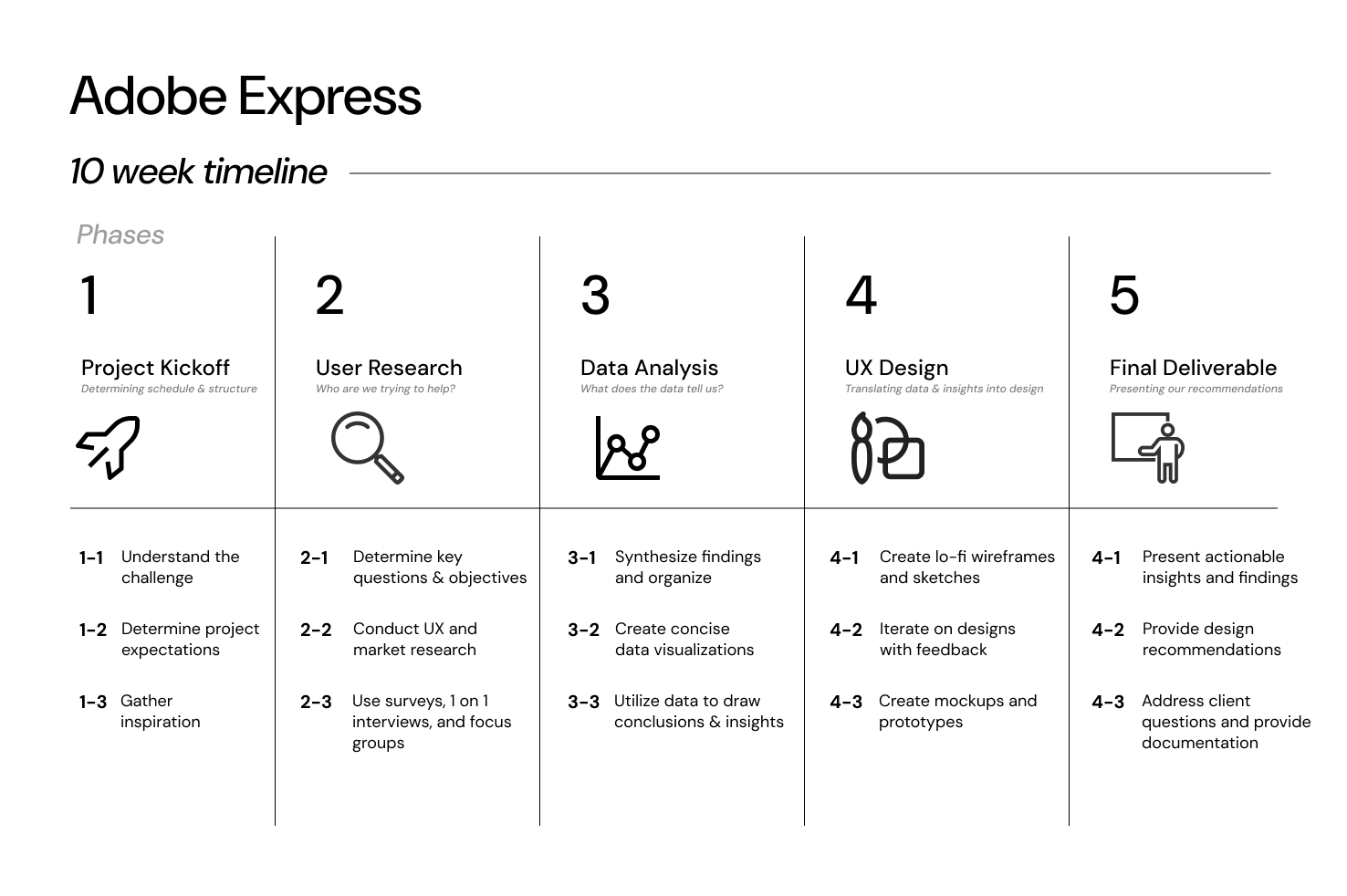
Before starting the project, we met with the Adobe team to create an overall timeline; this would allow us to track our progress, keep the team accountable, and set accurate deadlines.
The project timeline consisted of several phases, beginning with user research, data analysis, and the development of a go-to-market (GTM) strategy and design prototypes. We held biweekly syncs to ensure consistent feedback and continuous iteration.
Research Focuses.
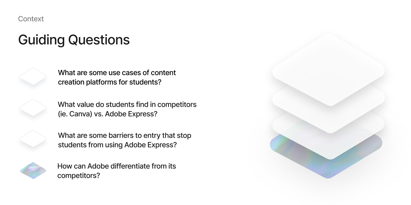
We then initiated our research process, brainstorming several guiding questions to focus our efforts, allowing us to assess Adobe Express’s current positioning among competitors, public perceptions of the application, and its overall functionality as a content creation platform.
Here are some of the main questions that we utilized to guide our research:
We aimed to conduct in-depth research on various groups of students to capture a spectrum of experience, from beginners to advanced users of content-creation tools.
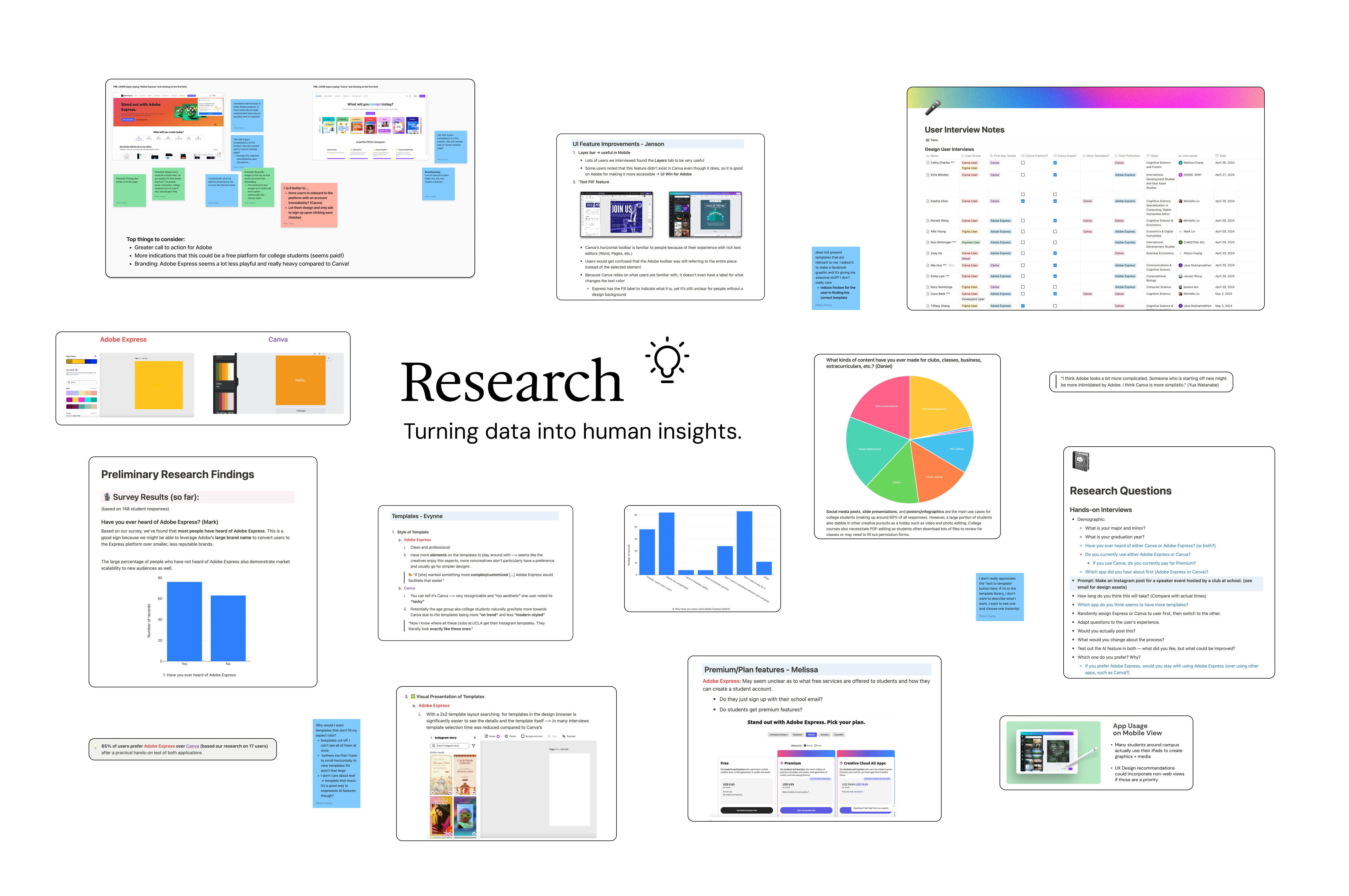
We began with a comprehensive online survey, followed by user insight and hands-on user testing interviews. This approach allowed us to gain a deeper understanding of individuals’ priorities when using these applications and assess their ease of use.
We also conducted research on Adobe Express’s capabilities compared to Canva, focusing on areas that we could capitalize on to make Adobe stand out.
Understanding our Users.
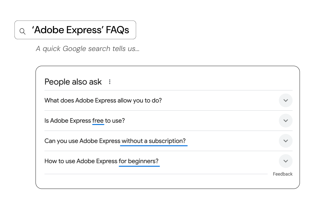
Just from a quick sweep of the internet’s FAQs, it was clear that many users already had confusion about how Adobe Express’s platform functions. This was already a barrier to entry that we discovered in our initial research. But how can we adjust this user perception through design?
We needed to strategize on what helps interfaces communicate simplicity and approachability, ensuring that users feel confident and supported from the very start.
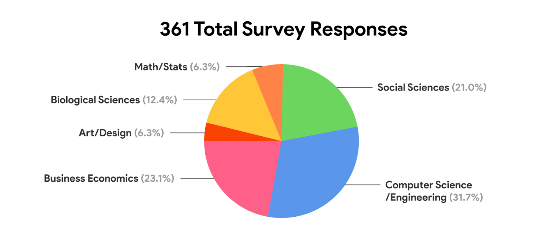
Breakdown of Student Majors
Over several weeks, we collected responses from over 350 students from a variety of schools, including UCLA, USC, and UC Berkeley. We then assessed their familiarity with various content creation tools, with a particular focus on Adobe Express.
We then created data visualizations of the collected information to make it easily digestible for both our team and our client. These visualizations helped us identify trends and highlight specific insights.
It was important for us to see the breadth of majors that were represented in our survey. Since Adobe Express is designed for users with little to no design experience, we aimed to gather data from a diverse array of majors to understand the different types of students who might need design tools in their daily lives.
Below are some of the key findings from our survey.

These data points were crucial for us, as they provided insight into Adobe Express’s brand awareness and its standing as a digital tool. Despite many students having never heard of or used Adobe Express before, we recognized this as a market opportunity that Adobe could capitalize on.
47% of students reported Canva as their main content creation platform. Given the similarities in functionality and target audiences between the two applications, it was essential to thoroughly understand each one’s capabilities and advantages. Since Canva is currently the most popular platform for beginner to intermediate designers, it was crucial to delve into its marketing strategies and design features.

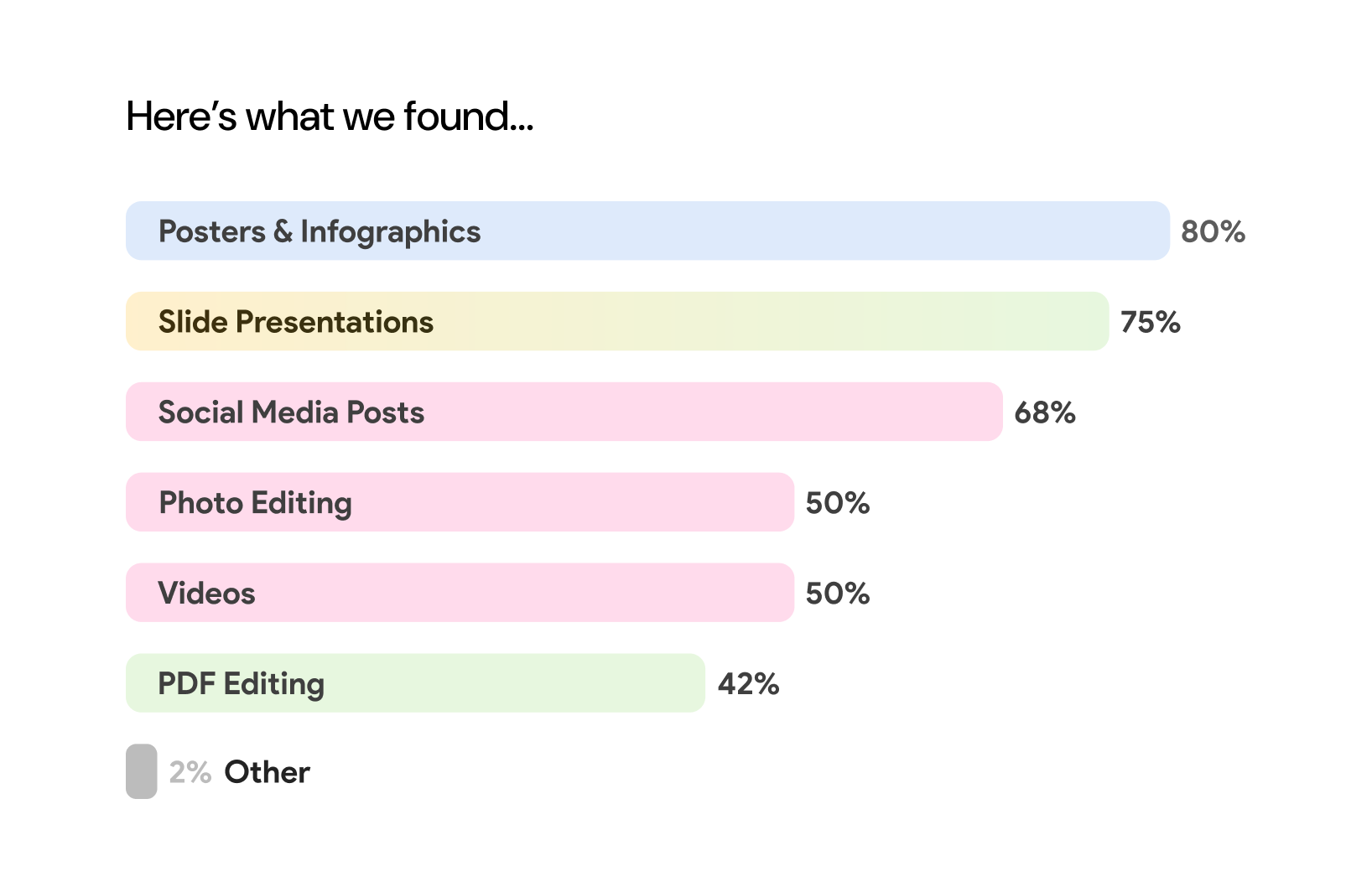
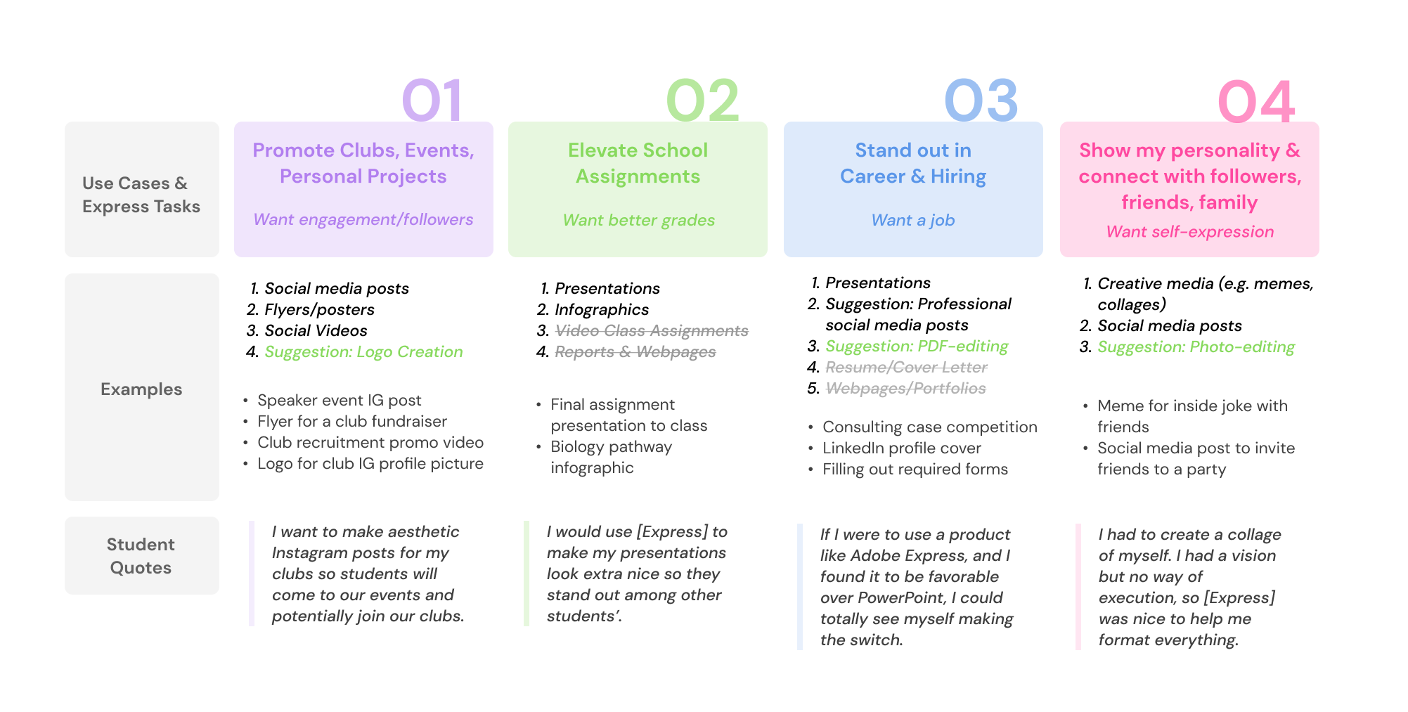
By clearly outlining the primary uses of these platforms, we then identified specific examples where students could effectively utilize Adobe Express. This understanding allowed us to better pinpoint the features Adobe could enhance or promote to improve their platform.

User Interviews.
We then conducted a series of one-on-one user interviews to gain deeper insights into user sentiments. Each interview lasted approximately 30 minutes, during which we explored individuals’ perceptions of Adobe Express, their current content creation tools, and how they discovered various platforms.
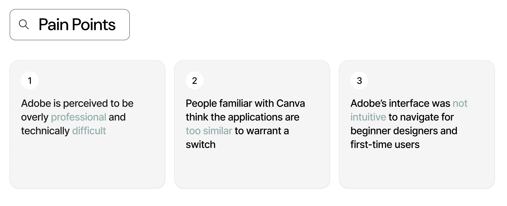
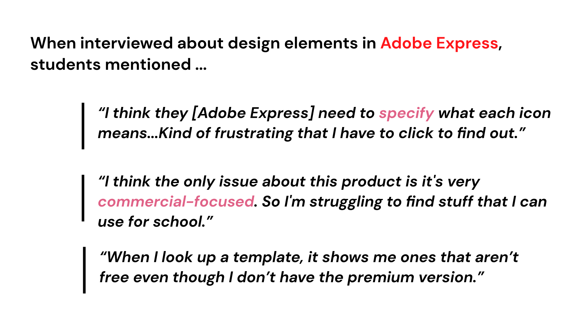
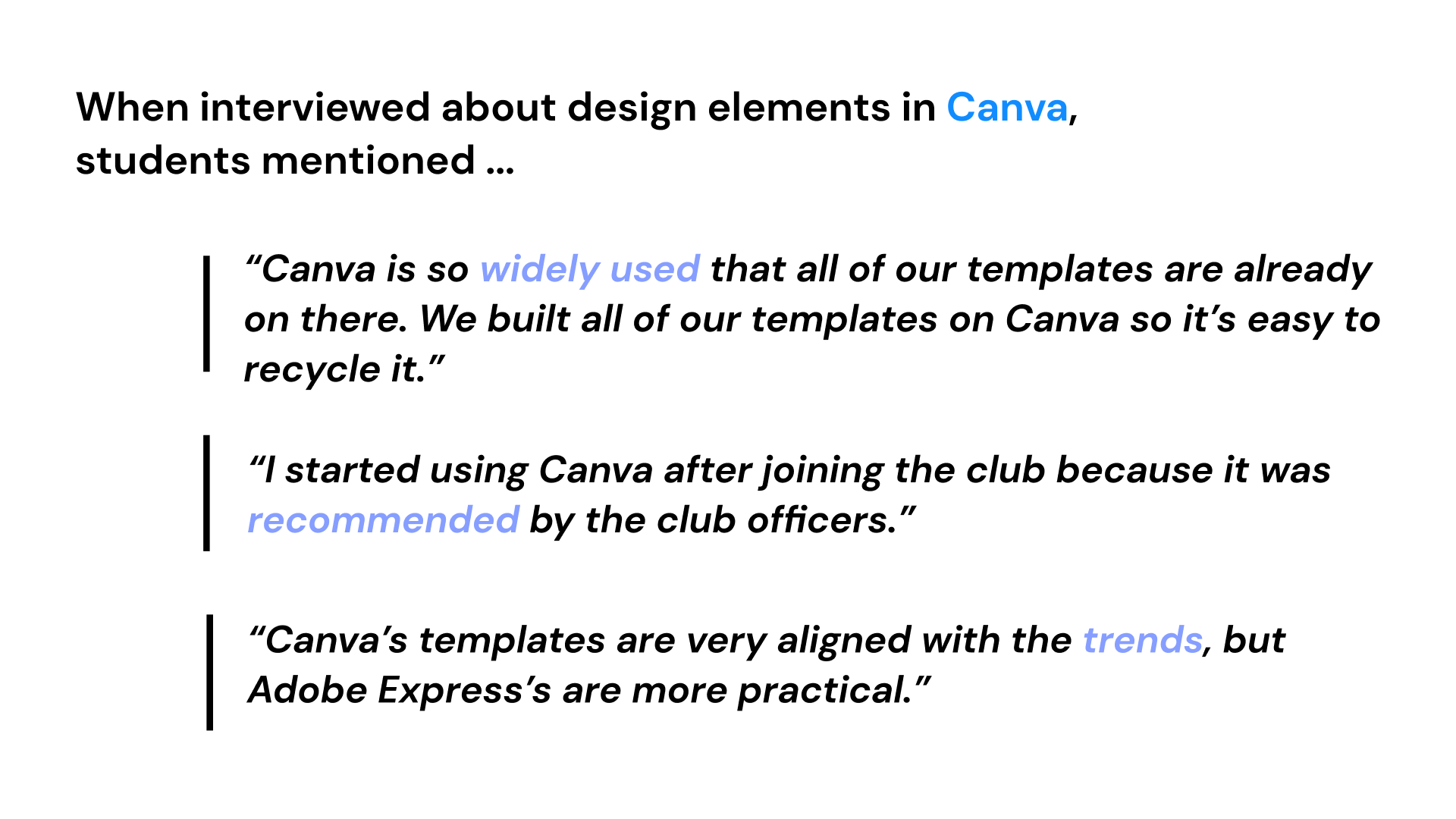
From these interviews, we were able to determine several pain points:
We also conducted design interviews with 28 participants, where each person used both Canva and Adobe Express to create a graphic for a school event. This exercise aimed to evaluate the efficiency of each app’s template selection process and the ease of editing individual elements.
We compared the average time students took to create graphics in each application, finding that it took 6.43 minutes on average in Canva versus 8.2 minutes in Adobe Express.
Users identified several areas of friction in their design process, prompting our team to explore solutions to make Adobe’s graphic creation more streamlined and user-friendly. For example, one student noted that it took too long to find a template they were satisfied with. Another mentioned that the text editing layout was difficult to navigate.
Furthermore, the Text fill feature was something we wanted to look closely at.
Canva’s horizontal toolbar is familiar to people because of their experience with other common text editors (Google Docs, Microsoft Word, etc). For Adobe Express, users became confused that the toolbar was referring to the entire graphic, rather than the specific item that was selected. Canva capitalizes on familiarity, while Adobe Express seems to have a larger learning curve for users.
Synthesizing our Findings.
With all of our research gathered, we needed to develop key areas of focus to guide our design trajectories. We had accumulated documents upon documents of data and user insights, but now we had to condense this information into actionable strategies.
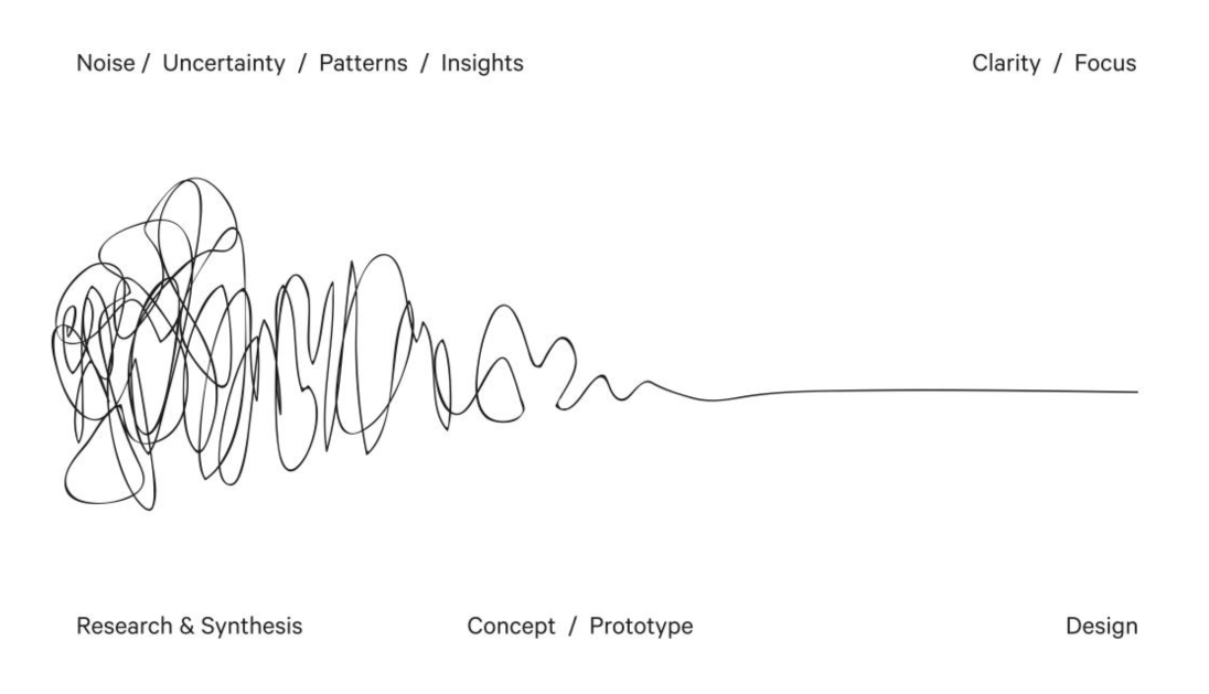
From our research, we understood that Adobe and Canva are fundamentally similar products that market towards the same audience. The vast majority of functionality that users want from these products is already implemented. However, while their features largely overlap, Adobe has a few distinct advantages it can leverage—particularly its advanced generative AI and free background remover.
What does that mean for us?
Adobe should prioritize capturing and retaining new users, rather than attempting to convert existing Canva users. Additionally, it should seek to promote these key areas of differentiation, giving it an edge over Canva.
🚀 Our Solution
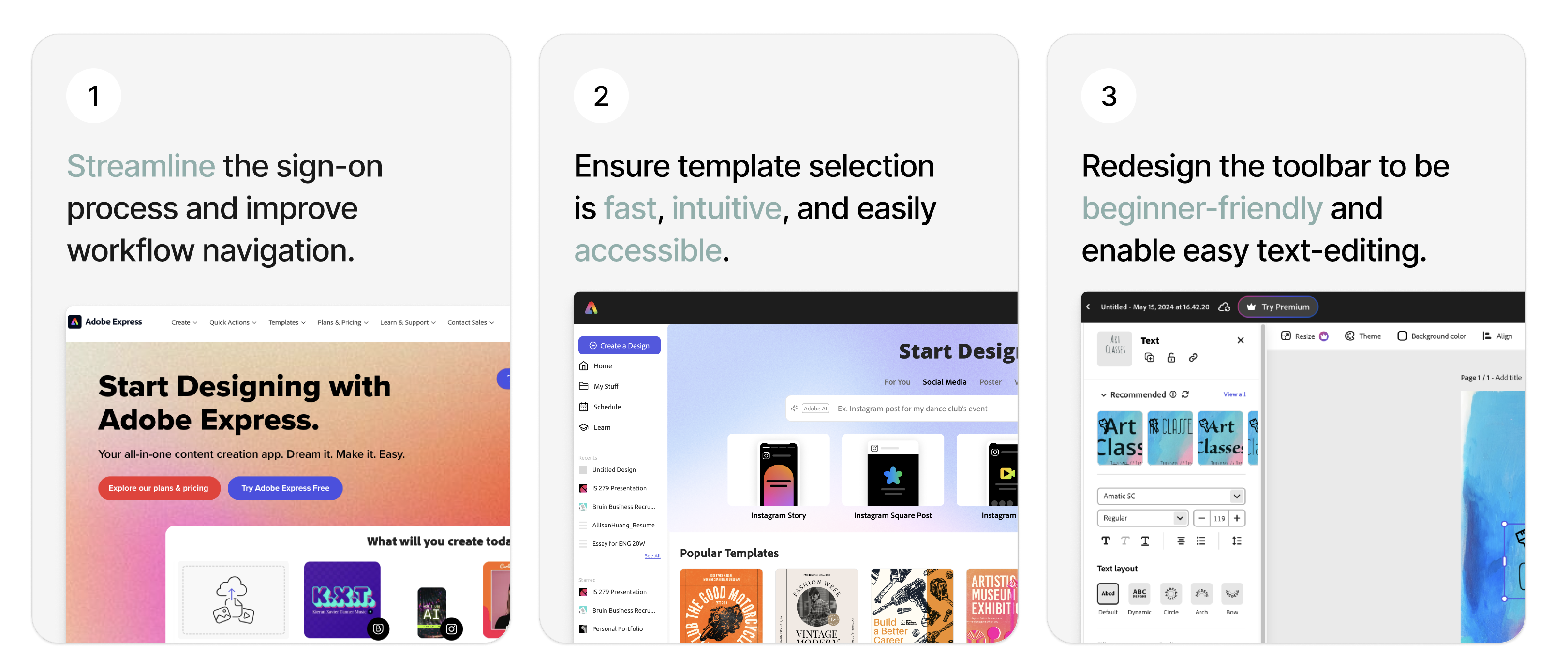
To achieve this, we needed to streamline the sign-on process and workflow navigation, making template selection quick, easy, and highly accessible. Since one of Adobe Express’s key selling points is enabling users to create quality designs quickly and efficiently, we needed to ensure this ease and speed were evident throughout the entire process.
Finally, since users struggled with editing text in their images—a key element they frequently customized due to the preset template designs—we needed to make the text-editing process intuitive and straightforward. Our goal was to align the editing tools with features that general users were already comfortable using in their daily routines, ensuring a seamless and familiar experience.
Overall, we needed to ensure Adobe Express felt approachable and unintimidating. Since it targets design beginners, the interface needed to be intuitive, inviting, and enjoyable to use.
Design Process.
Phase 1: Landing Pages
We started with the first area of friction: landing pages.
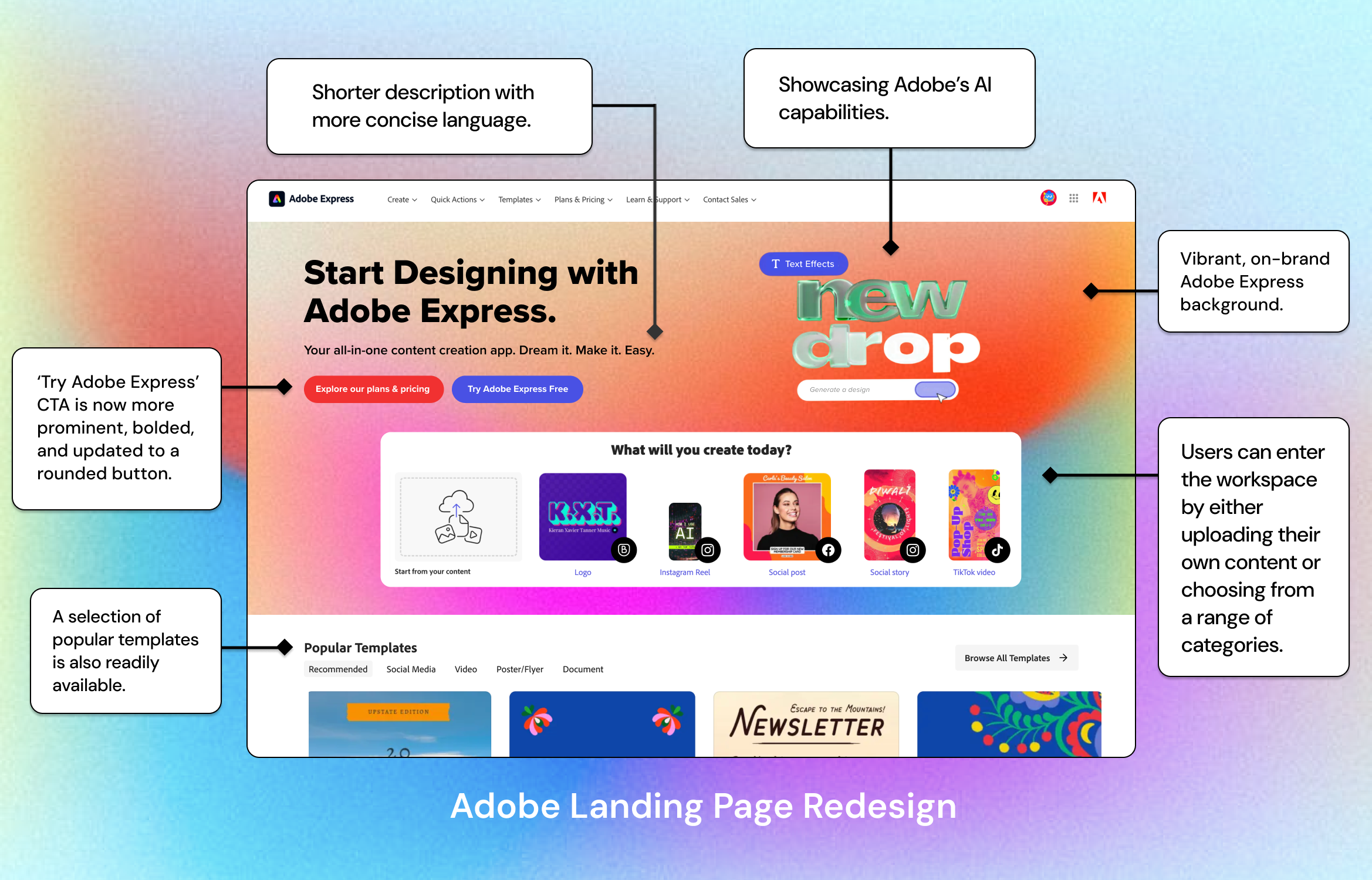
From our research and interviews, we noted that users were initially confused by the landing page; they weren’t sure where exactly to click to enter the workspace. We wanted to make the CTAs clear and accessible, displaying “Try Adobe Express Free” clearly either in the center of the screen or as the first button users read as they move from left to right.
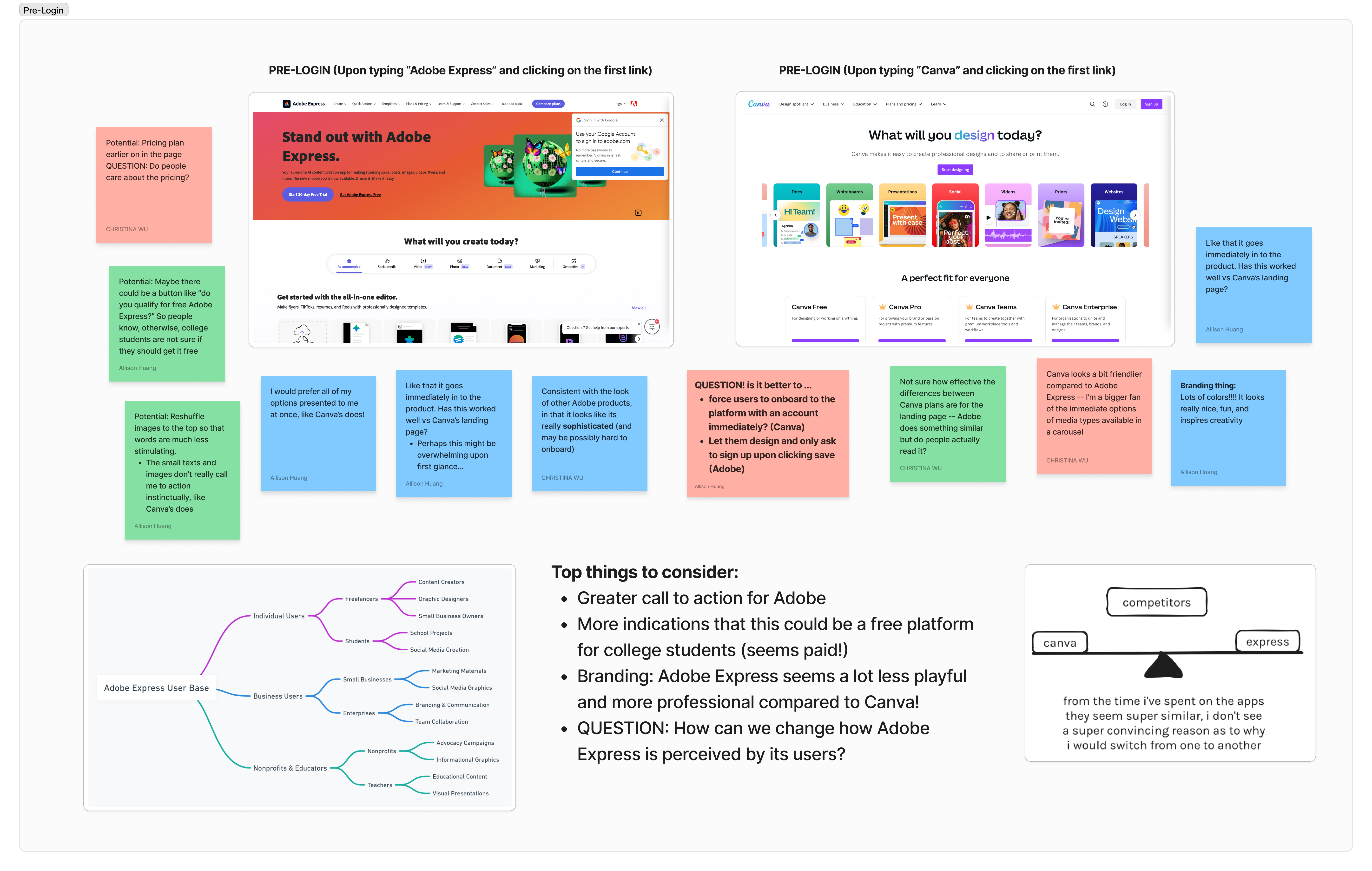
One key observation was that Adobe Express presented a more professional, sophisticated look, while Canva’s landing page was more vibrant and visually colorful, with a concise and appealing header and CTA.
Additionally, Canva’s CTA of “Start Designing” takes users exactly where they need to go.
But Adobe Express doesn’t have a clear CTA, and users have to navigate to “Try Adobe Express free” to enter the workspace.
We created some lo-fidelity prototypes to explore some different variations.
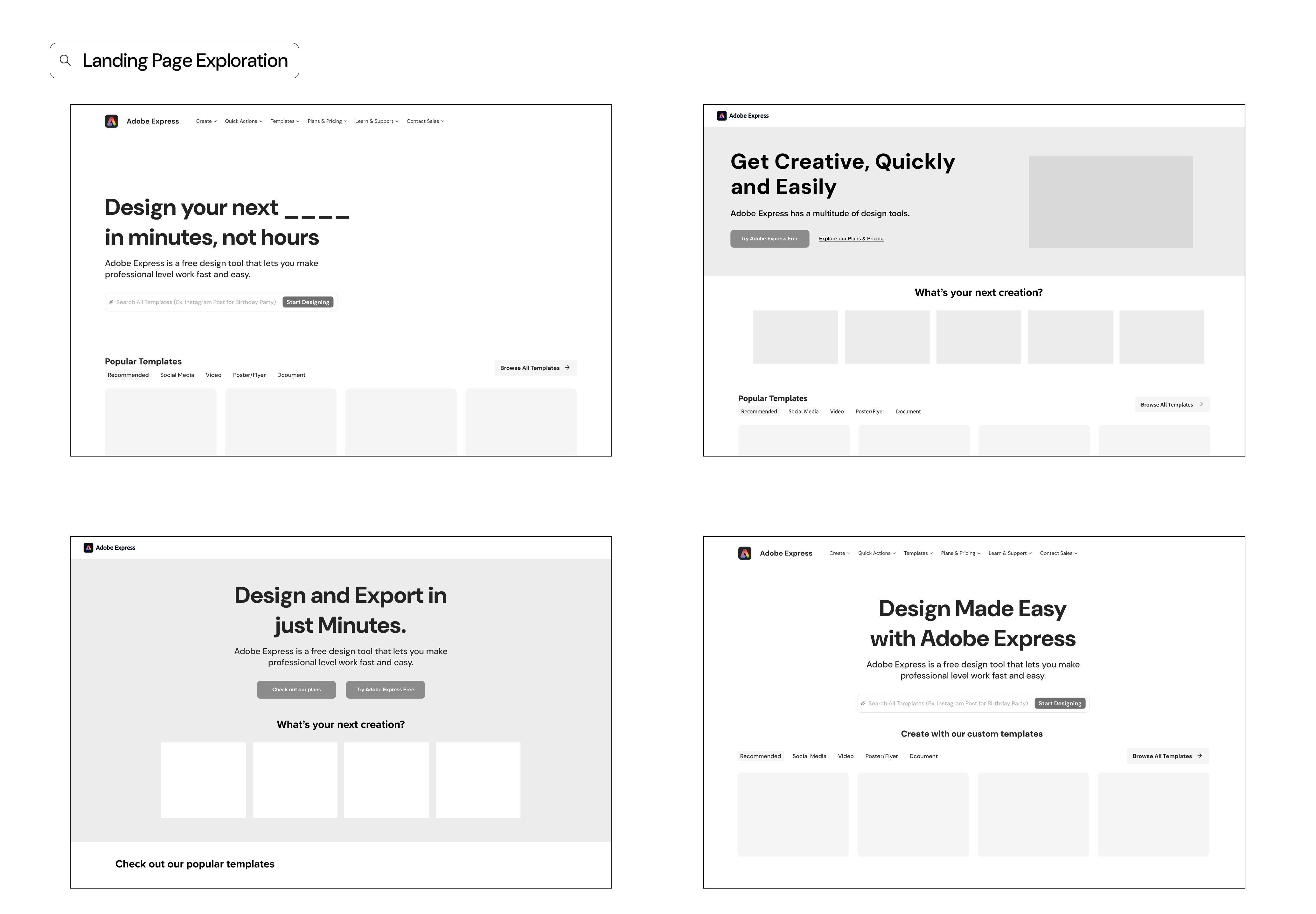
We met with the Adobe team to discuss the designs and received positive feedback. They especially appreciated the wide selection of items available for users to bring into the workspace. Additionally, they were enthusiastic about the generative AI features, as they mentioned previously that this was one of the app’s strong suits.
We then moved to develop a high-fidelity screen, incorporating elements from all of these prototypes while adhering to Adobe’s critiques and comments.
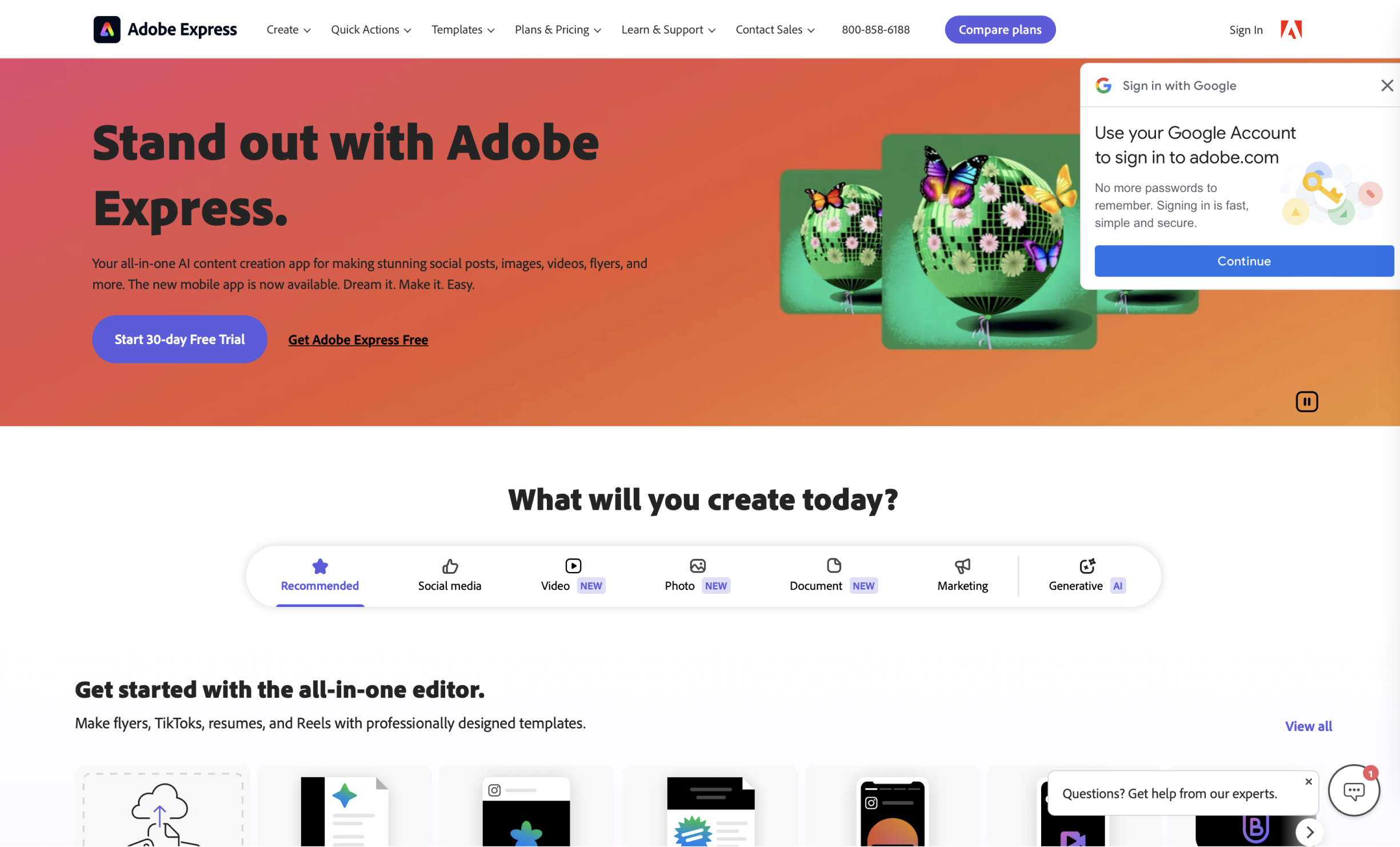
Current Design
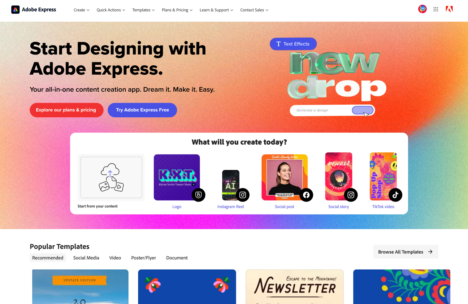
Redesign

Phase 2: Workspace
We then moved onto the second area of friction: the workspace.
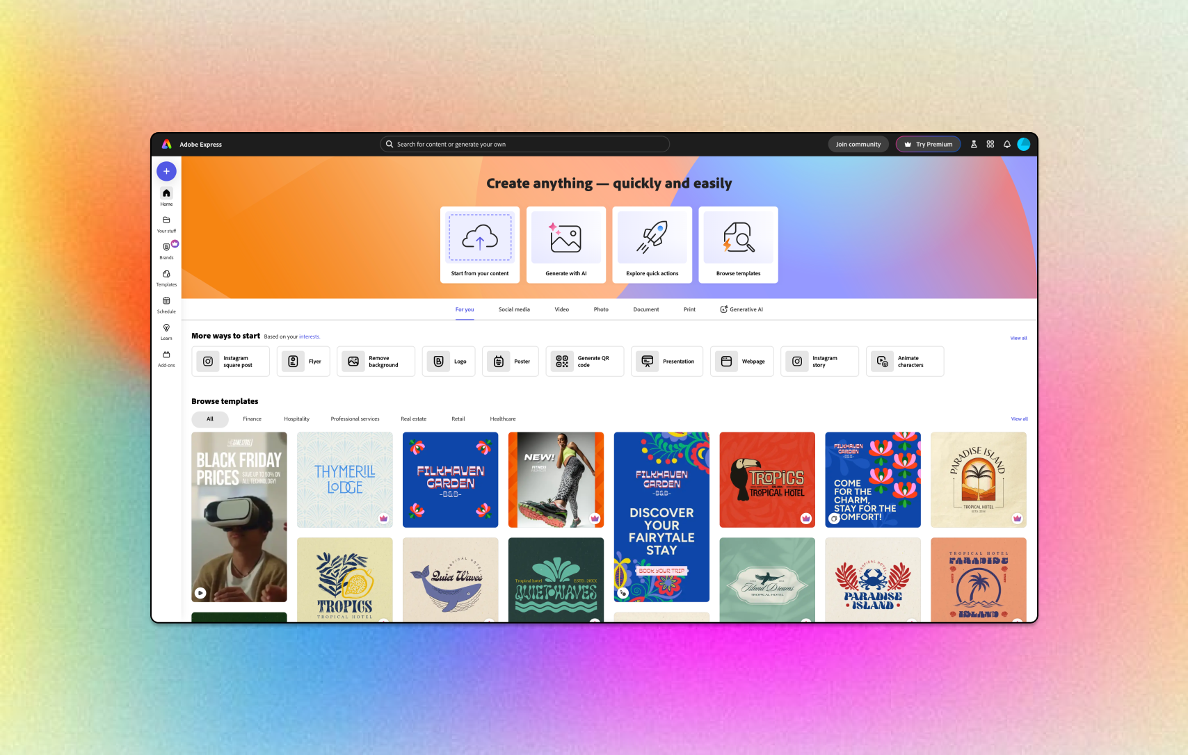
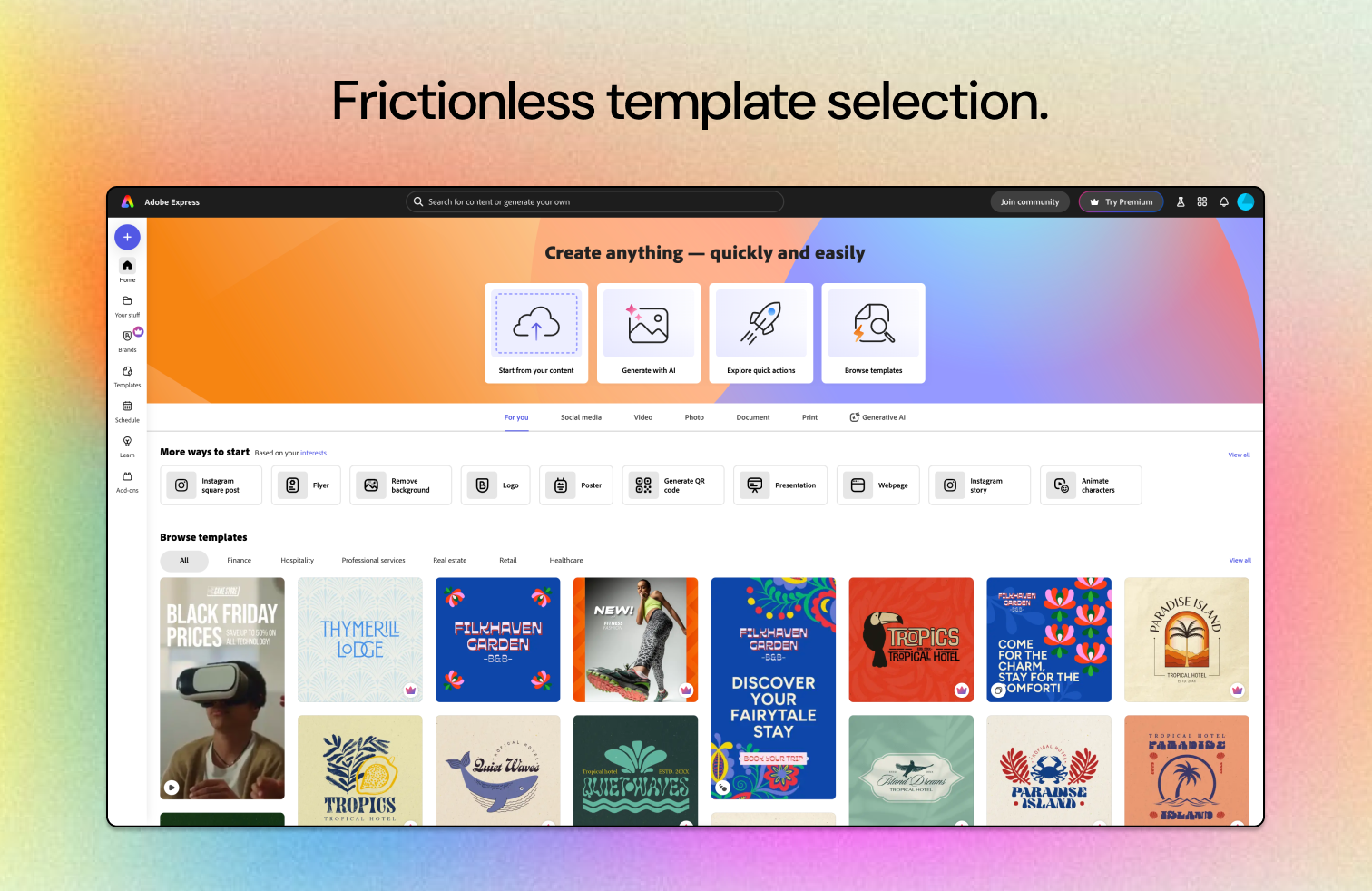
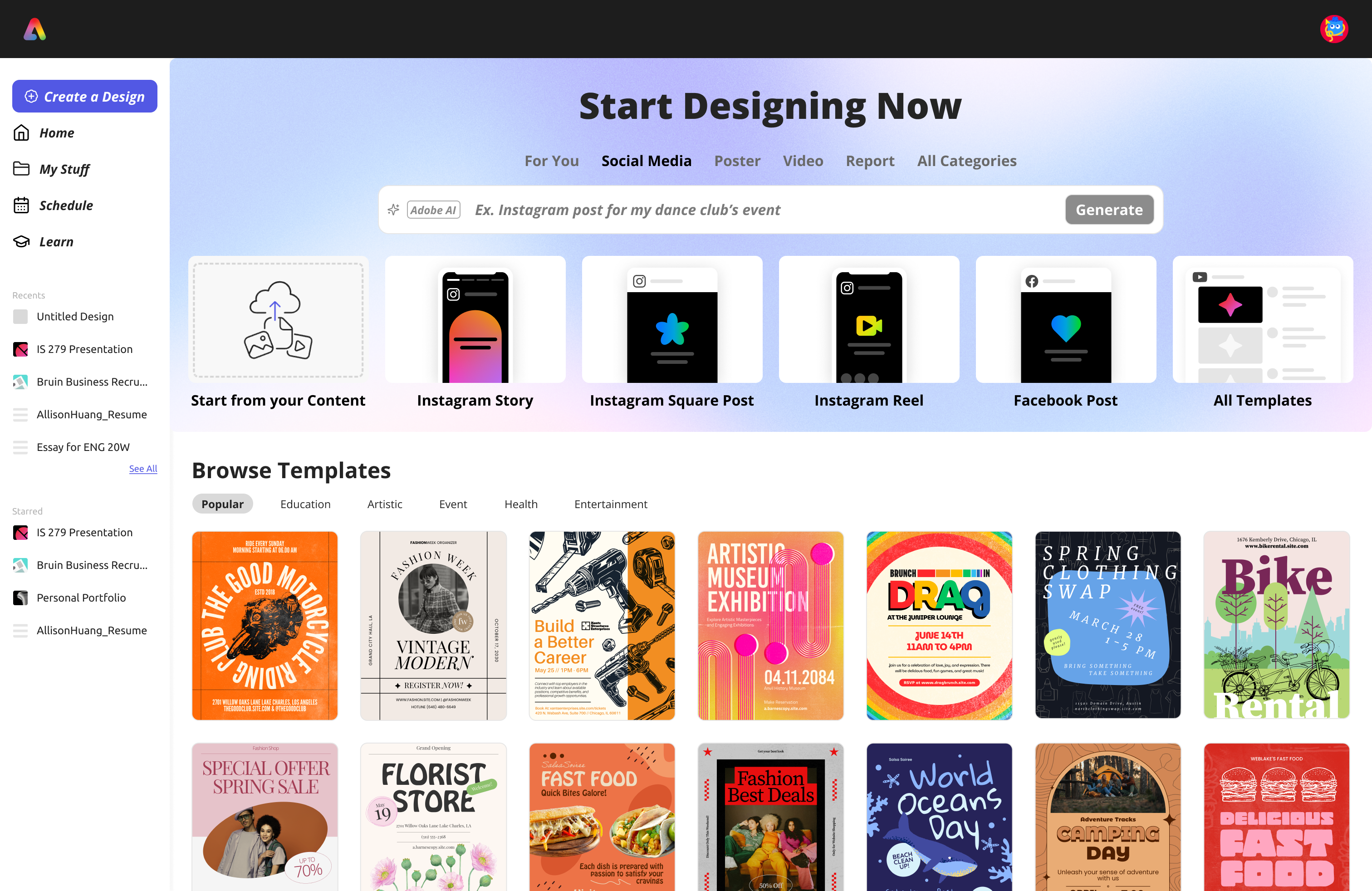
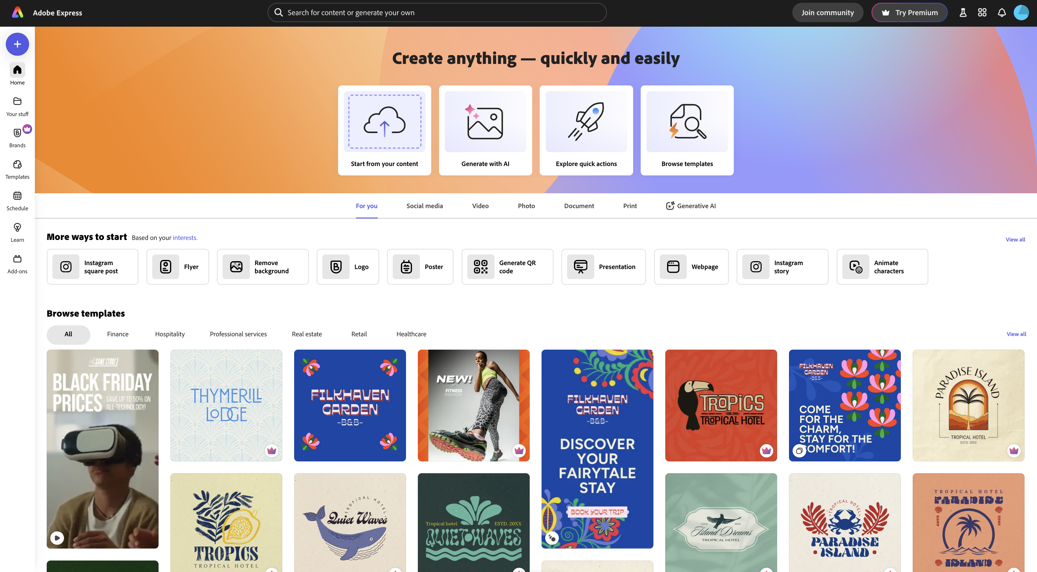
From our research and interviews, we noted that templates weren’t available for immediate selection; users had to scroll to the middle of the page to browse. In these prototypes, we prioritized keeping templates immediately visible as soon as users landed on the page.
Additionally, we wanted to make the CTAs clear and accessible. “Try Adobe Express Free” is displayed clearly, either in the center of the screen or as the first button users read as they move from left to right.
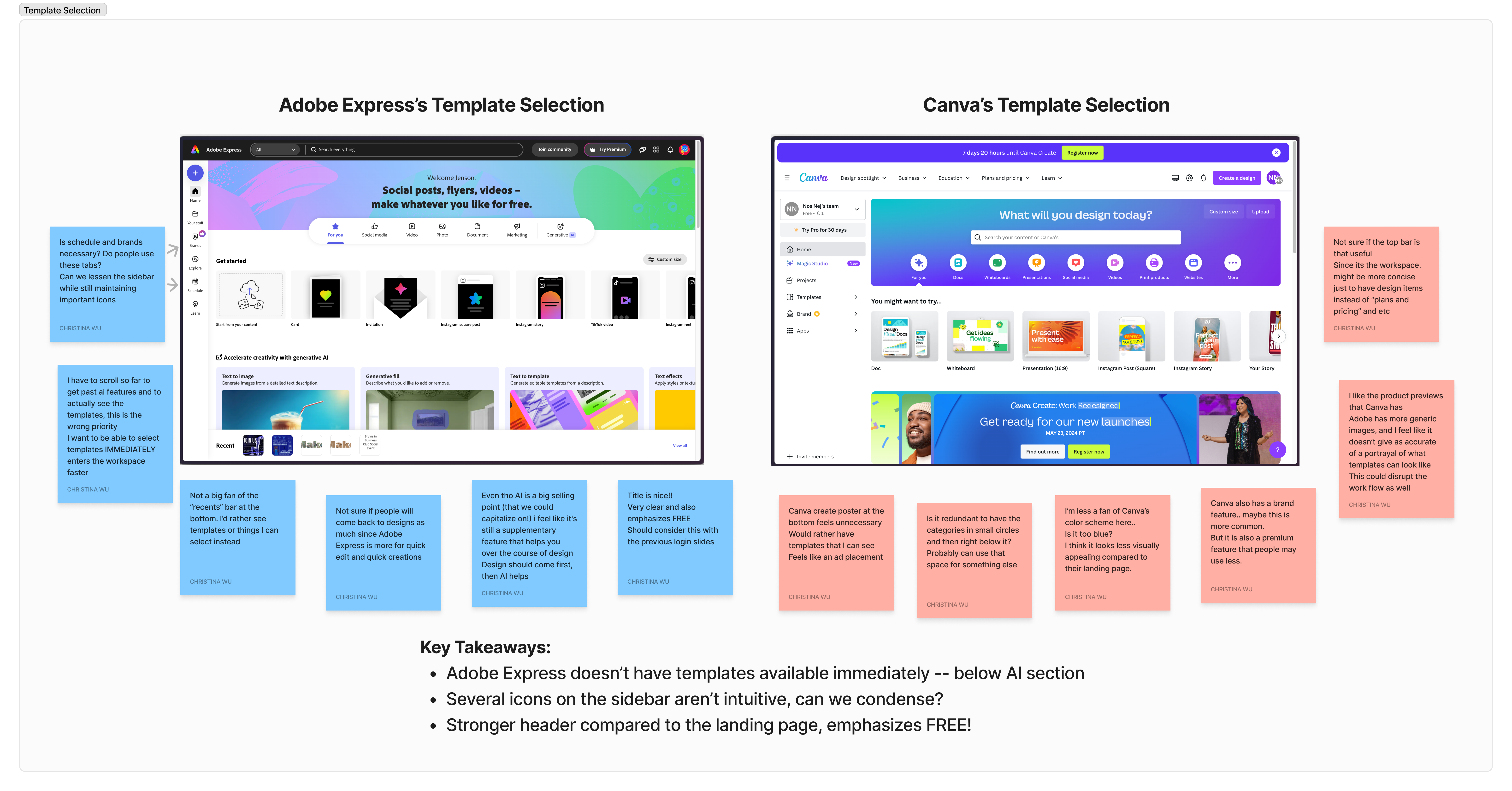
We compared Adobe Express’s and Canva’s workspaces. Adobe had a stronger header but Canva had better template previews. Both had different strengths that made them stand out.
However, one main comment was regarding template selection.
After entering the workspace, the first thing that users want to do is to find a template to edit. However, Adobe Express’s layout was somewhat unintuitive; users needed to scroll past the AI generative section, a large chunk of the page, to access templates.
We recognized Adobe’s intent to highlight its AI capabilities, so our goal was to create a balance that would effectively showcase both the AI features and the template options within the workspace.
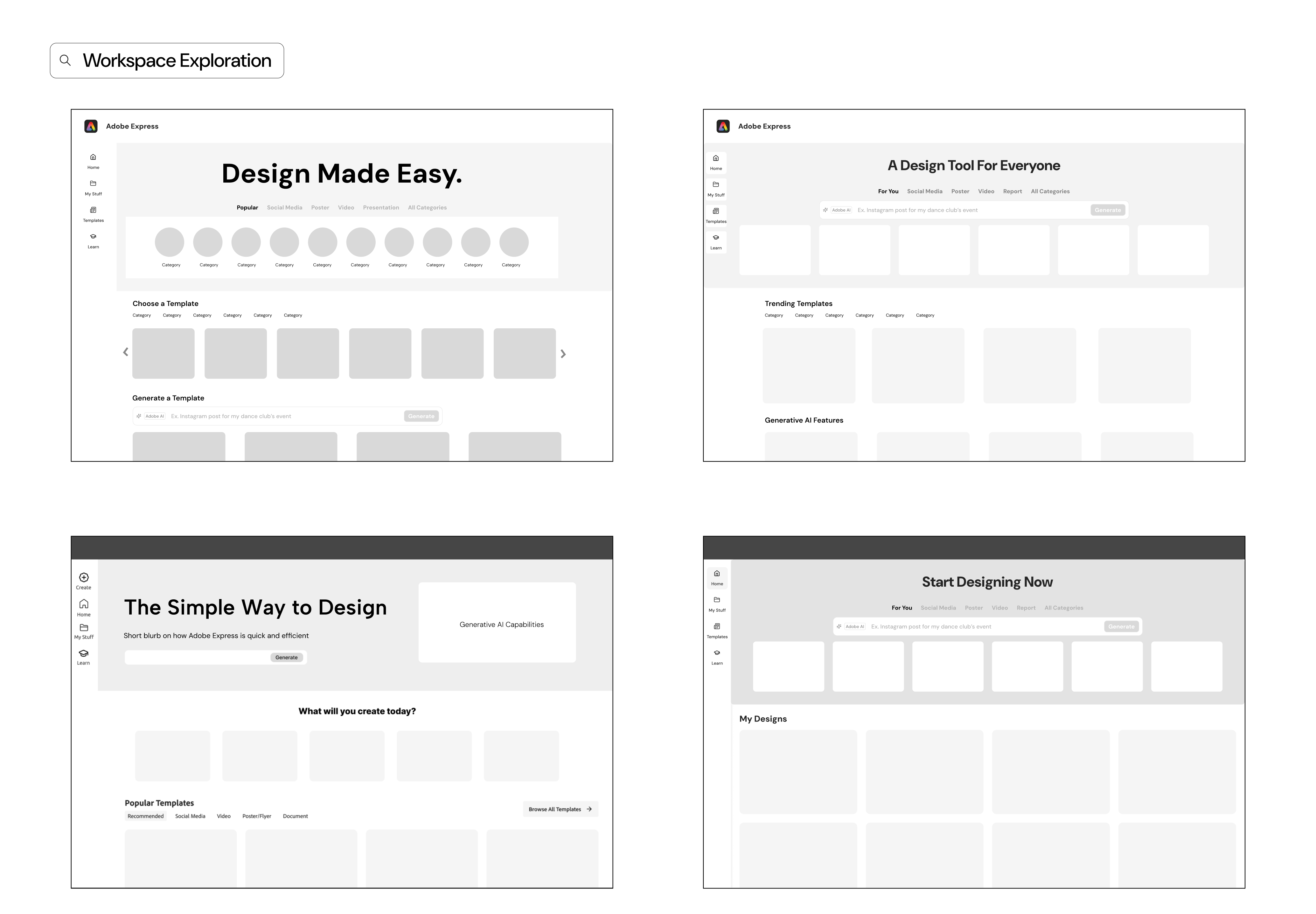
After gathering feedback and refining our concepts through low-fidelity prototypes, we transitioned to creating high-fidelity designs. We took the foundational ideas from our low-fidelity prototypes and enhanced them with polished graphics, precise layouts, and interactive elements.
Below is a side-by-side comparison of Adobe’s current design and our redesign.
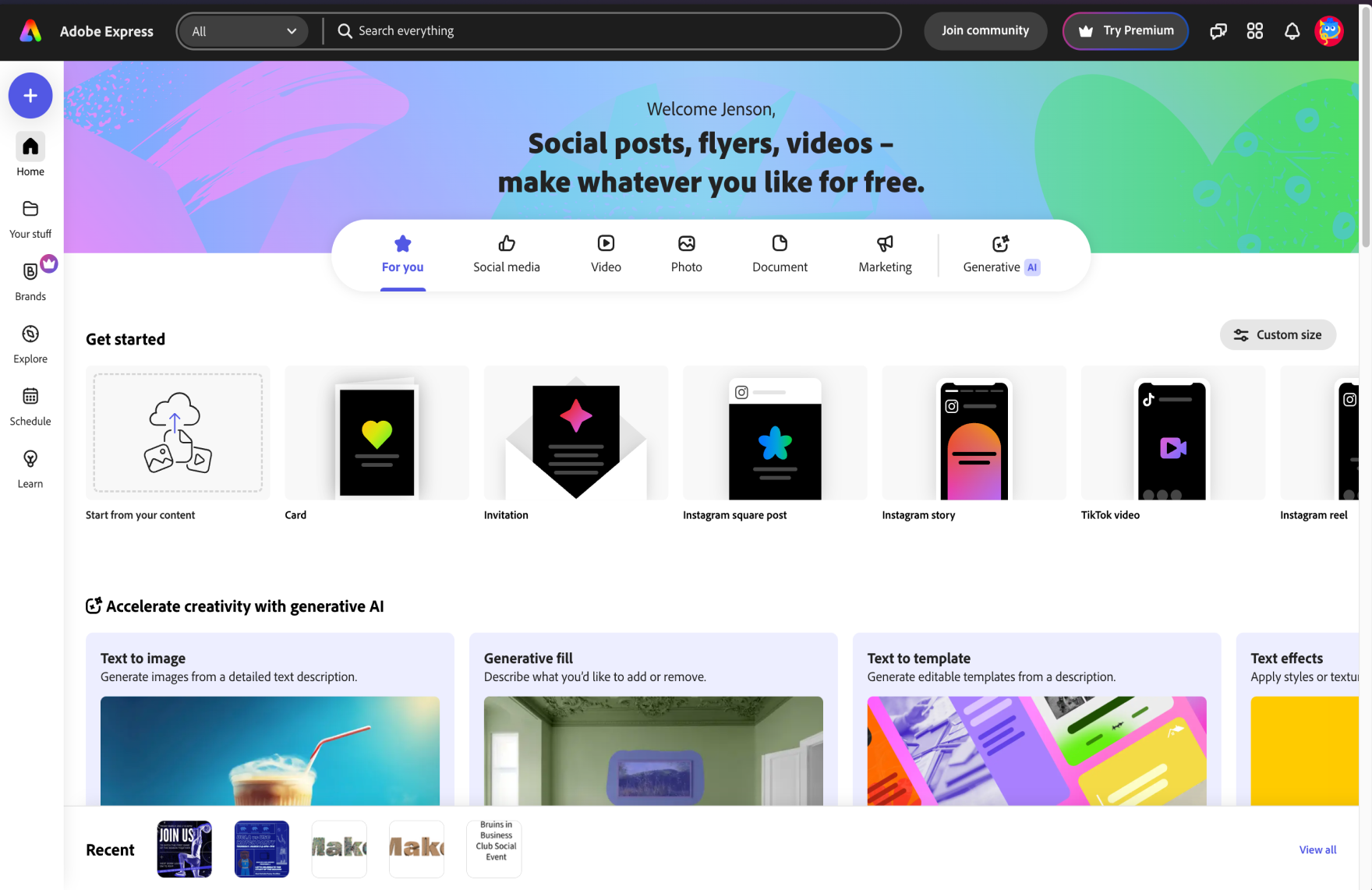
Current Design
Redesign
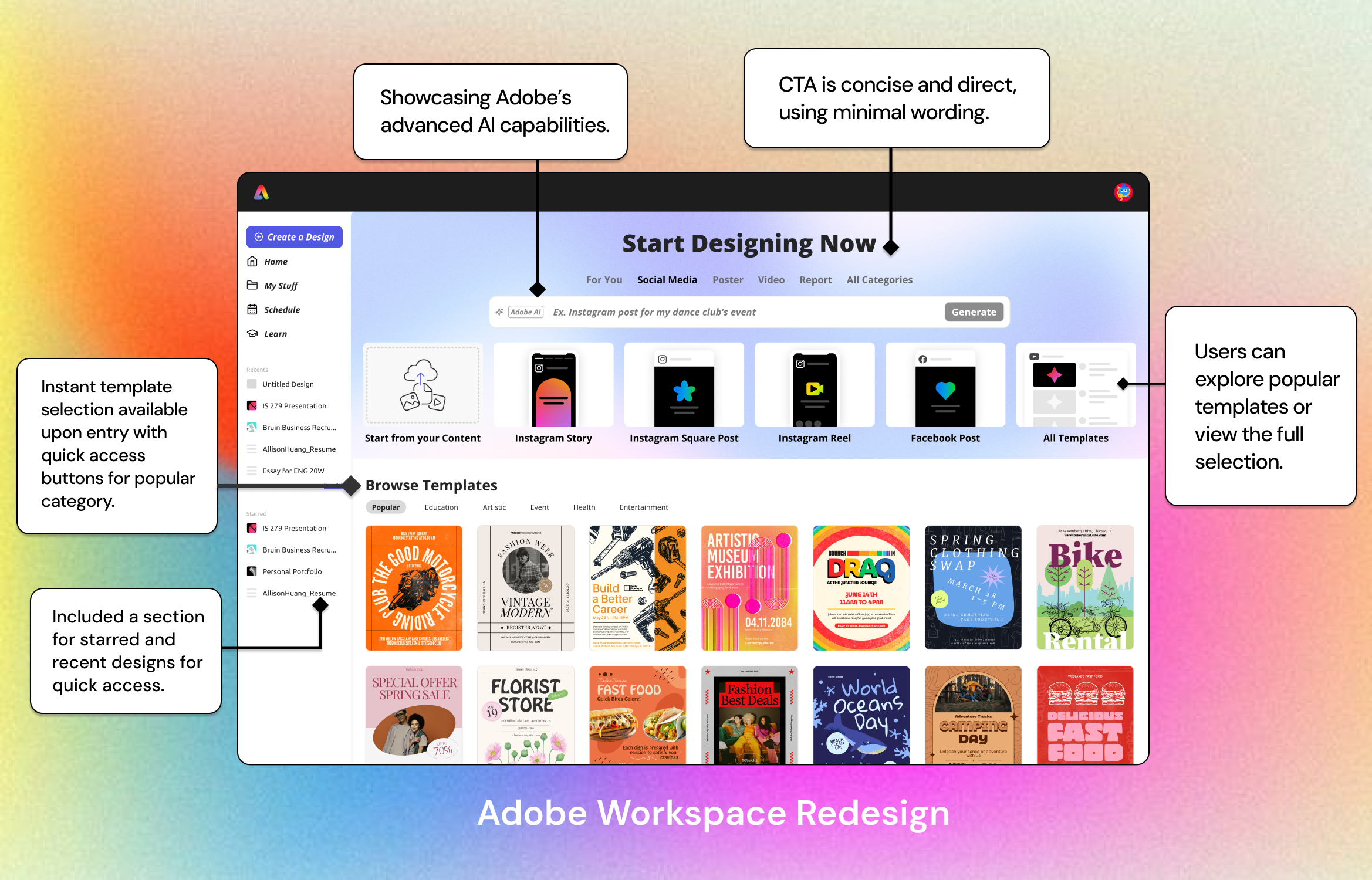
In our new design, we moved the generative AI section to the top of the screen, adding a search bar to allow users to input personal keywords to find designs. This change prioritizes template selection as the main feature on the page while still maintaining Adobe’s AI capabilities. This would allow users to quickly browse content categories, select a template, and begin editing.
We also made adjustments to the sidebar, as individuals in our design interviews were confused by the placement of recent designs in a static bottom tab on the page. In our redesign, we added a section for both recent designs and also favorited items, allowing efficient access and minimal previews of files.

Phase 3: Toolbar
Now onto the final redesign initiative: the toolbar.
During the design interviews, users instinctively gravitated towards the horizontal toolbar for text editing controls. However, when they couldn’t locate the right controls there, they had to sift through various icons on the left vertical bar. Users with minimal design experience also struggled to quickly change text styles due to an overwhelming number of controls without hover indicators and a cluttered layout.
With this in mind, we redesigned for a more intuitive interface. Our goal was to provide users with a quick-edit option, enabling them to efficiently modify text styles in a format they are more familiar with.
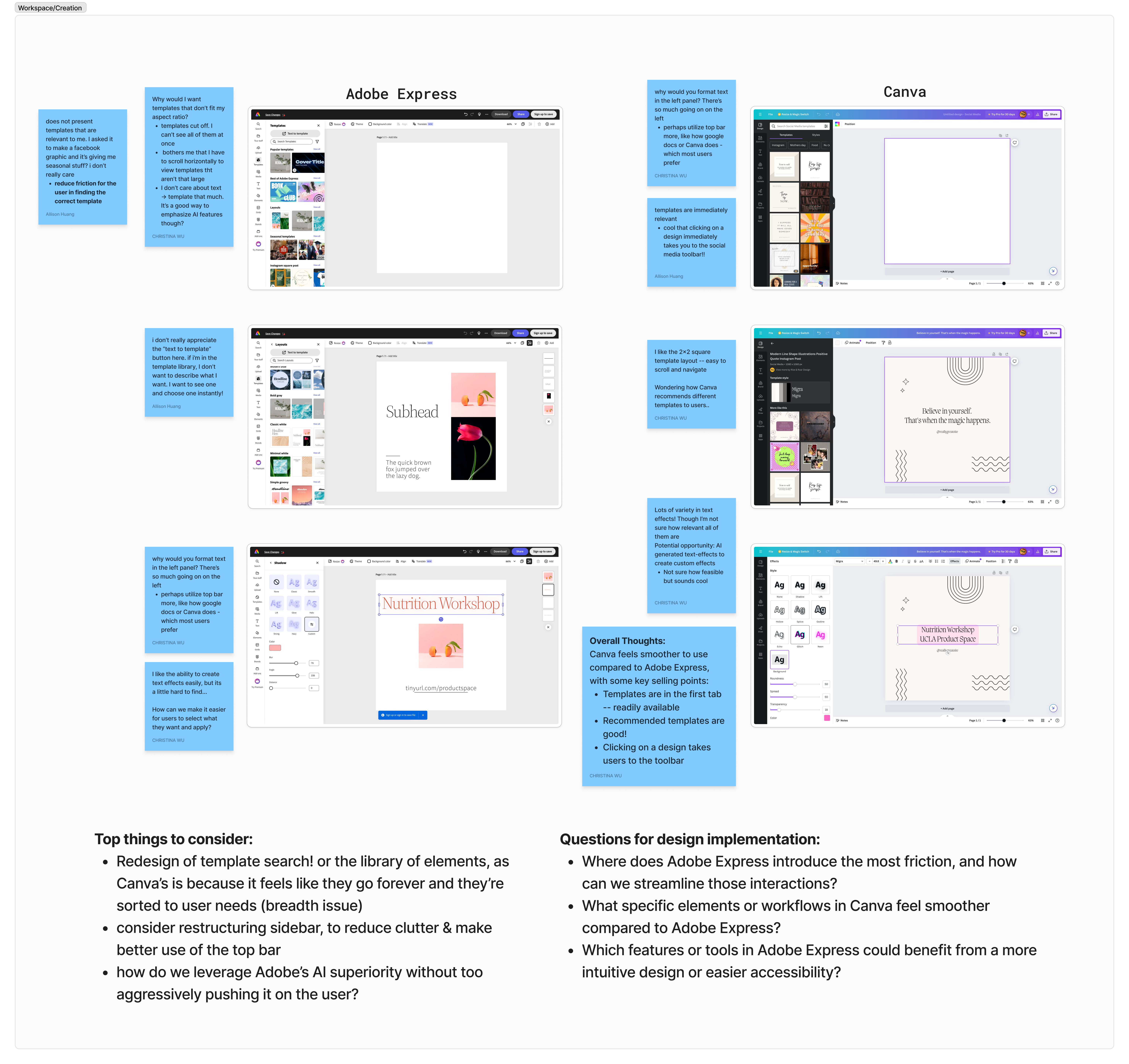
After conducting user research and pinpointing specific challenges in the design process, we found that the toolbar was a frequent source of frustration due to its complexity and lack of intuitiveness.
Users reported that essential tools were difficult to locate, leading to unnecessary time spent navigating menus and disrupting their workflow. Additionally, users felt that the toolbar’s layout was cluttered, making it overwhelming, especially for new or occasional users. To address these issues, we decided to prioritize a redesign of the toolbar, aiming to simplify access to core tools, improve visual organization, and introduce customizable options to tailor the workspace to individual needs.
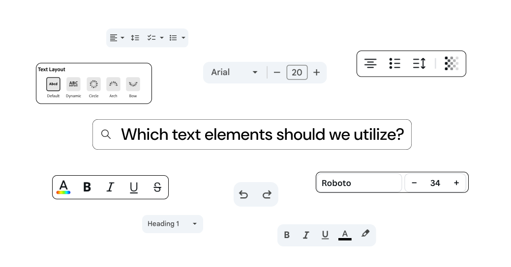
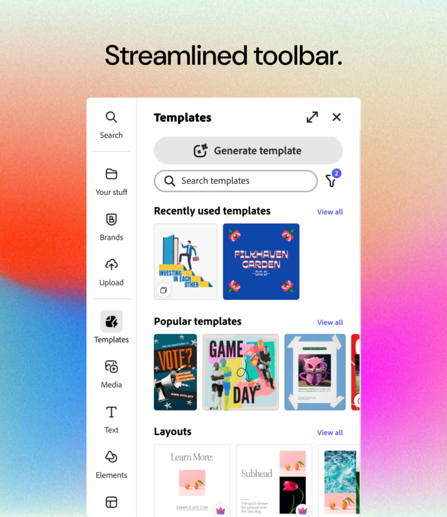
We carefully evaluated which text editing options to include in the toolbar to maintain a clean, user-friendly interface. Our goal was to avoid cluttering the toolbar with icons that users wouldn’t frequently use. Instead, we prioritized essential tools, balancing functionality and simplicity to enhance the overall user experience.
We experimented with various iterations to identify which combinations were effective and which were not.
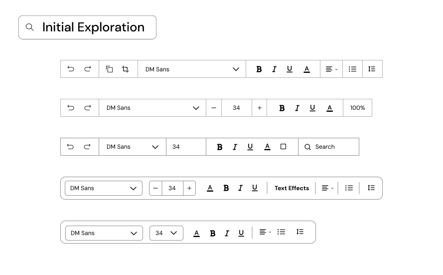
We showed these examples to the Adobe team, and were met with positive feedback and a few critiques. We took their considerations in mind and started to create a final design.
Here’s a closer look at the comparison between their current design and our redesign.
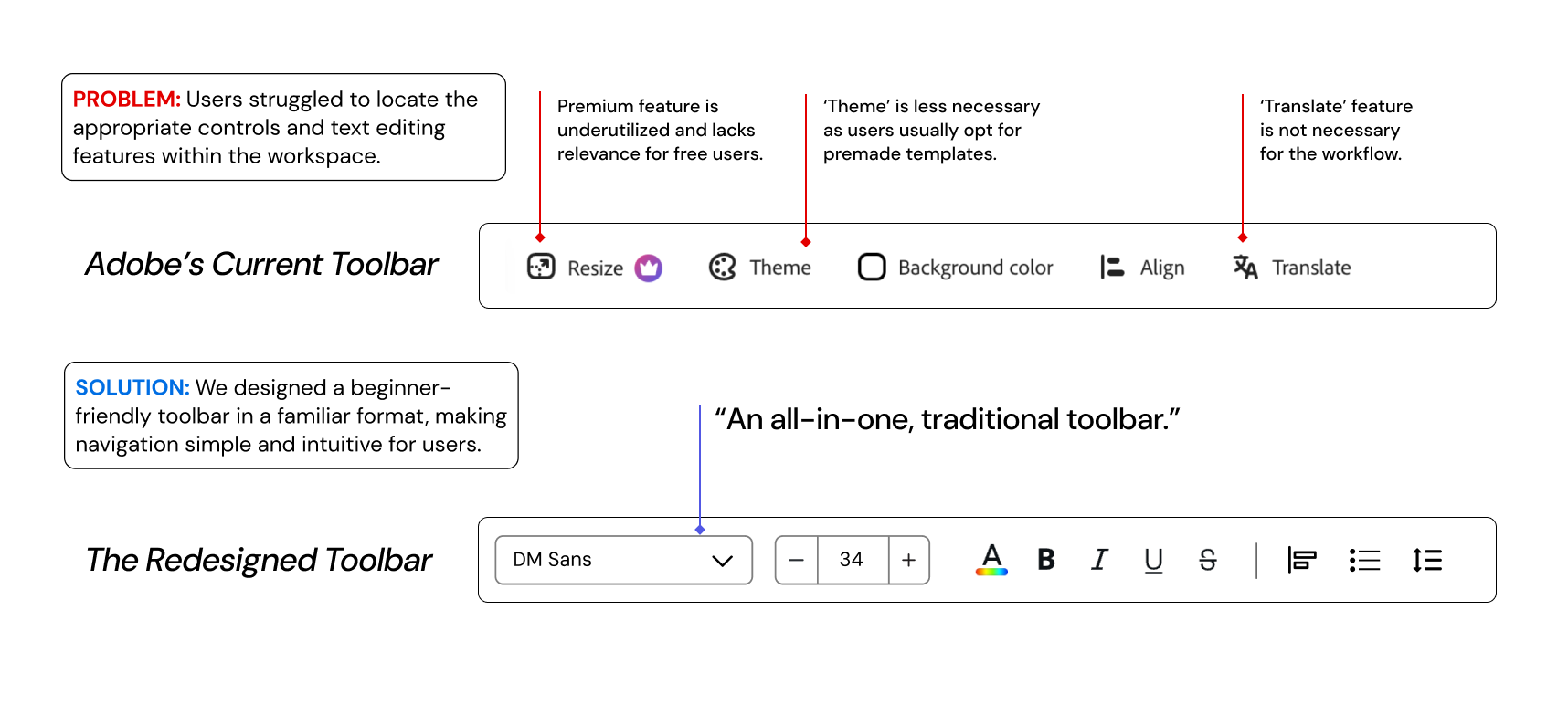
In our new design, frequently-used text options were placed in the top menu, displayed in a traditional format similar to other editors. From our user testing, we found that individuals preferred this more familiar layout, and we wanted to reflect this want in our redesign. We included typography, font size, text styles, and text formatting in the menu, grouping the visual effects to the side bar. This change also allowed us to give other features, such as texture previews, more space to work with.
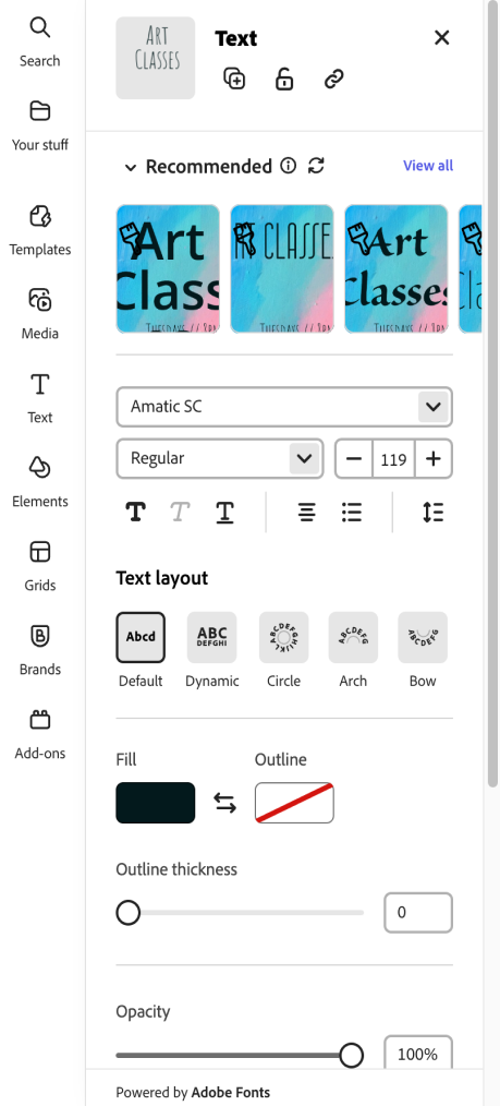
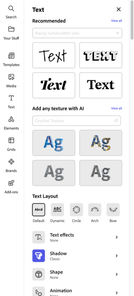
We also opted to revise elements in the vertical pop-out menu. In Adobe Express’s current “Recommended” text section, a carousel format is used to allow users to choose different text fonts. We found this approach to be somewhat cluttered, especially since it also displays the background of the text area. We redesigned it with options displayed in a grid layout for easier viewing.
Below is a side-by-side comparison of the two menus.
Current Design
Redesign
We designed an interface that presented AI text suggestions and textures in a grid layout rather than a carousel, enabling users to view multiple options simultaneously without scrolling. Additionally, we removed the background to keep the text as the primary focus, providing more clarity in this new design.

Key Takeaways.
Working on this project has taught me a variety of skills in product strategy, UX research, and competitor analysis. One significant takeaway from the Adobe project was recognizing the importance of continuously iterating on designs based on user feedback. It reinforced the need for flexibility and open-mindedness, as design solutions often evolve throughout the process. Effective collaboration and communication within the team were crucial in adapting to these changes and successfully integrating new ideas into the final product.
Questions for future work:
- How can we better communicate Adobe Express’s simplicity to overcome user preconceptions about its complexity?
- How can we leverage data from user feedback to continuously improve the platform’s interface and functionality?
- How can we further streamline the template selection process to reduce friction and enhance the user experience?