1on1 is a networking mobile app designed to make connecting in Web3, a blockchain community, easy and efficient.
My task was to conduct UX research on competitor apps and work with a team to create the mobile app prototype, overall user flow, typography, and key components.
Details
Role: UX Researcher and Product Designer
Duration: 6 months, Dec 2022 – May 2023
Tools: Figma
Objective
I was tasked with researching and analyzing competing social media apps and laying out the user flow.
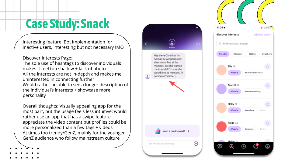
I led the UX research to analyze different social apps (Hinge, Bumble, Snack), taking note of key design elements that made the user experience cohesive and easy to navigate.
We would then design our app with this information in mind, making the features streamlined and accessible for users.
Defining the Scope
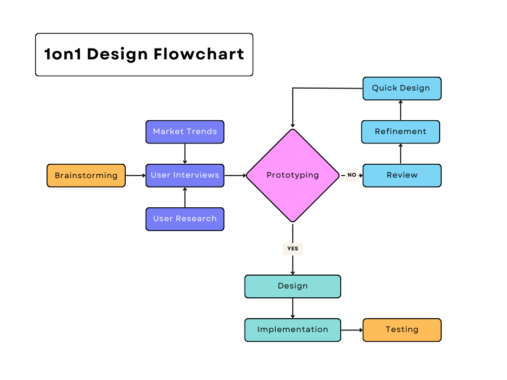
I initially created a roadmap of how our overall process would look like. It would be important for us to visualize the steps we’d take in each phase to track our progress and ensure we wouldn’t gloss over any important steps.
Research
I conducted user interviews to identify user needs and important features of a professional mobile app.
Some ideas I had to consider were:
What were the pain points of individuals trying to enter the Web3 community?
What kind of Web3 professionals are we targeting (e.g., blockchain developers, traders, etc.)?
How should we consider the user interface and user experience design for web3 professionals?
We asked a series of questions to individuals in 30 minute interview slots, understanding their needs and wants for a professional networking app.
Below is a summary of the information gathered.
User Interview Findings
Needs
Simple navigation menu
Search bar for professionals and specific industries
Ability to customize user profiles
Wants
Ability to have unlimited connections
Sharing profiles with external individuals
Design centered around Web3, catered to users
Professional but welcoming aesthetic
Desires
For the app to not feel overcrowded or overwhelming
Easy and simple onboarding process
Helpful notifications in the event of a “match”
User Research & Competitor Analysis
In my research, I conducted multiple competitor analyses while also studying our target audience (GenZ).
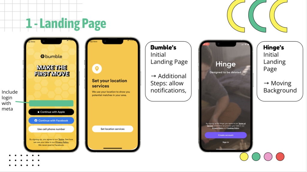
I took note of the small differences in the onboarding process for these different apps, understanding what would be optimal for a user in their 20-30s.
The landing page was also important to consider, as it was the first impression of a user on an app. I wanted to emphasize a visually concise home screen and an efficient sign-in process.
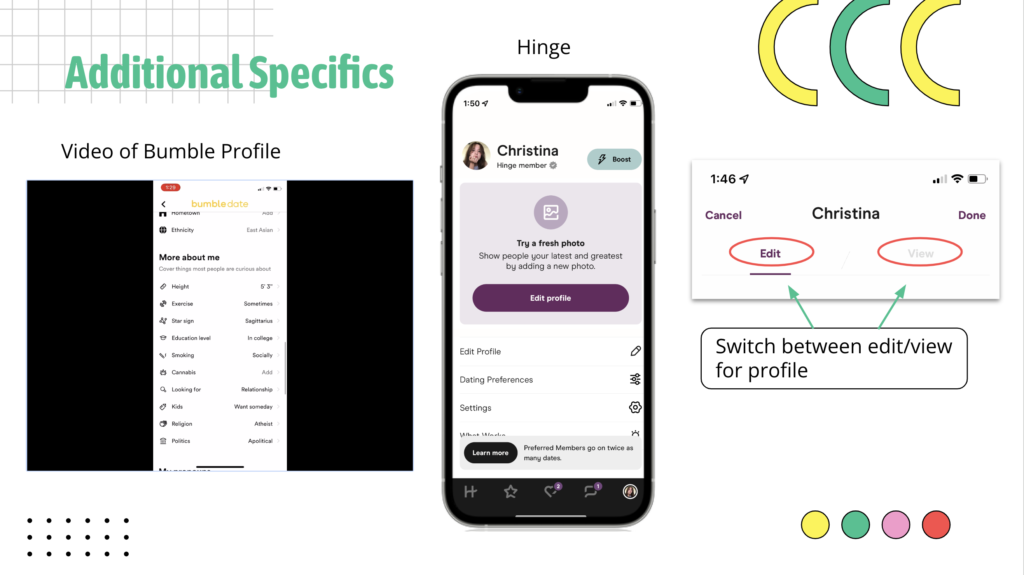
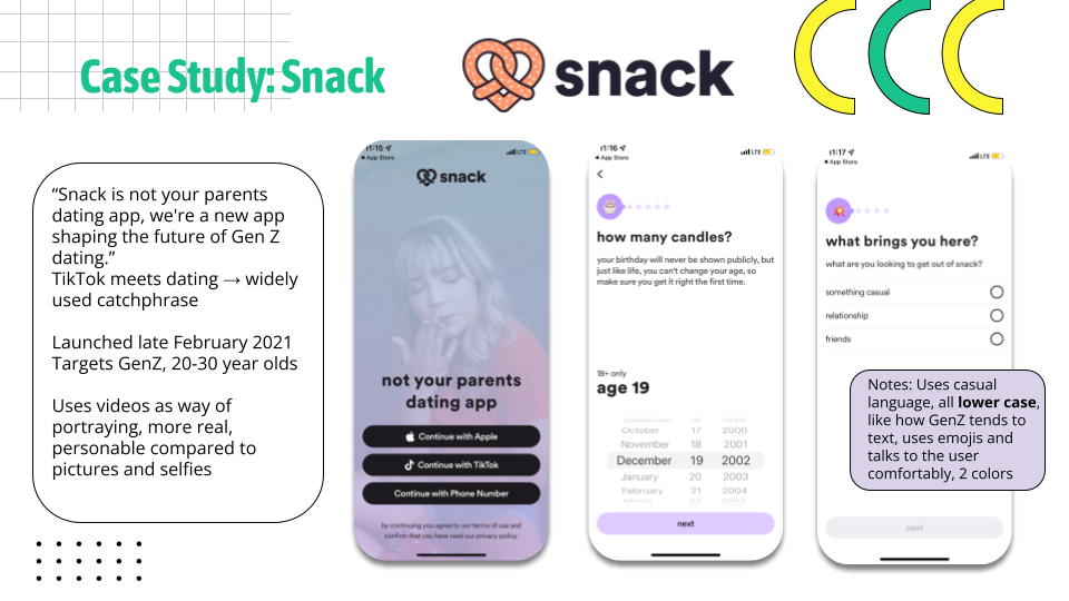
I also conducted case studies of popular social media apps, such as Hinge and Bumble, but also studied a recently published app that focused on video content, known as Snack. Because it was newly established, I thought it would be important to analyze elements that led to its success.
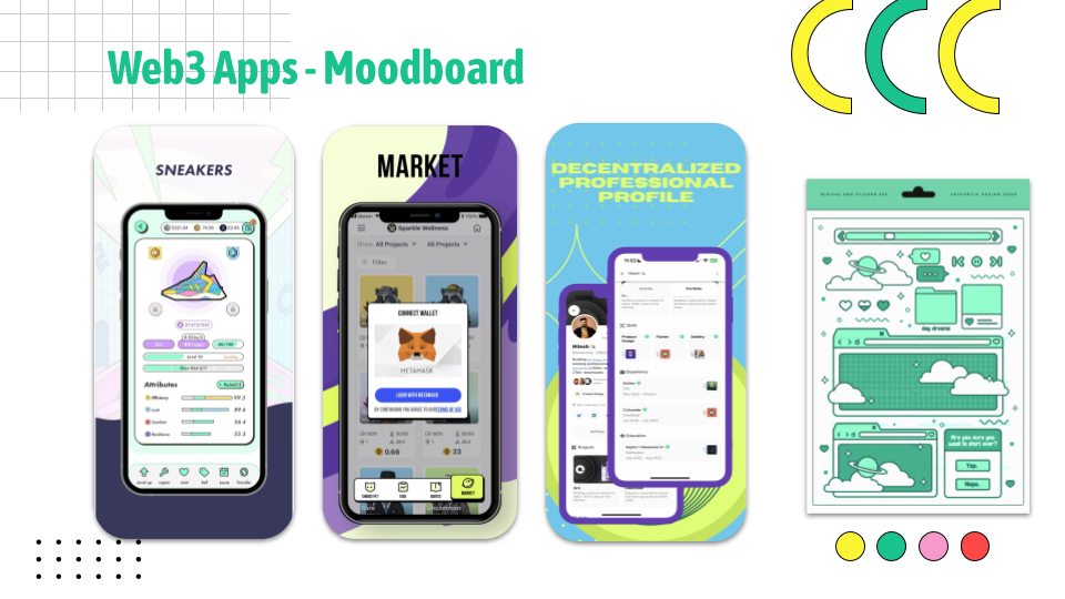
I also created a moodboard with colors and details of other Web3 apps, to provide bits of inspiration of where we could take our own color palette.
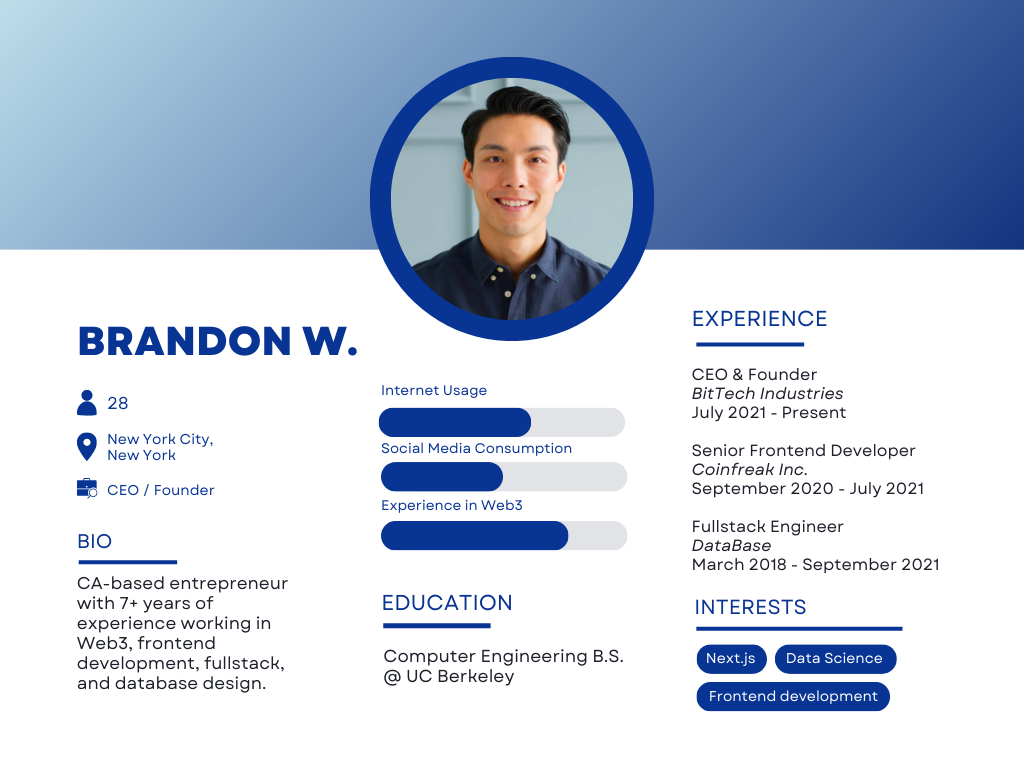
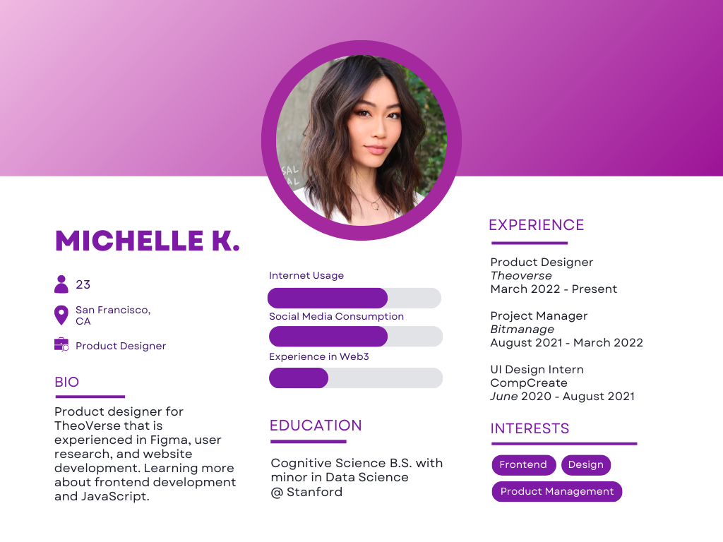
User Personas
I then created some user personas to encourage a deeper understanding of our target audience. It would also provide visual representations of different segments of our consumer base, allowing us to create more personalized product features and design elements.
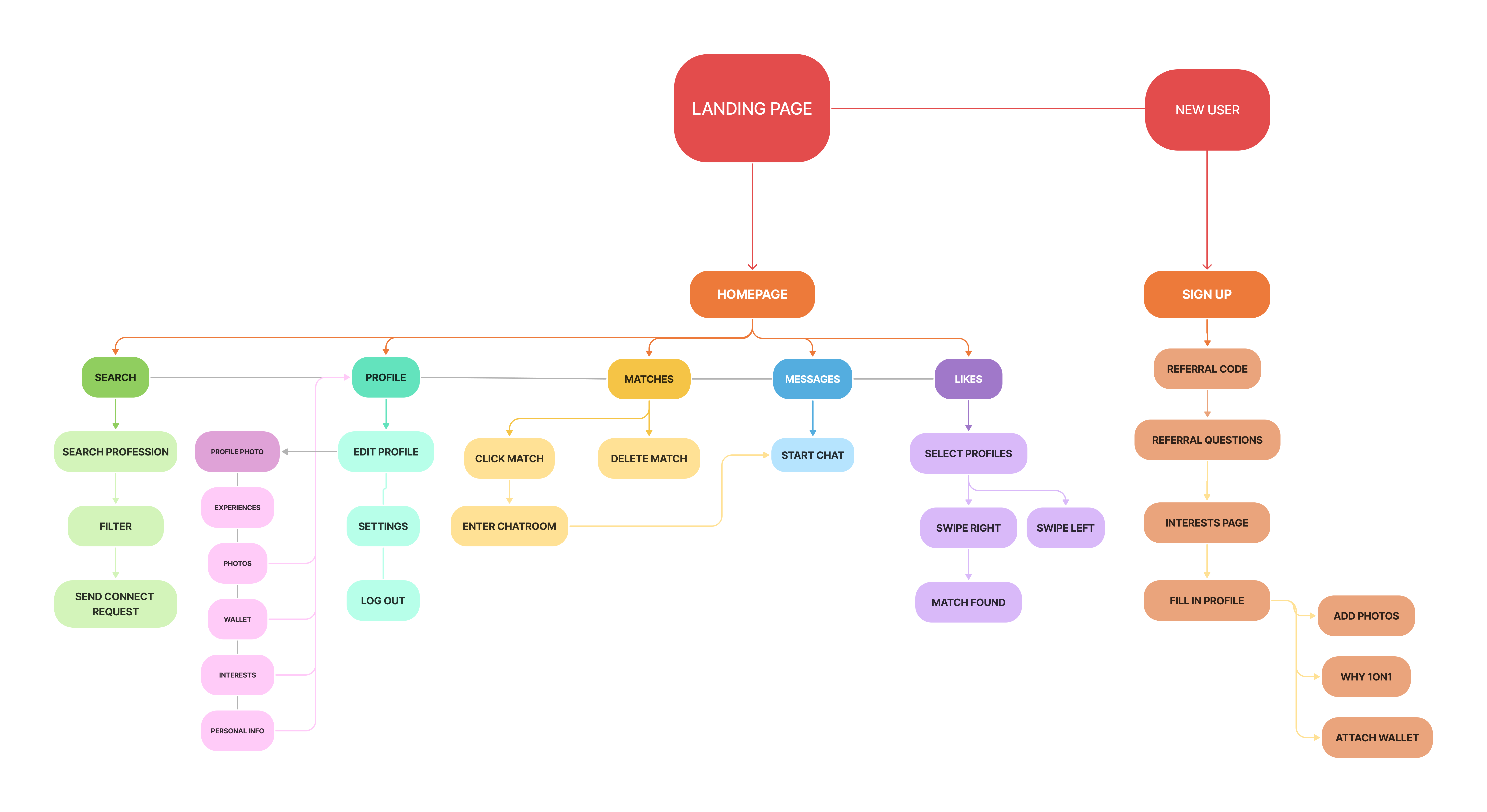
Information Architecture
I then created a visualization of the user flow, mapping out a basic outline of a user’s usage of our app.
Lo-fi Designs
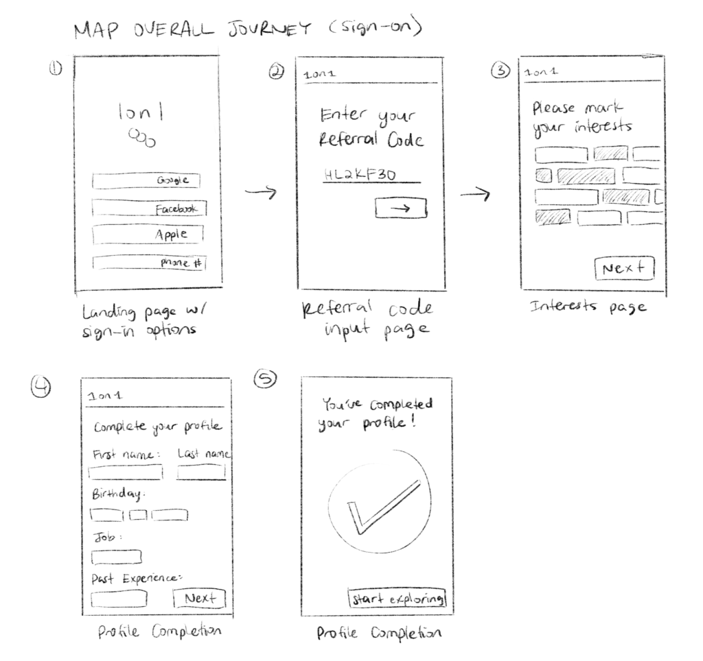
With the information from the user interviews and the competitor research, we started to prototype the onboarding process and create some lo-fi designs.
I created some wireframes of the sign-on process and created mockups of the pages.
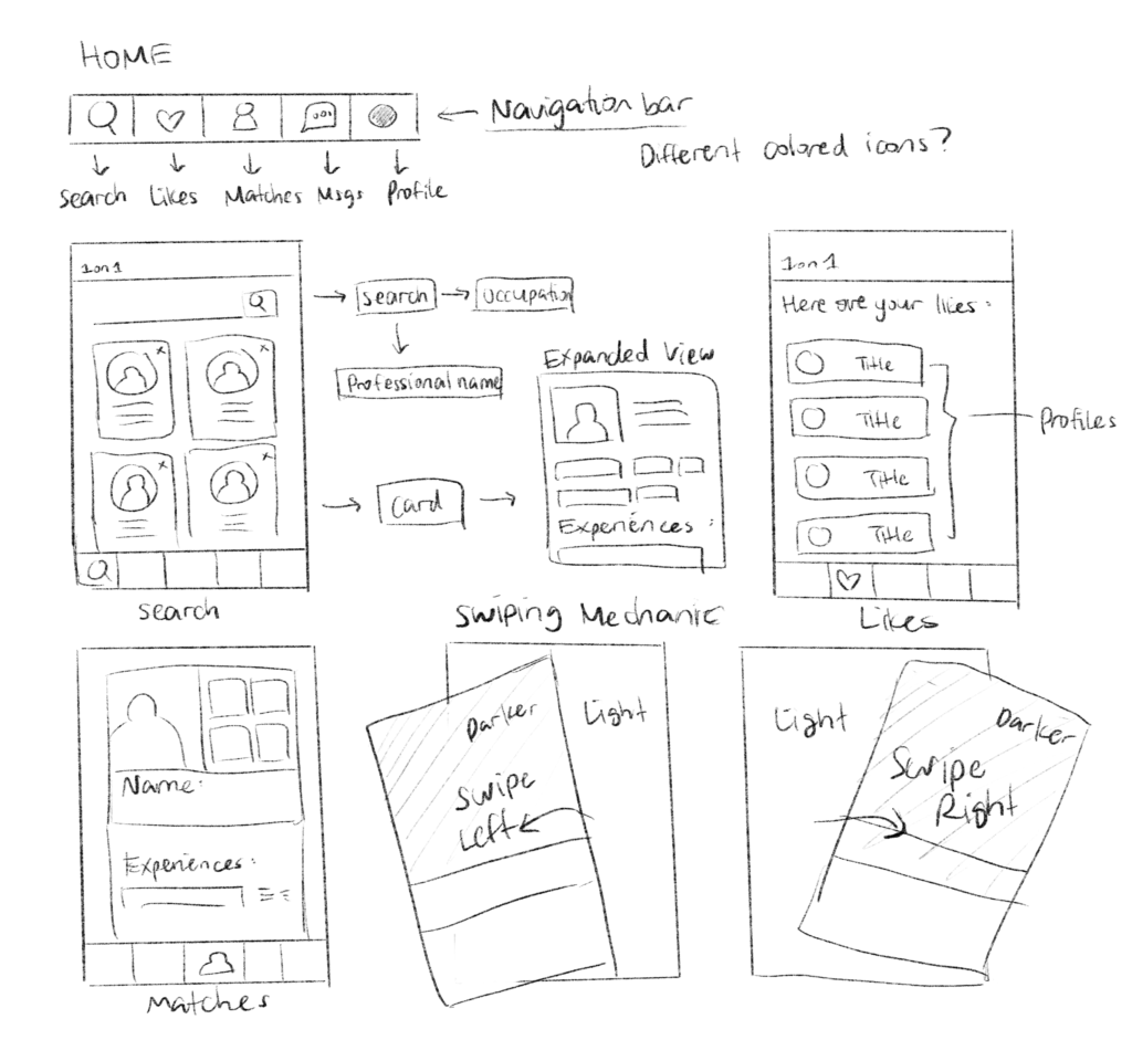
I then identified what features we would use for our navigation bar. We decided on 5 sections: Search, Likes, Matches, Messages, and Profile. I then mapped out how each of these might function or look to the user.
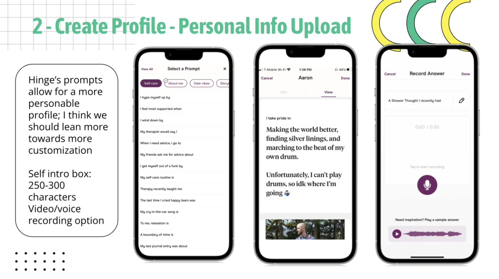
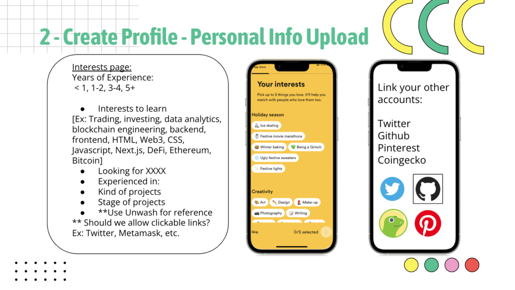
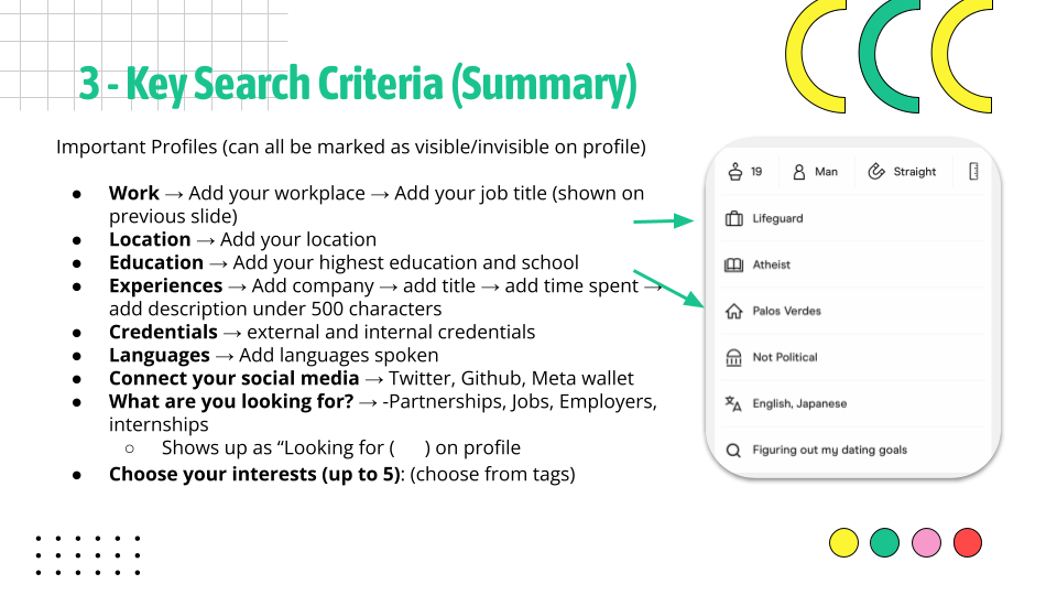
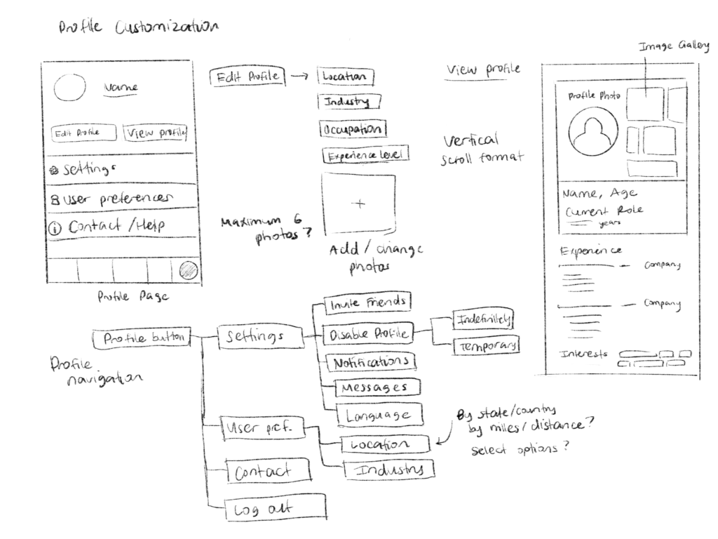
From the user interviews I conducted, profile customization was identified as a necessity for any social or networking app. I needed to ensure that individuals had the ability to customize their profiles with pictures and relative experiences, and be able to view how their profile would look to others.
Brand Aesthetic
With the initial drafts in place, it was also important that we established the app’s main colors and aesthetic early on.
We were split between two choices; one theme was more vibrant and neon-colored, meant to cater to a more “fun” side of GenZ, while the other was more primary color focused and bold, to give it a more professional look.
After conducting a survey of over 100 participants in the age ranges of 20-35, asking them “Which color palette would you prefer for a professional networking app?”, 71% of participants chose the more professional theme. We then decided to choose this as our final color system, and it also became the basis for our logo design.
We then finalized other design elements, including the fonts, buttons, and icons we would implement in our app. We also created a moodboard that would guide our app’s visual focus.
Prototypes
We then began creating some UI designs of our app, creating the landing page, sign on process, profile customization, and search application for the professional network.
From there, some design details we decided to change included:
Omitting the onboarding steps caption (felt too large and unnecessary)
Adding an “objectives” page to see what category individuals want to use the app for
Making the interests page less overwhelming, enlarging the bubbles
Changing the look of the referral graph
Minor grammar fixes and wording changes
We implemented these changes for a cleaner, sophisticated look, shown in the demo video below.
Demo Video
Conclusion
Working on this project has taught me a variety of skills in product creation, UX research, and competitor analysis. One important takeaway was the need to adapt to different challenges and understand that designs are always subject to change; it is up to the team and designers to effectively communicate and implement these new ideas.
Questions for future work:
What is the emotional response we want an app to evoke?
How can microinteractions and animations enhance the overall experience?
How will the app evolve over time with scalability in mind?
")